2.9.4-data-list-view
2.9.4 Data List View
Views are windows for users to view and manage table data, displaying target data in different formats based on user roles or scenarios. The current view configuration supports data list view, Gantt chart, card view, kanban view, and calendar view.
2.9.4.1 View Operation Interface
The management console defaults to displaying the form view page, which shows the current form's viewing and data list views.
Users can also configure the created views on the app design page, including display, search, sorting, filtering, buttons, and basic settings.
2.9.4.2 Data List View
Data list view primarily displays data in a tabular format, presenting important data and content intuitively.
2.9.4.2.1 Application Scenario
- In employee information file management, a data list view is used to display key employee information.
- In sales management, the data list view displays quotation information.
2.9.4.2.2 Effect
Using employee information file management as an example, the data list view display on the homepage is shown in the figure below. It allows viewing statistics for regular employees, resigned employees, and probationary employees; supports conditional filtering; and provides clear visibility of key employee information.
2.9.4.2.3 PC Operation
Step 1: Under "data list view," click "Create" in the upper left cornerand, set the view name in the settings.
Step 2: Click upper operation area in the data list view of the display area to configure the settings.
a) Select the display fields for the data list view. Arrange the fields from left to right based on their importance, with the most important field placed first. Hover over the six-dot icon in front of a field to drag and reorder it.
b) Set the width of each field based on its content length.
c) Click "Filter Area" to set filter settings, such as adding name, phone number, etc.
d) Click "Basic Settings - Statistics," add the employee status field, and click the "Settings" button next to the field to configure the three statistical items: number of regular employees, number of resigned employees, and number of probationary employees. There are two statistical display styles: top cards and style options.
e) After completing the above steps, click "Save" to apply. The runtime effect is shown below.
2.9.4.2.4 Mobile Operations
Click "Mobile" at the top to input the mobile version's data list view editing page.
Column display settings: Click "Column Display" to configure the configuration.
a) Set a theme, that is, the title of each employee's information, using "Name" as the theme
b) Set tags, which means the tag field information will be displayed next to each employee's title;
c) Settings statistics items, indicating employee status as regular, resigned, or probationary;
d) After completing the settings, click "Save."
Filter area: Click the funnel chart icon to configure the filter fields.
Statistics section: Add the name field, then click the "Settings" button next to the field to configure the three statistics: regular employees, resigned employees, and probationary employees.
2.9.4.2.5 Instructions
View Settings
a) Supported terminals: Set the display terminals for the current view (PC or mobile).
b) View Selection: Set the specific content to be displayed when clicking on data in the Homepage list. Users can configure the view to be displayed. For adding new view operations, please refer to section 2.3.5.1.2.2.3 View Editing.
c) Accessible Users: Set permission for viewing the data list view on the Homepage. If left empty, everyone can access it.
Column Display Settings
a) Column Display: Set the fields to be displayed in the data list view. Multiple fields can be selected, with support for drag-and-drop sorting and toggling display. The sorting determines the left-to-right display order in the data list view.
i. Table style settings: Font colors can be differentiated for specific statuses or conditions. For example, HR may need to highlight employees pending resignation by marking them in red in the list.
ii. Field Settings - Open View: Business association widget fields can open views. Clicking on data in the list will navigate to the corresponding associated data details for viewing. For example, the item name in the inventory is associated with the business association, linked to the item management data, with the view switch settings turned on.
b) Data Filtering:
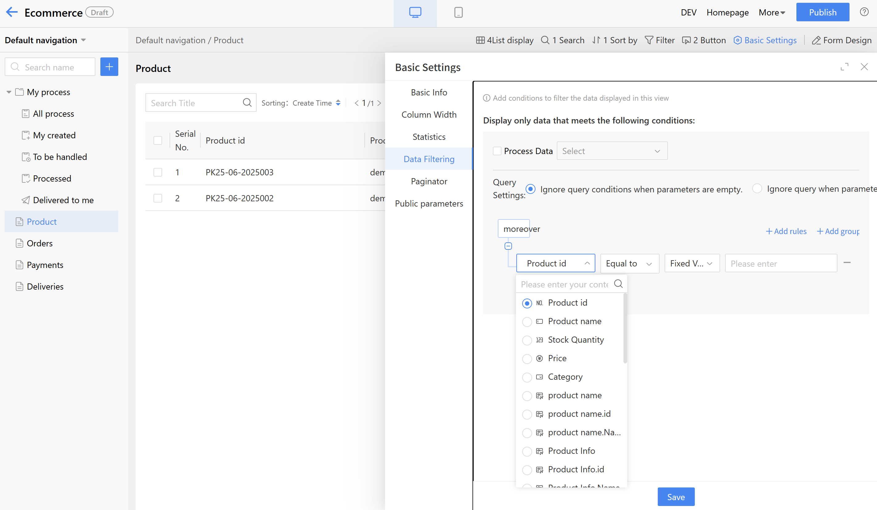
i. Set the data list view to display data that meets the filtering conditions. For example, to show only data for full-time employees, set the filter to display employees with a "full-time" status.
ii. Custom Condition Calculation Method:
- Fixed Value: Input a value according to the data type. For example, text type displays text, date type shows a date picker, and organizational structure displays an address book.
| Data Type | Operators | Valuation Method |
|---|---|---|
| Single-line Text | =, !=, includes | Fixed value, input parameter, formula |
| Multi-line Text | =, !=, includes | Fixed Value |
| Single-selection/Multiple-selection | =, !=, includes | Fixed value, input parameter, formula |
| Dropdown single select/Dropdown multi-select | =, !=, includes | Fixed value, input parameter, formula |
| Date/Numeric | >, >=, <=, <, !=, = | Fixed Value |
| Organization Structure | =, !=, includes | Fixed Value |
- Formula: Use the formula editor to set settings.
- Input Parameter: Input values from other fields to the current field as query conditions. Primary use case: When creating a list-type business tag in a view, if the selected list has input parameter configuration configured, a field in the view will be set as the input parameter value to transfer the data to conditional field.
Example of input parameter usage: When setting up a project plan as a business tag in the project ledger, use the project name as the input parameter value to query corresponding data. The specific steps are as follows:
Step 1 - In the data list view of the project plan, set the project name as the input parameter method;
Step 2 - On the view config page of the project ledger, create a business tag for the project plan and use the project name as the input parameter value. Query the corresponding data using the input parameter value and display it on the previous business tag page.
b) Quick Actions:
i. After enabling the "DING" feature, users can see the "DING" icon on the viewing page and perform actions.
ii. After enabling the quick approval, quick approval pass, and quick rejection features, approvers can perform these actions in the data list view to improve approval efficiency.
c) Pagination: Set the pagination method for tables, supporting three options: no pagination (view via scrollbar), default pagination, and simple pagination.
Filter Area: Set the filter conditions displayed on the Homepage page.
a) Click the plus sign, select the form fields, and the selected fields will be displayed in the filter area.
b) After adding a filter field, users can drag to sort, adjust settings, or delete the field.
c) For individual field settings, click the edit button to set whether it should be expanded by default; for option fields, users can set whether multiple selections are supported.
d) Users can select the settings button for filtering fields, as shown below, to perform batch settings.
Search title: Displays the search box at the top of the Homepage list, allowing users to input text as prompted to search.
a) Prompt text: Default is "Search Title," which can be modified as needed.
b) Search scope: Optional fields are single line text fields, and checking them allows searching within those fields.
Statistics settings: Configure the statistical items displayed on the front-end page.
a) Click the plus sign, select the form fields, and the selected fields will be displayed in the statistics area.
b) After adding a statistics field, users can drag to sort, configure settings, or delete the field.
c) Statistical Settings:
i. Statistical item name: Set the display name of the statistics item on the Homepage.
ii. Multiple conditions can be set, with the relationship between settings being either "all must be met (AND)" or "any can be met (OR)."
iii. Operations: Amount, numerical, and calculation widgets can perform operations such as sum, maximum, minimum, average, and count; other widgets perform count operations.
Operation settings: Click the button area to configure operations, which supports adding multiple buttons and allows custom creation of operation buttons. For details, refer to section 2.3.5.1.2.2.1 Business Operations.
2.9.4.3 Gantt Chart
A Gantt chart is a commonly used chart type in project and task management, visually displaying the progress of projects, tasks, and plans over time through bar graphs.
2.9.4.3.1 Application Scenario
- Real estate projects involve over a dozen different project phases, and managers use Gantt charts to evaluate project progress and manage tasks and projects.
- In the Double 11 e-commerce campaign plan, multiple departments such as design, product, and marketing are involved, enabling the team to track progress against the Gantt chart in real time.
2.9.4.3.2 Effect
Taking project management as an example, the Gantt chart can compare completed progress with overall progress. Click on any data entry to view specific details. The chart supports viewing by day, month, quarter, or year.
2.9.4.3.3 Operations
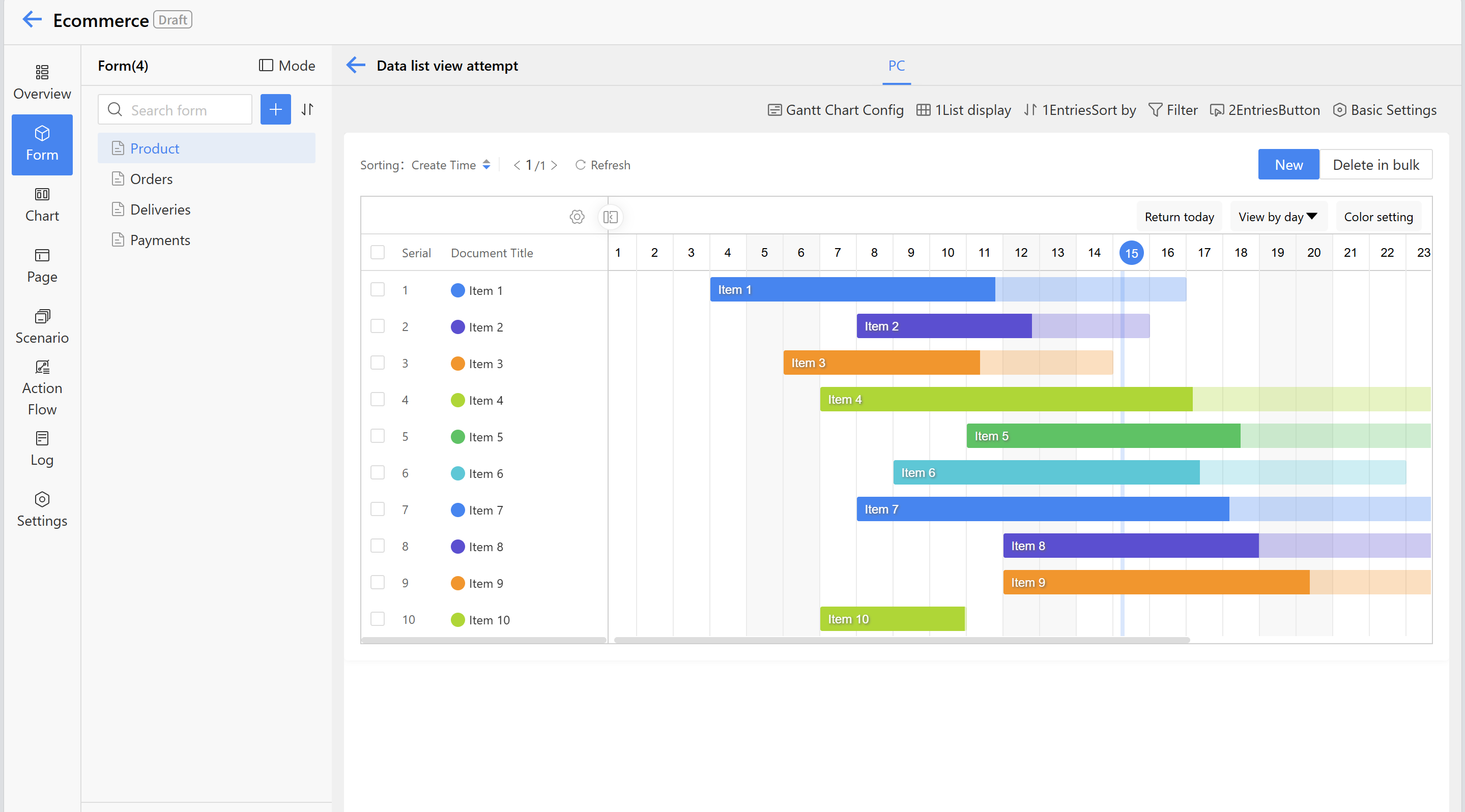
Step 1: Click "Create" in the upper-left corner, select "Gantt chart," and set the view name in the settings.
Step 2: Click the Gantt chart in the display area to configure the Gantt chart settings.
a) Select the display fields for project information, primarily shown on the left side of the Gantt chart.
b) Set the settings fields for the bars, start time, end time, and progress;
c) After completing the above steps, click "Save" to apply the changes. Settings -> settings
2.9.4.3.4 Instructions
View Settings—Visitors: Set the permissions for viewing the Gantt chart on the front end. If left empty, everyone can access it.
Gantt Chart Settings
a) Table fields: Set the "Gantt Chart Config" fields. Multiple fields can be selected, with support for drag-and-drop sorting, style rule settings, and deletion. The sorting determines the left-to-right display order in the list.
b) Data filtering: Configure the Gantt chart to display data that meets the filtering criteria, such as showing only milestone-related data by setting filters for milestone data.
c) Drill-through view: Default view for inspection. When the current user views Gantt chart data in homepage, clicking on the relevant data will take them to the details page.
d) Default display dimensions: Supports displaying data by day, month, quarter, or year.
e) Color Scheme: Six default color schemes are provided, and Gantt chart data can be displayed according to color settings during runtime.
Sorting field: Supports adding multiple sorting fields, which can be sorted in ascending or descending order.
Operation Settings: Click the button area to configure operations. Supports adding multiple button types and allows custom creation of operation buttons. For details, refer to 2.3.5.1.2.2.1 Business Operations.
2.9.4.4 Card View
Card view displays each piece of information as an independent card with images.
2.9.4.4.1 Application Scenario
- In store management, information is displayed through a card view, allowing customers to easily and intuitively understand store details.
- In book management, book information is displayed in a card view format, enabling readers to quickly access book details.
2.9.4.4.2 Effect
Using store management as an example, the entity information display on the homepage, where user can view the entity image and access key entity details.
2.9.4.4.3 Operations
Step 1: Click "create" next to data list view, select "card view," and set the view name in the settings.
Step 2: Click the card view in the PC display area to configure the card settings.
a) Set the store photo as the card cover.
b) Set the settings name as the card title.
c) Select the summary fields to be displayed on the Homepage.
d) After completing the above steps, click "Save" to apply the changes.
Step 3: Click "Mobile" at the top to input the mobile view configuration page. Then select the card area and configure the card settings on the right, including the card cover, card title, and summary fields.
2.9.4.4.4 Instructions
View Settings
a) Supported terminals: Set the terminal displayed in the current view, with options for desktop or mobile. b) View selection: Configure the content displayed when clicking data in the front-end list. Users can specify which view to display. For adding new view operations, refer to section 2.3.5.1.2.2.3 View Editing. c) Accessible to (visitors): Set permissions for viewing the card view on the home. If left it empty, everyone can access.
Table Settings
a) Table fields: Set the display fields for the card view. Multiple fields can be selected, with support for drag-and-drop sorting and deletion. The display order is from top to bottom. Data filtering: Set the criteria for displaying data in card view, such as only showing data where the store status is "Open."
Search title
Displays the search box at the top of the Homepage list, allowing users to input text as prompted to search. a) Prompt text: Default is "Search Title," which can be modified as needed. b) Search scope: Optional fields are single line text fields, and checking them allows searching within those fields.
Default card view display settings
Adjust card size and card content.
Operation Settings
Click the button area to configure operations. Supports adding multiple button types and allows custom creation of operation buttons. For details, refer to 2.3.5.1.2.2.1 Business Operations.
2.9.4.5 Kanban View
The Kanban view groups data by a specific field and displays it in card format under each group, making it suitable for project management, task management, customer management, and more.
2.9.4.5.1 Application Scenario
- In recruitment task management, using a kanban view to display tasks helps HR promptly follow up on unfinished recruitment matters.
- In project management, categorizing projects by type using a kanban view enables project managers to efficiently allocate resources for different project types.
2.9.4.5.2 Effect
Taking project management as an example, the kanban view of the project records supports categorization by different fields and viewing in various modes. For the "Colorful" display settings, the color of the grouping field can be customized.
2.9.4.5.3 Operations
- Step 1: Click "Create" next to data list view, select "Kanban view," and set the view name in the settings.
- Step 2: Click the kanban view in the PC display area to configure kanban settings. a) Set the grouping field; the front end will display data classified by this field, such as project records categorized by project type. b) Set the display settings, which currently support two types: "Colorful" for color-coded classification and "Elegant" for a unified color scheme. c) Select the card title and the display fields for supplementary content.
- Step 3: Click "Mobile" at the top to input the mobile view configuration page. Then select the Kanban area and configure the grouping field, card title, and display field in the settings panel on the right.
2.9.4.5.4 Instructions
View Settings
a) Supported terminals: Set the terminal displayed in the current view, with options for desktop or mobile. b) View selection: Configure the content displayed when clicking data in the front-end list. Users can specify which view to display. For adding new view operations, refer to section 2.3.5.1.2.2.3 View Editing. c) Visitors: Sets the permission for viewing the kanban view on the front end. If left it empty, everyone can access it.
Kanban Settings
a) Grouping field: The system only supports single-select widgets, single-select dropdown widgets, and document status as grouping criteria. b) Display Fields: Set the display fields for the kanban view. Multiple fields can be selected, with support for drag-and-drop sorting and deletion operations. The sorting determines the display order from top to bottom. c) Data Filtering: Set the data displayed in the kanban view to meet the filtering conditions. For example, to display only project ledger data with a planned start time from January 1, 2022, users can set the condition that the planned start time is no earlier than 2022-01-01.
Search title
Displays the search box at the top of the Homepage list, allowing users to input text as prompted to search. a) Prompt text: Default is "Search Title," which can be modified as needed. b) Search scope: Optional fields are single line text fields, and checking them allows searching within those fields.
Kanban view default display
Adjust the default classification field for viewing and the default viewing mode.
Operation Settings
Click the button area to configure operations. Supports adding multiple button types and allows custom creation of operation buttons. For details, refer to 2.3.5.1.2.2.1 Business Operations.
2.9.4.6 Calendar view
A calendar view is a way to present data in a calendar format. To use the calendar, the form must contain date and time data.
2.9.4.6.1 Application Scenario
When users need to view and manage data by date, users can use the calendar component:
- For work schedules, such as visit plans or assigned tasks.
- For meeting management, such as checking meeting schedules;
- For daily report management, such as viewing team members' daily reports.
2.9.4.6.2 Effect
Taking work management as an example, the calendar view of the work schedule is displayed on the Homepage as shown below. Click on a date with data in the calendar to view the schedule details.
image : Effect1
2.9.4.6.3 Operations
- Step 1: Click "Create" next to data list view, set the settings name, and select "calendar view."
- Step 2: Click the calendar view on the PC to configure the calendar settings. a) Set the start time field and end time field; the Homepage will display the schedule on the calendar according to the time settings. b) Select the schedule title and use the summary as supplementary content. c) Calendar view configuration adds a summary toggle. When enabled, form fields will be displayed synchronously; when disabled, they will be hidden. During runtime, users can directly click on instance data in the calendar view to access the details page (this configuration applies only to PC).
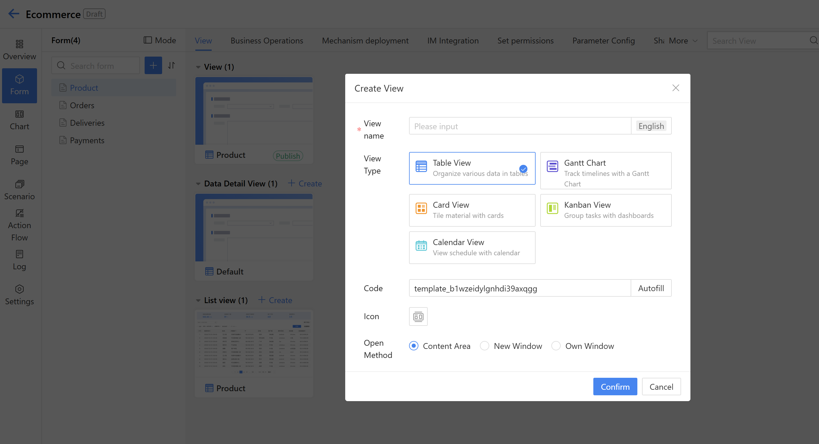
2.9.4.7 Create View
After entering the middle stage of creating a new application, users can directly click the "Create View" card to create a new view (prerequisite: a form has already been created). Alternatively, users can click "+" and then select "Create View" to perform the same operation.
image : Create View
Enter the "DEV" console. If forms and data list views already exist, users can click "Create" in the data list view to create a new view.