2.9.2-form-design
2.9.2 Form Design
For business personnel who prefer a more intuitive understanding of form implementation results, the WYSIWYG form design option can be used for form configuration.
The form design interface consists of four sections, as shown in the diagram below. The left panel is the widget selection area. Users can drag & drop widgets to the form design area in the center, set widget properties in the right-side property settings panel, and perform form design operations using the toolbar above. After setting all widgets, save to complete the form design.
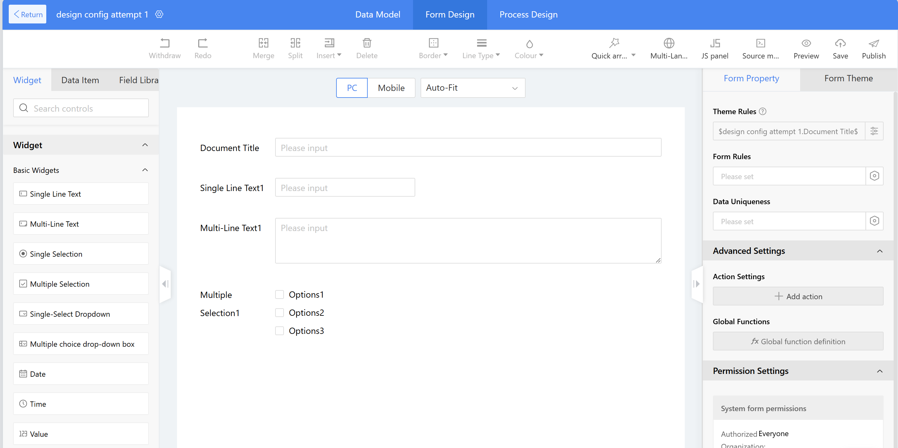
Figure: Form Design Interface
2.9.2.1 Data Model
Business forms consist of multiple sections such as data model, form design, process design, and data list view, allowing users to operate based on specific needs. For developers who prefer using data tables, the Low-Code platform offers a form design approach through data model design. The data model consists of data tables and fields, serving as the foundation for forms.
There are two ways to add fields and tables in a data model:
- Adding data tables and fields through the data model
- Generating fields and data tables by dragging widgets during form design
This chapter primarily explains how to add data tables and table fields in a data model.
2.9.2.1.1 Add Data Table to the Main Table
2.9.2.1.1.1 Add Fields
For creating forms, fields can be quickly added in batches through the data model, then directly imported by selecting the layout on the form design page. After the form is created, the system automatically generates a data table and also supports adding fields directly to the table.
Create a form and add fields:
a) Open the data model page and click "Add Field"; b) Mainly involves filling in the field name, field editing (system defaults can be used directly), and selecting widget types; c) After completing the fields, click on "Form Design" and select an appropriate layout to finalize the form. Specific rules and properties can be adjusted in the property area.
Adding fields to existing data tables:
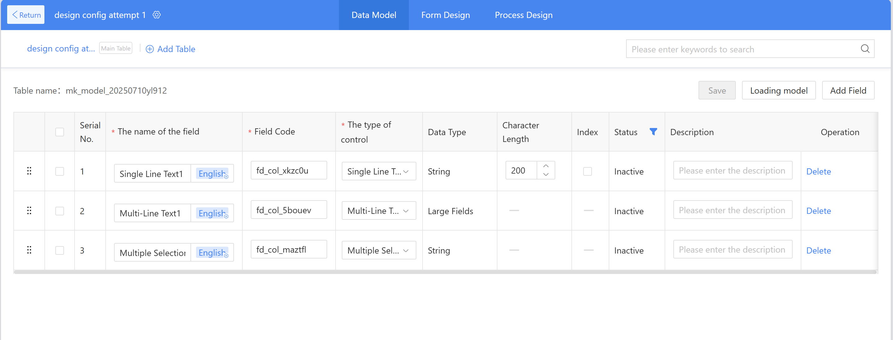
For example, adding a "Type" field to this attempt app. The procedure is as follows:
Figure 2.9–1 Add Fields to Existing Table
a) On the data model page, click "Add Field," input the field name and field code, select the widget type, then click Save. b) Open the form design page, add layout widgets, then open the data items, drag the type to the newly added layout widgets, then edit the dropdown single selection options (for specific operations, refer to 2.9.2.8.1.3 the Single Selection section).
2.9.2.1.1.2 Field Status
- Inactive: After a field is added, it defaults to the "inactive" status, meaning the field has not been generated in the database. It supports modifying the name, code, widget type, and deletion operations.
- Active: After clicking "Publish" in form design, the "Inactive" field changes to the "Active" status. Active fields do not support modifying the code or widget type; only the name can be modified.
- Disabled: Fields in the "Active" status have been generated in the database and may contain data, so they cannot be deleted. If a field is no longer in use, users can click "Disable." Disabled fields will still appear in the data model list and can be re-enabled.
Field enable and disable operations:
Example: disabling and enabling the "Attempt" title in the attempt application form.
a) Disable field: Click "Disable" in operation, then click "Save"; b) Viewing and enabling fields: Click the filter button under "Status," check "Disabled" to view disabled fields; find the field to be enabled and click "Active," then click "Save" in the upper right corner.
2.9.2.1.1.3 Other Field Properties
- Associated table: Field data retrieved by associating existing tables through third-party data sources;
- Index: Whether an index is created for this field in the database, it is defaultly as unchecked.
2.9.2.1.2 Add Detail Table to the Data Model
A data table is generated by default after form creation. When a detail table is needed to store business data, a new detail table can be created, such as adding an "XXX Detail Table" for the applications. The Instructions are as follows:
- In the data model tab, click "Add Table." In the New Table window, input the name and table name. The table name can be auto-filled or manually input as a code starting with "mk_".
- Refer 2.9.2.1.1.1 to "Add Field" to add the corresponding fields for the detail table, then click save;
- Open the form design page, add layout widgets, then locate the detail table created in the previous steps from the data items. Drag the detail table header directly into the layout and adjust the field properties according to business requirements.
2.9.2.1.3 Add Sub table to Data Table
Sub tables primarily serve to display large forms by business segments, storing different business data in separate database tables to enable more complex business scenarios.
Add Sub Table: On the Data Model tab, click "Add Table," select "Sub table" as the type, input form name (required). The table name can be auto-filled or manually input with a code starting with "mk_." Click confirm to generate a sub table. Multiple sub tables can be added. The method for adding fields to sub tables is the same as for the main table.
Note: Sub table fields can only be added in the data model. After adding, switch to form design, drag fields from the sub-table data items in the left widget area into the form design, then configure the widgets the same way as for main tables.
2.9.2.1.4 Relationship between Data Model and Form
Once data model fields are created, they will automatically appear in the form design and can be dragged to generate widgets.
Impact of data model operations on form design:
| Data Model Operations | Form Design |
|---|---|
| Add Fields | Synchronously Displayed in the Data Items of the Form Design |
| Disabled Fields | Synchronously delete widgets in form design and disable data items |
| Delete Fields | Synchronously delete widgets and data items in form design |
Impact of form design operations on the data model:
| Form Design Operations | Form Design | Data Model |
|---|---|---|
| Drag the Data Item to the Design Area | Generate Widget Element | No Effect |
| Disable Data Item | Data item disabled, widget removed | Synchronously Disable Data Item |
| Delete Data Item | Synchronously Delete Data Item and Widget | Synchronously Delete Data Item |
| Delete the Widget in the Design Area | The data item remains, but the widget is deleted. | The Data Item Still Exists |
| Publish Form | Form Available after Publishing | Activate All Inactive Data Items |
2.9.2.2 Widget Area
The widget area on the left side of the form design displays layout, widgets, and data items, primarily providing components for the design area. Widgets, layouts, and data items can all be dragged to the design area in the middle. Widgets are the display format of data, and the system includes various pre-built widgets for users to select.
Design Approach:
- Drag the layout to the center of the design area;
- Drag widgets (or data items) into the layout or directly drag widgets (or data items) to the design area;
- Set the relevant settings in the right-side property area.
2.9.2.2.1 Widget Group
For commonly used widget combinations, users can drap a group of single or multiple widgets into layout widget sets and add them to the widget group by "Widgets-> Layout Widgets", then drap & drop widgets into layout area, select the widgets and click "Set as a widget group". These widget sets can be reused in subsequent form designs, reducing repetitive configuration work.
Widget groups are divided into two categories: public and private. Public widgets are primarily used to store commonly used widget sets for the team, which are accessible to everyone, such as overtime suite (overtime request forms) and leave suite (leave request forms). Private widgets are mainly used to store personal frequently used widget groups.
2.9.2.2.2 Data Items
The data items display main table fields, detail table fields, sub-detail table fields, and sub table fields (excluding layout widgets). The main table fields include system fields such as creator, create time, and create department. These system fields can be directly dragged into the form design for use based on business needs.
The following operations can be performed on form fields in data items (excluding system fields):
- Disable: For active form fields, they can be disabled. Disabled fields will not appear in form design and will be unavailable across all system page.
- For inactive form fields, the ID can be modified, with the same effect as modifying the ID in the right-side properties panel.
- Delete: Inactive form fields can be deleted. Disabled fields will not appear in form design and will be unavailable across all system pages.
Note: The form fields and system fields in the "Data Item" can not all be dragged into the form designer for active using. The usable fields are in gray, while unused fields are in black.
2.9.2.3 Design Area
The design area is where the design is displayed. By dragging widgets and configuring widget styles, users can create the expecting form layout.
2.9.2.3.1 PC Design
Sequence of design form on PC: Design the layout first, then drag the widgets. For instance, to configure a product information recording form:
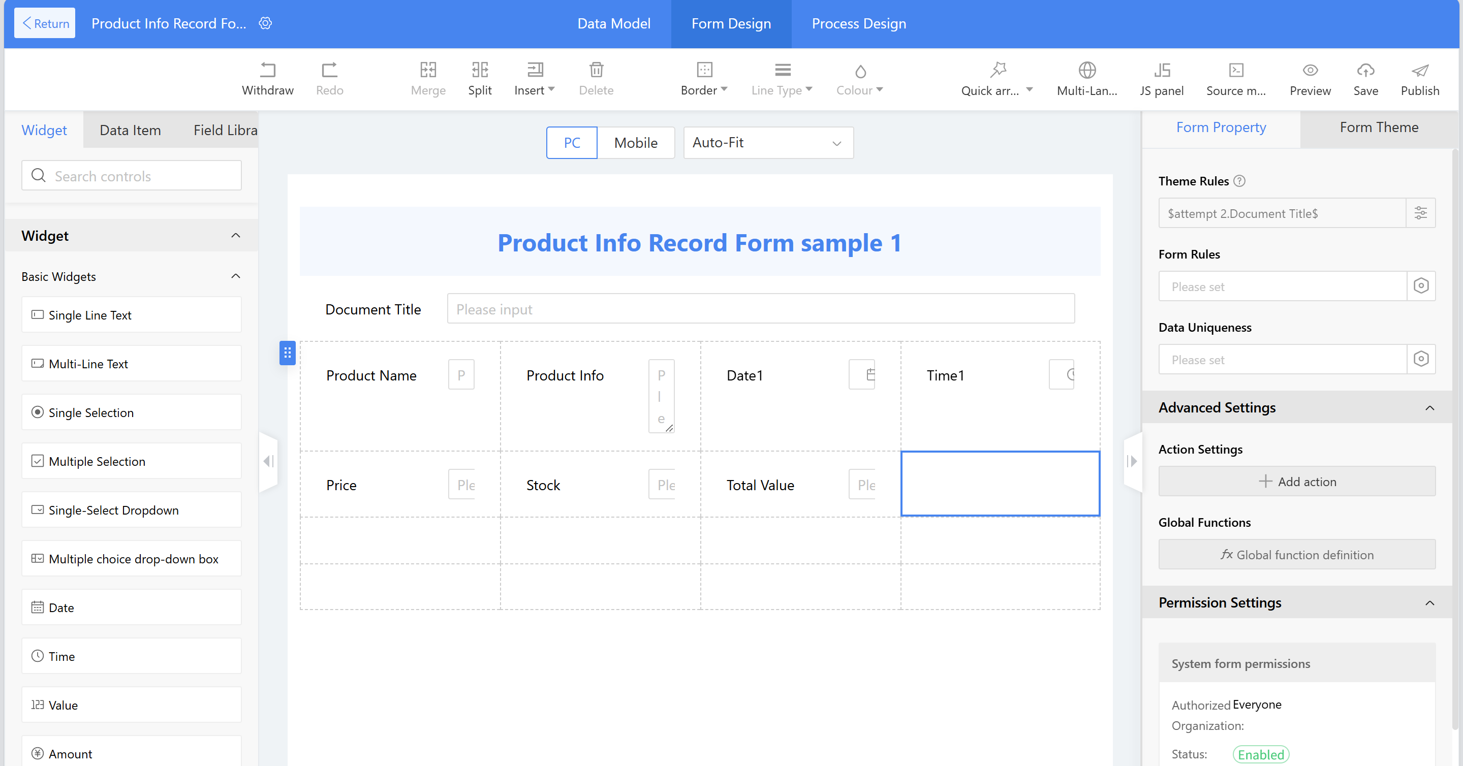
Add layout widgets operation: Drag and drop the "multi-row multi-col" layout widgets, set it to xxx rows and xxxx columns, then click confirm.
Add Title: a) Drag the text description widget into the layout widgets users previously set up. b) Set Content c) Configure the title display style configuration. d) Click to select a layout, then drag it to select other layouts, right-click and select the "Merge Cells" option.
e) Select the layout widgets, right-click and choose the "Horizontally Center Alignment".
Add Text Fields: a) Drag the single line text widget into the layout widgets. b) Set the title content to "Name"; c) In the style settings, set the title to bold and configure the name to complete the configuration. d) For other configurations, follow the steps above.
2.9.2.3.2 Mobile Design
The mobile version can directly synchronize with the PC version through "One click Import."
On mobile, one widget is displayed per row. No layout widgets need to be added; simply drag widgets or data items to complete the form design. It also supports deleting widgets and drag-and-drop sorting.
2.9.2.3.3 Multi-view
The form design area now supports multi-view functionality. Based on actual business needs, different scenario views can be created to associate various application scenarios with process nodes, meeting enterprises' diverse and complex business process approval requirements.
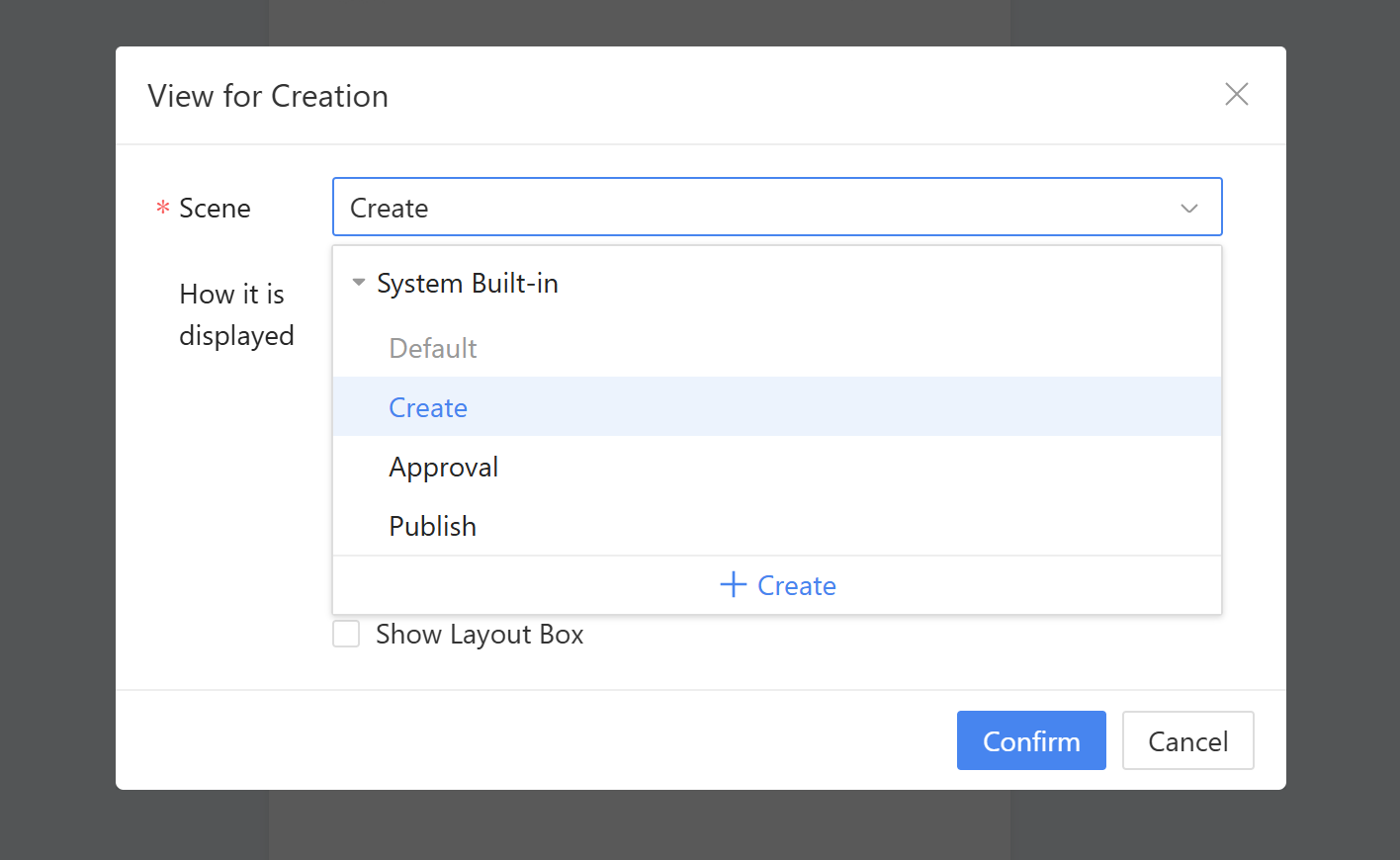
Form scenario view usage rules (distinguishing between forms with and without processes):
- Default View: Used by default. During runtime, the new page, edit page, and view page all use the form's default view.
- Create view: After adding a new view, the new page in the form will always use the new view; otherwise, the default view is used.
- Approval view: For forms with processs, after adding an approval view to the form, the approver will use the approval view during runtime; otherwise, the default view will be used.
- Publish view: For forms with processes, after adding a publish view, the form will display the publish view when viewing completed data at runtime; otherwise, the default view is used.
- Custom view: In the manual selection scenario configuration within a process node, users can choose a custom view. During runtime, the approver will use the custom view, which has a higher priority than the default approval view.
Scenario: Using a company's internal visitor application approval process as an example, employees fill in visitor information, the receptionist reviews it, and security personnel verify the details. Different roles see distinct information during the approval process.
Instructions:
- Add view to the visitor information table, containing visitor-related details and the information entered during the visit application.
- Add a custom view (Receptionist Receptionist Approval View) to the visitor information table, containing visitor-related details and receive confirmation information that will be completed during the Receptionist approval process.
- Add a custom view (Security Verification View) to the visitor information table, containing visitor-related details and host information for security personnel to review.
- In the process design of the visitor information form, assign different form views to different approval nodes and publish the form.
2.9.2.4 Form Properties
Form properties primarily involve settings for form operation rules and homepage display. This section primarily covers form properties, including theme rules, form rules, data uniqueness, and view settings.
2.9.2.4.1 Theme Rules
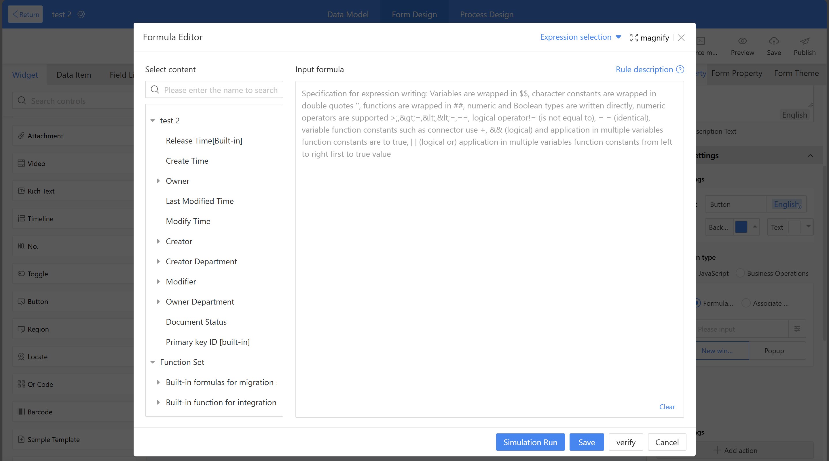
Theme rules define the title rules for business data and apply globally to the current form. For example, approval titles and document titles will reference theme rules. Theme rules settings are set using the "Formula Editor" and are required fields, supporting up to 200 English characters.
Theme rules naming method: Using employee health information submission as an example, the desired outcome is "Sam's health information" Therefore, in the formula editor, reference the name variable + the string "Health information" (Note: String constants must be enclosed in English double quotes. For more details on rules, click "Rule Description" in the upper right corner of the formula editor page).
2.9.2.4.2 Form Rules
Diverse business scenarios are achieved through format validation, display rules, edit rules, required rules, and calculation rules of form widgets.
2.9.2.4.2.1 Format Validation
Format validation primarily verifies the format of input content and prompts users to input the correct format based on predefined settings. The system defaults to showing format validation only for single line text settings. For example, verifying whether phone numbers, ID cards, email addresses, etc. are in the correct format.
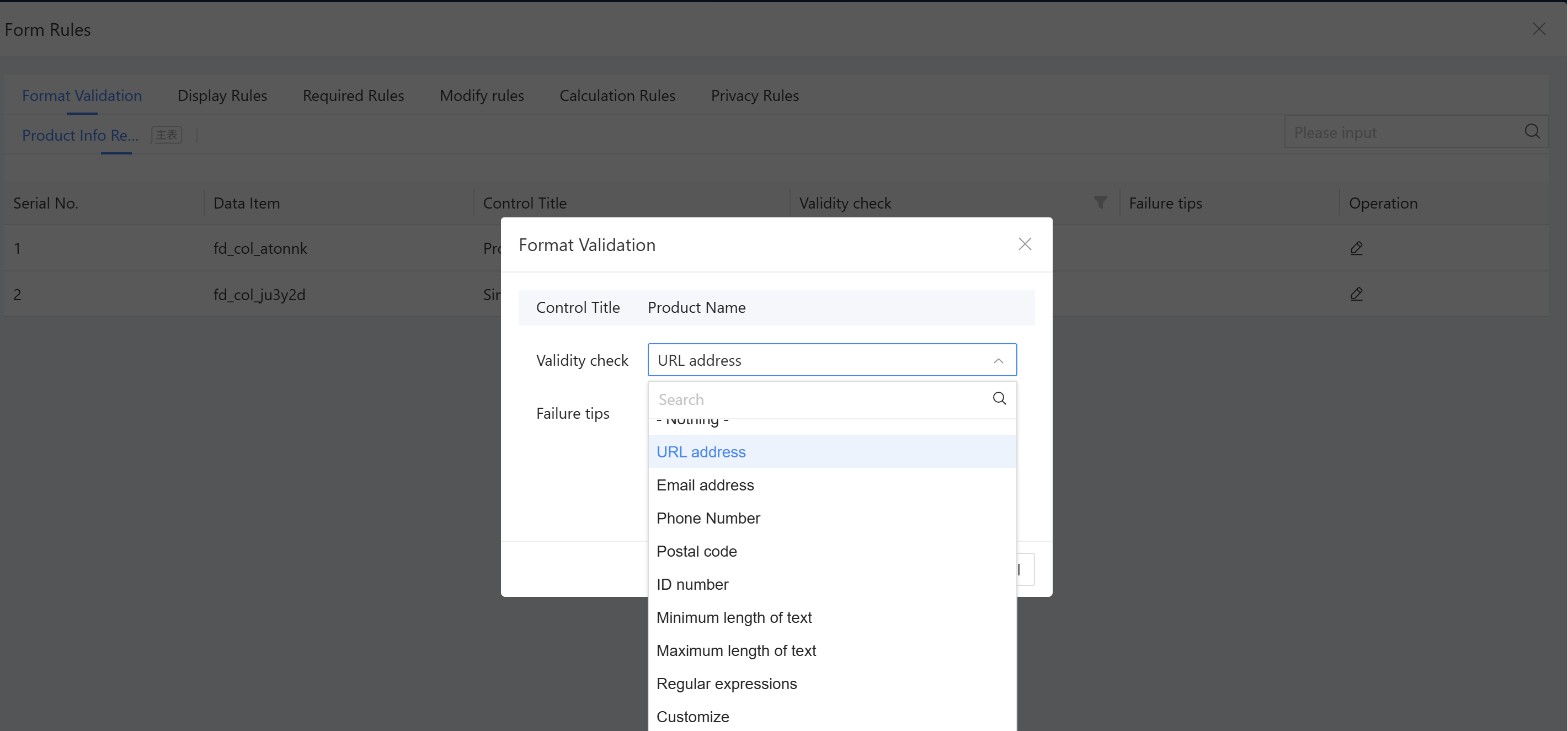
- Scenario: To validate whether a user has entered a correct phone number format in a form, this can be achieved by configure format rules.
- Instructions: Select “Form property”-> “Form Rules”-> “Operation” to format validation.
- The system includes several preset formats:
a) Email address: Validates whether the data is a valid email address.
b) URL address: Validates whether the data is a valid web URL.
c) Phone number: Validates whether the data is a valid mobile number.
d) Postal code: Validates whether the data is a valid postal code.
e) ID number: Validates whether the data is a valid ID number.
f) Minimum text length, maximum text length: Limits the length of input content. When configured with character count parameters, prompts can be retrieved through the parameters.
g) Regular expression: Validates whether the current input format is correct using a regular expression. For example, to restrict the date format to YYYY-MM-DD, configure the regular expression as:^\d{4}-\d{2}-\d{2}$.
h) Customization: Implement by writing JavaScript code in the onValidator function.
2.9.2.4.2.2 Display Rules
Set settings to widget the display and hiding of form widgets based on business scenario requirements. For example: When filling out a meeting RSVP form, if users are unable to attend the meeting, users must provide a reason for your absence; if users plan to attend as scheduled, no explanation is required.
- Effect:
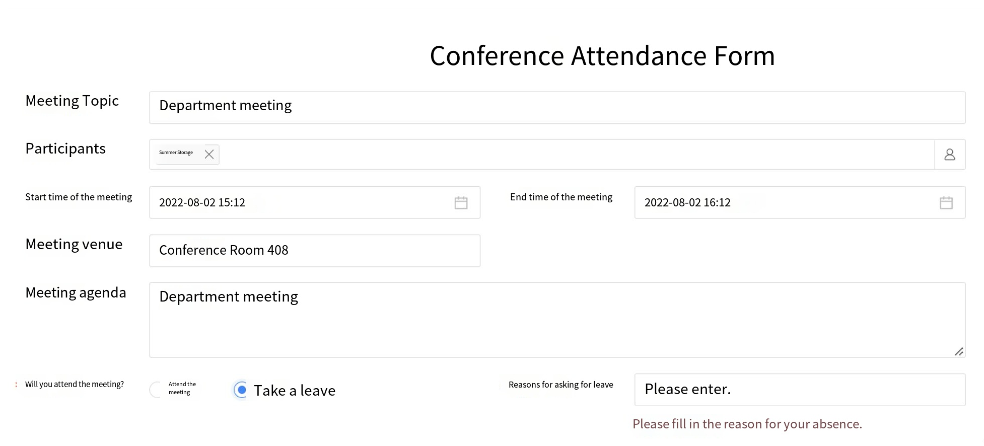
-
Configuration:
Step 1: Go to Form Properties → Form Rules → Display Rules, and click the " New rules ";
Step 2: Input the rule name—"XXX" set the settings and actions: If attending a meeting, hide the leave reason;
Step 3: Input the rule name—"XXX not requied" set the conditions and actions: If on leave, display the leave reason. -
Conditional relationships:
a) Each rule can include multiple conditions or actions;
b) The "If condition node" can select either "AND" or "OR": Choosing "AND" requires all conditions to be met before executing the action; selecting "OR" means the action will be executed if any condition is met. -
Widget Types and Corresponding Operators
| Data Type | Operators |
|---|---|
| Single-line Text | Includes, excludes, =, !=, is empty, is not empty |
| Single-selection/Multiple-selection | Includes, excludes, =, !=, is empty, is not empty |
| Dropdown single select/Dropdown multi-select | Includes, excludes, =, !=, is empty, is not empty |
| Date/Numeric | >, >=, <=, <, !=, =, empty, not empty |
| Organization Structure | = , ! =, contains, does not contain, is empty, is not empty |
- Change Rule: Supports configuring "Show", "Hide", "Change Title Content".
- Change object: Supports selecting fields from the main table or detail table. If a detail table field is selected in the condition, only fields from the current detail table can be selected in "Then Execute the Following Actions". During Homepage runtime, detail table data can only use the current row's data to control the display, hide, or required status of fields in the same row.
- Other Notes:
a) This configuration has the lowest priority. If a field is configured as hidden in a process node, it cannot be displayed through this configuration. This rule only takes effect when the process node is configured to display the field.
b) Supports creating multiple rules. If the same field is set to show or hide multiple times, only the last configuration takes effect.
2.9.2.4.2.3 Required Rules
Based on business scenario requirements, set conditions to widget whether form widgets are mandatory or optional. For example, when the total purchase price exceeds 100,000, the purchase description must be completed; if the total purchase price is less than or equal to 100,000, the purchase description is optional.
- Effect:
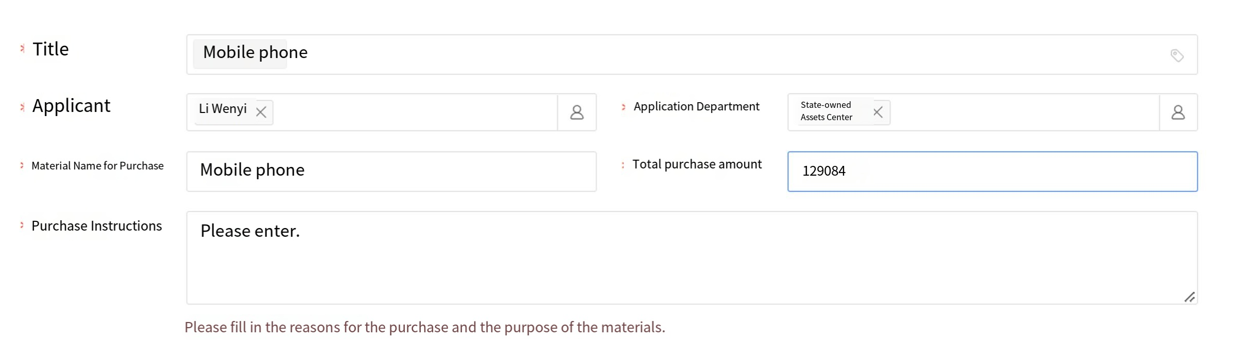
- Configuration:
Step 1: Go to Form Properties → Form Rules → “Required Rules”, and click the " New rules”.
Step 2: Input the rule name—"XXX" set the conditions and actions: e.g., if the total purchase amount > 100,000, then the purchase description is required.
Step 3: Input the rule name—"XXX not requied" set conditions and actions: For example, if the total purchase amount is less than 100,000, then the purchase description is optional.
- Widget Types and Corresponding Operators
| Data Type | Operators |
|---|---|
| Single-line Text | Includes, excludes, =, !=, is empty, is not empty |
| Single-selection/Multiple-selection | Includes, excludes, =, !=, is empty, is not empty |
| Dropdown single select/Dropdown multi-select | Includes, excludes, =, !=, is empty, is not empty |
| Field | Operators |
| ---------------- | ------------------------------------------------ |
| Date/Numeric | >, >=, <=, <, !=, =, empty, not empty |
| Organization Structure | =, !=, contains, does not contain, is empty, is not empty |
- Change rules: Supports configuring "required" and " not requied"; when selecting required, users can configure the required prompt.
- Other Notes:
a) This configuration has the lowest priority, meaning that if a field is configured as required in a process node, it cannot be changed to “not required” through configuration here. This rule is only effective when the process node is configured as non-mandatory.
b) If the same field is set to “required” or “not required” multiple times, only the most recent configuration will take effect.
2.9.2.4.2.4 Rules Modification
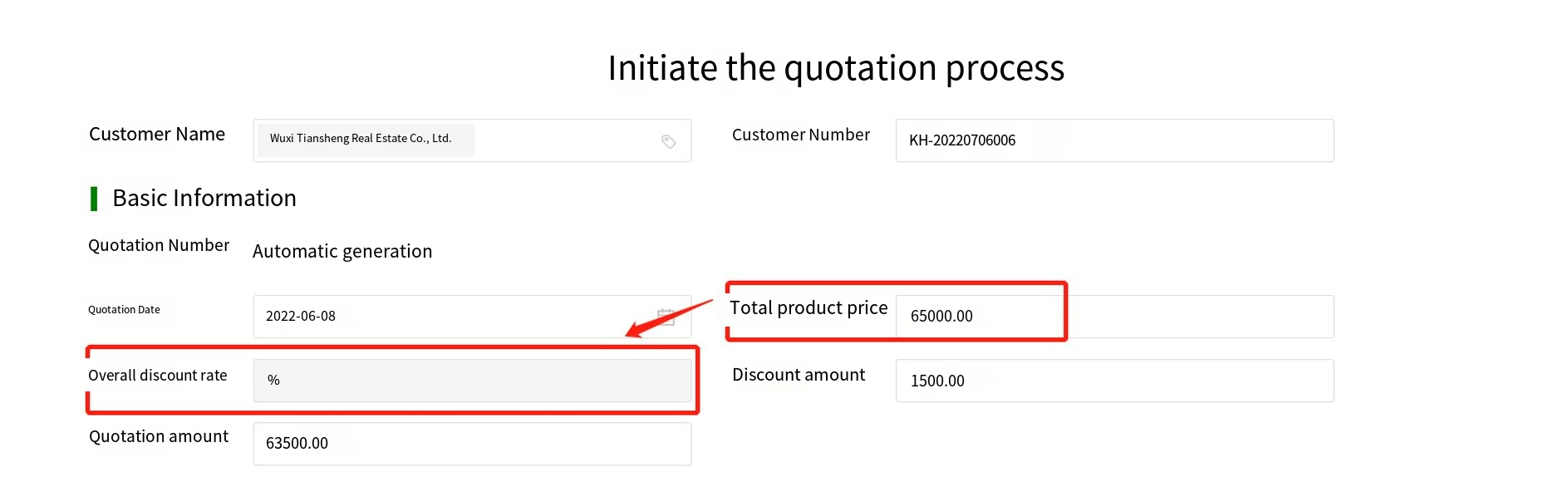
Configure form widgets to be read-only or editable based on business scenario requirements. For example, in the sales quotation process, if the total product price exceeds 100,000, the order discount rate field becomes editable; if it does not exceed 100,000, the order discount rate remains read-only.
- Effect:
-
Configuration:
Step 1: Go to Form Properties > Form Rules > Modify Rules, and click “New rules”;
Step 2: Input the rule name—"XXX" set the conditions and actions: if the total product price exceeds 100,000, the whole order discount rate can be edited;
Step 3: Input the rule name—"YYY"—and set the conditions and actions: If the total product price is <100,000, the entire order discount rate becomes read-only and cannot be edited. -
Widget Types and Corresponding Operators
| Data Type | Operators |
|---|---|
| Single-line Text | Includes, excludes, =, !=, is empty, is not empty |
| Single-selection/Multiple-selection | Includes, excludes, =, !=, is empty, is not empty |
| Dropdown single select/Dropdown multi-select | Includes, excludes, =, !=, is empty, is not empty |
| Date/Numeric | >, >=, <=, <, !=, =, empty, not empty |
| Organization Structure | =, !=, contains, does not contain, is empty, is not empty |
- Change rules: Supports configuring "Read-only" or "Edit" modes.
2.9.2.4.2.5 Calculation Rules
Set calculation rules for form widgets. Supported widgets mainly include calculation widgets, numerical, and currency widgets. The calculation result can only be selected as a calculation widget. For example: Total Purchase Amount = Purchase Quantity * Purchase Unit Price, where the Total Purchase Amount uses a calculation widget.
- Configuration:
Step 1: Go to Form Properties → Form Rules → Calculation Rules, then click the "New Rule" button;
Step 2: Select the total purchase amount (must be a calculation widget type) as the calculation result;
Step 3: Set the formula: Select the mathematical product function for the formula; for values, choose variables from numerical or currency widgets within the form, separating multiple values with English commas.
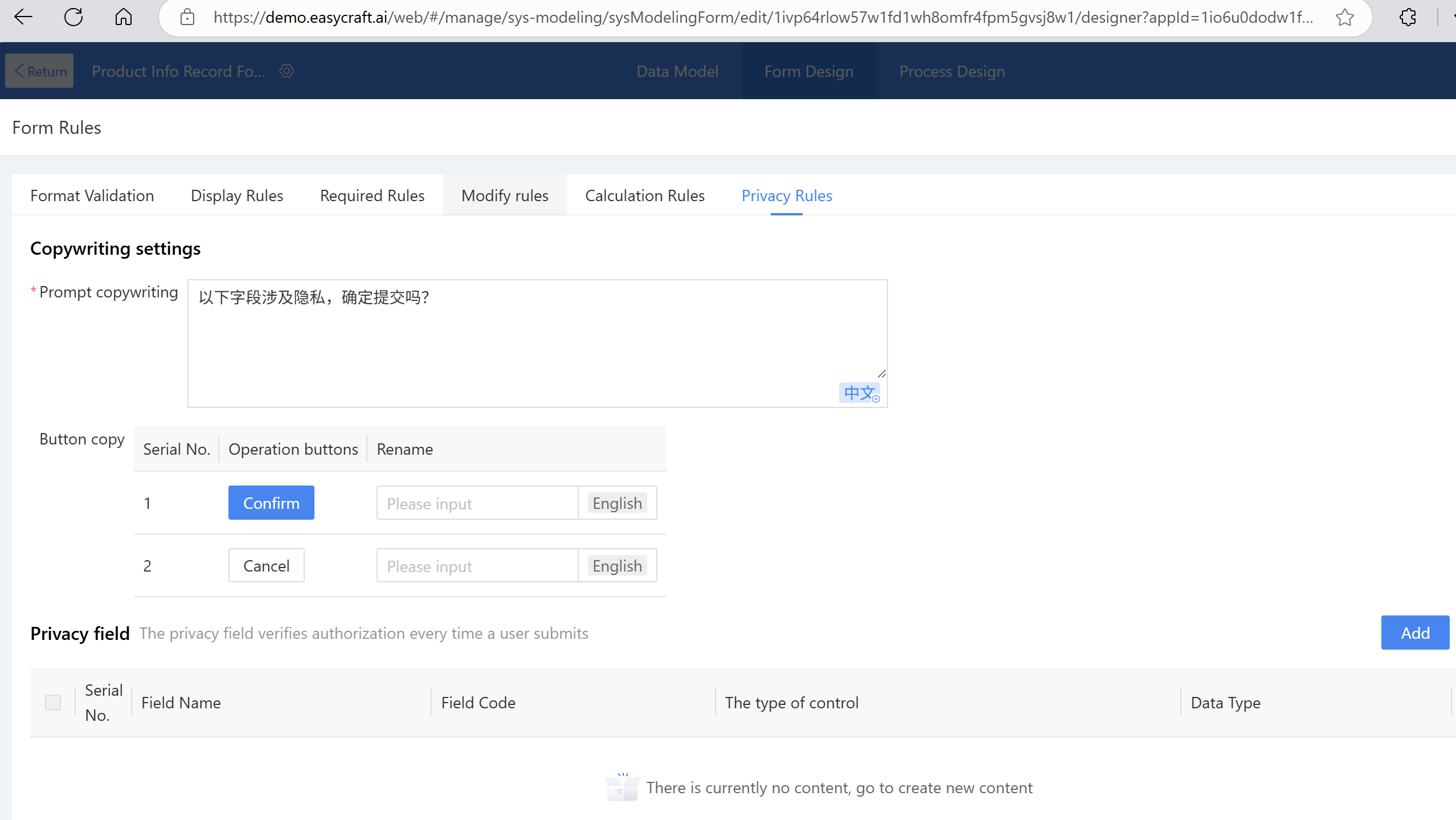
2.9.2.4.2.6 Privacy Rules
Set privacy rules in form settings. Multiple fields from main tables, detail tables, and sub-tables can be added to the privacy rules. Any fields involving business privacy can be configured within these rules. When users submit data on the new page, they will receive a pop-up reminder, and authorization records will be logged. For example, when submitting a project form involving monetary amounts, a pop-up will remind users about privacy-related fields and confirm whether to proceed with submission.
- Configuration:
Step 1: Go to Form Properties → Form Rules → Privacy Rules, then click the New;
Step 2: Select form fields, then publish the form;
Note: The prompt and button schemes can be modified according to business needs.
After users submit data during runtime, authorization records can be viewed under "Low-Code platform → Form Management → Authorization."
https://demo.easycraft.ai/web/#/manage/sys-modeling/sysModelingForm/edit/1ivp64rlow57w1fd1wh8omfr4fpm5gvsj8w1/designer?appId=1io6u0dodw1fw8u8bwf3u68p2p9ksi11v6w1
2.9.2.4.3 Data Uniqueness
Used to determine the uniqueness of data records, the system validates based on the configured fields and alerts users if duplicate data is detected during creation. For example: Check if the product name is duplicated and prompt to modify if a duplicate is found.
- Expected outcome: Check if the product name is duplicated.
- Configuration:
Step 1: Go to Form Properties → Data Uniqueness, then click the Create;
Step 2: Input the rule name—"Product Names Must Be Unique";
Step 3: Set unique identifier data items (multiple selections allowed), define a period, and select a frequency (supported frequencies: daily, weekly, monthly, yearly). Data cannot be duplicated within the period.
Step 4: Set prompt messages. When duplicate data is detected, the Homepage will display a pop-up with the configured message.
2.9.2.4.4 Action Settings
Form action settings: Form properties now include pre-load and post-load events to meet business requirements before submission and after loading.
On the right side of the form design, click "Add Action" to set the onBeforeSubmit event (before form submission) and onLoad event (after form loading). After adding, click "JS Edit" to open the JS panel, which will be positioned in the added event. The event will include a brief usage description. Edit the script as needed to achieve the event's purpose. For example: In a procurement scenario, the material code entered by the user must be validated before submission to verify its existence. If the code is invalid, submission will be blocked and an error message will be displayed to the user.
2.9.2.4.5 Permissions Settings
Permissions are mainly used for form field configuration. The default permission is for everyone, and the status is enabled. Different permission groups can be added based on business scenarios, with varying usage permission settings for each.
- For the finance center, the purchase request form only grants edit permission for the total amount. Configuration Method:
a) Set the permission name and authorize the organization as "XXX";
b) For new and edit views, check all fields for visibility permissions, and only check the "Total XXX Amount" field for editable permissions. Required fields do not need to be checked.
c) Check all field permissions for the view visibility settings.
d) Finally, click "Save."
Tip: If multiple enabled permission organizations take effect for the same organization, that organization will have all permissions from those organizations. For example, if Permission Organization A and Permission Organization B both apply to Organization a, and both are enabled, Organization a will have the permissions of both A and B.
2.9.2.5 Form Theme
The form theme allows for unified configuration of the form's theme, layout, common widgets, divider widgets, logo, and form name style, enabling users to complete designs more efficiently while maintaining consistent styling. The form themes include basic (default), simple, classic, block, and azure, which can be switched as needed.
2.9.2.5.1 Layout Settings
The form layout settings function is used to adjust the compactness or looseness of the form and can be selected as needed.
2.9.2.5.2 Generic Widget Settings
-
PC Layout:
a) Left-right layout (title on the left side of the content). When configuring the left-right layout for PC, users can set the field title to align left or right.
b) Top-bottom layout (title above the content). When the title content is long, users can choose the top-bottom layout style. -
Mobile Layout: The display style of mobile widget titles and content. The default is left-right layout. When configuring the left-right layout on mobile, users can set the field content to align left or right.
2.9.2.5.3 Divider Widget Settings
When a divider widget is used in a form, users can configure it uniformly through the "Divider Widget Settings" feature in the form theme to improve efficiency and maintain style consistency.
id: 2.9.2.5.4-display-logo title: Display LOGO and Widget Properties sidebar_position: X
2.9.2.5.4 Display LOGO
- Upload Logo:
a) Logo upload options: Select from the media library or upload from your local device. The material library contains system-provided image resources. For local uploads, the accepted formats are limited to PNG, JPG, JPEG, and GIF, with a maximum file size of 100 KB. After the logo is displayed in the design area, users can adjust its size by modifying the height and width.
b) Logo Position: There are 6 options — top-left, bottom-left, top-right, bottom-right of the form, left of the title, or right of the title. Preview to see the logo effect.
c) Display on mobile: When checked, the logo will also appear on mobile. It is checked by default. The logo size can also be adjusted in the mobile design area.
2.9.2.5.5 Display Form Name
When "display form name" is checked, the form name will automatically appear at the top of the form. Users can configure the style and alignment of the form name. The form name is displayed as the form name in the new view, while the title content is shown in the view mode.
To synchronize the current form's design style to other forms within the application, use the "Sync to Application" feature (this feature only applies to regular forms; category forms are not supported).
2.9.2.5.6 Background Settings
The default background of the form is white. Users can change the background color in the settings or add a background image to improve the visual appeal of the entire form page.
-
Example Scenario:
The product requirement version displays various stages, with basic information shown in the form header and highlighted with a background. -
Instructions:
Steps: Under Form Design > Form Theme, locate the background settings. For solid colors, select the desired color (e.g., light blue), check the gradient option, adjust the height to the desired value (e.g., 400), publish the form, and view the result on the front end. -
Other Configurations:
- Color: Under the solid color option, users can select the desired background color. Restore default to return to the white background.
- Effect: With the solid color option, checking "Gradient" makes the top of the background darker and gradually lighter toward the bottom; unchecking it applies a uniform color throughout.
- Height: Under the solid color option, the default is 400. Adjust as needed, or enable "Auto Height" to match the form content and display the full background.
- Image: Under the image options, users can select the desired background image.
- Effect (Image): Under the image configuration, users can configure the background gradient. Checking "Gradient" makes the top of the background darker and gradually lighter toward the bottom; unchecking it applies a uniform color throughout.
- Opacity: Under the image configuration, configure the opacity (default: 100%).
2.9.2.6 Widget Common Properties
Widget properties are primarily used to configure display and operational settings for widgets. This section introduces the common properties of widgets.
2.9.2.6.1 Basic Settings
Basic settings primarily configure the widget type, title, description, ID, hint content, etc.
-
Widget Type: By default, this is the currently used widget type. Some widgets can be switched to other widgets of the same type before they take effect:
a) Single line text, single selection, multiple selection, single-select dropdowns, and multi-select dropdowns can be switched between each other.
b) Numeric and currency widgets can be toggled;
c) Other widgets do not currently support switching. -
Title: Serves as the title of the widget, a required field with a maximum of 200 characters. There is a "Hide Title" checkbox at the bottom. If selected, the title will be hidden and only the input field will be displayed.
-
Widget ID: Bound to the data item, with the same code as the data item. It can be modified in the properties before publishing but cannot be changed after publishing.
-
Widget Description: After entering content, a Tips icon will appear next to the widget name when displayed on the front end. Optional; display position and font style can be configured in settings.
-
Hint text: Pre-filled text that guides users on how to proceed when no content is entered. Optional field.
2.9.2.6.2 Property Settings
-
Initial Value: sets the default initial settings. For example, set the initial value of the date widgets to the current time, or set the initial value of the directory picker widgets to the submitter.
a) Supported Widget Types: single line text, multi-line text, date widgets, numeric value, currency widgets, etc.
b) Recalculate on Update: After selecting the formula editor for the initial value, the recalculate configuration option appears by default unchecked. When this option is checked, during runtime, editing the main document will cause the field to recalculate its value based on the rules. -
Passable Value: When enabled, the widget can still retrieve and assign values even if set to invisible.
-
Field Permissions: Supported widgets—single line text, multi-line text, date widgets, numeric value, currency widgets, etc.
a) Required field: Set whether this field is mandatory. To set conditions, users can configure them in Form Settings - Form Rules - Required Rules.
b) Editable: Set whether this field is editable. To set settings, users can configure them in Form Properties - Form Rules - Edit Rules.
c) Visibility: Set whether this field is visible. When visibility is disabled, the required and editable settings are automatically disabled, and both the current widget and its title are hidden. To set conditions for controlling a widget's visibility, users can configure them in Form Properties - Form Rules - Display Rules. -
Audit Trail: When enabled, users can view the operation history of this widget. Supported widgets—single line text, multi-line text, date widgets, numeric value, currency widgets, etc.
2.9.2.6.3 Action Settings
Widget action settings mainly apply to individual widgets and support three action events: "onChange value change," "onFocus gain focus," and "onBlur lose focus." Click the JS icon for an action event to navigate to the corresponding event location and write the event code, or click the JS panel in the upper right corner to locate and write the corresponding event code.
-
Example scenario: When filling out a purchase requisition form, to standardize the title format, action settings can be used to generate titles in a unified format.
-
Instructions:
Step 1: Select the purchased material name, click "onChange value changes" in the action settings, and name the action "Generate Title."
Step 2: Click "JS," edit the corresponding JS snippet on the JS page (recommended for users with development skills and the ability to troubleshoot issues), then click "OK" to complete the operation.
2.9.2.6.4 Style Settings
Configure the settings style of the form on the front end, including the widget title, widget content, and layout settings. The widget title and content can be customized with font color, bold, italic, and underline settings. Widget layout settings allow titles to be displayed left/right or top/bottom.
- Example Scenario: Bold the product name title, set the font color of the content to blue, and configure the layout as left-right. The steps are as follows:
- Go to settings.
- Select layout settings.
- Choose left-right layout.
2.9.2.6.5 Margin Settings
Set the display margins of widgets on the front end, including top margin, bottom margin, left margin, and right margin in the settings. Widget margins can be customized in size. If a form theme is set and margin settings are later modified, the last customized margin settings will take precedence. Due to different layouts between the editing page and viewing page on mobile, there are separate margin settings for creation and viewing pages.
2.9.2.7 Operation Area
The operation area manages common actions for form design, including undo, redo, save, publish, border design, etc.
-
Undo and Redo:
a) Design actions can be undone and redone. However, once the form is saved, previous actions cannot be undone.
b) The undo/redo actions for the PC and mobile versions are not merged. Clicking undo on the PC can only undo PC operations, while the mobile design page can only undo mobile operations.
c) Undo actions in different views are independent; only actions in the current view can be undone at a time. -
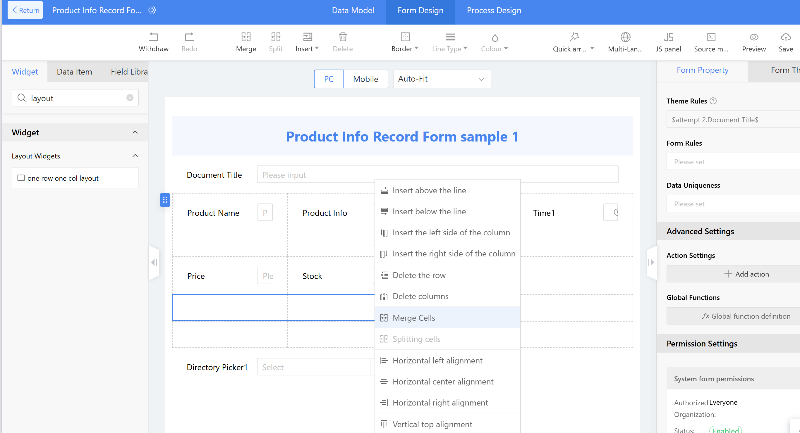
Merge - Merge cells: Used when selecting two or more layout cells. After merging, only the top-left widget remains; other widgets are deleted.
-
Split - Split cells: Select a single cell to use. The number of columns to split is automatically determined by the current layout.
-
Insert:
a) Insert row: Add a row above or below with the same number of columns as the current row.
b) Insert column: Add a column to the left or right with the same number of rows as the current column.
c) Delete row: Remove a row from the selected layout, including its widgets.
d) Delete column: Remove a column from the selected layout, including its widgets. -
Delete: Perform delete operations on widgets.
-
Border: Add border styles, including weight and color.
a) Select the layout to adjust the cells or individual rows within it.
b) Widgets with one per row automatically have a one-row-one-column layout and also support border and background color modifications. -
Line Style: settings for border line types.
-
Background Color: Select the layout settings and set the bottom color of the layout settings.
-
Alignment (right-click menu): Configure multiple cells in the layout widgets, primarily for displaying widgets within the layout: left, center, right, top, bottom, center. Default left-aligned and vertically centered.
-
Save: Save the pre-designed content of the form, requiring validation of the required fields in the form.
-
Publish: Publish form design and data fields. Only published forms can be used on the front end.
-
Preview: View the design effect of the current view. Preview does not save; it directly displays the current design content when previewing. The preview can be switched to view the PC and mobile versions.
2.9.2.8 Widget Overview
This section primarily introduces the usage and application scenarios of widgets within forms. Widgets are mainly categorized into basic widgets, enhanced widgets, advanced widgets, layout widgets, and more.
2.9.2.8.1 Basic Widgets
This subsection introduces basic widgets. Basic widgets generate data item fields and are displayed synchronously in the data model.
2.9.2.8.1.1 Single-line Text
Single line text is the most basic field, widely used in forms to collect information such as text, numbers, and codes.
-
Application Scenario:
a) Single line text can be used to input short text information, such as product names, company names, specifications, models, etc.
b) It can also be used to input numeric information that does not require or is unsuitable for arithmetic calculations, such as phone numbers, ID numbers, employee IDs, bank card numbers, and membership numbers. -
Example Scenario: The personnel records used in HR management require employees' email addresses to be filled in. To minimize manual verification, the system needs to validate whether a valid address has been entered.
-
Expected outcome: If the input is not in the correct email address format, the system will automatically display an error message and prevent submission.
-
Instructions:
Step 1: Drag the single line text widget into the layout and set the title style.
Step 2: Click Form Rules > Format Validation, then select the edit option next to the email field and configure the validity check as "Email Address." -
Other Configurations:
a) Configurable Prompt Text: Indicates the content the user needs to fill in.
b) Initial Value: the default initial value, which can be manually entered or defined by a formula. This is an optional field.
c) Length Limit: sets the character length limit for the input field, allowing only integers between 1 and 1000. The default is 200.
d) Encryption: When enabled, the widget content will be displayed in masked mode on the user side. Disabled by default.
i. Mask format: Offers five different format options, where '#' represents visible characters and '' represents hidden characters. For example, selecting the format "**#" will display "6" on the Homepage. Customizable formats.
ii. Encryption duration: Offers six options — "Permanent, 1 month, 2 months, 3 months, 6 months, and 12 months."
iii. Expiration rule: Determines how encrypted content is displayed after the encryption period expires. Default is "Anonymization" (encrypted content displayed as ""). Optionally "Clear" (delete the encrypted content).
id: 2.8.5.1.1.2 title: Multi-line Text, Selection Widgets, and Date Widget sidebar_position: X
2.8.5.1.1.2 Multi-line Text
For business projects that require extensive text input, multi-line text can be utilized. Such as descriptions, notes, feedback, etc.
-
Example Scenario:
a) Project overview in the project ledger.
b) Notes in reimbursement applications. -
Implementation result:
The project overview allows for entering longer text content. -
Steps:
Drag the multi-line text widget into the layout and set the title style. -
Other Settings:
a) Maximum Length: Up to 2000 characters, default 2000 characters.
b) Height: Set the height of this widget to determine whether scroll bars appear in the content area. Default is 3 lines; cannot be empty; modified value cannot be less than 1 line.
c) Height auto-adjustment: When enabled, height automatically adjusts based on input text during editing. If disabled, content exceeding default lines can be viewed by scrolling vertically.
d) Encryption: When enabled, the widget content will be displayed in masked mode on the user side. Disabled by default.- Mask format: Offers five different format options, where '#' represents visible characters and '*' hidden characters. E.g., "**#" displays "**6" on the homepage. Customizable formats.
- Encryption duration: Six options — Permanent, 1 month, 2 months, 3 months, 6 months, and 12 months.
- Expiration rule: Determines how encrypted content is displayed after expiration. Default is "Anonymization" (shows "***"). Optionally "Clear" (deletes content).
2.9.2.8.1.3 Single-selection, Multi-selection
Used for single or multiple selection from preset options, with options displayed in a list format.
-
Single-selection application scenarios:
a) Input approval results during approval processes.
b) Collect gender, marital status in personal information management.
c) Multiple-choice questions in exams or surveys. -
Checkbox (multi-selection) application scenarios:
a) Collect hobbies in personal information management.
b) Multiple selection questions in exams or surveys.
c) Collect employee health status during the pandemic. -
Example Scenario: Employees input gender (single selection) and health status (multiple selection) in health information forms.
-
Implementation effect: Gender uses single selection; health status uses multiple selection.
-
Instructions:
- Drag the single selection widget into the layout.
- Set options in "key|value" format (e.g., "Luohu District|1").
- Set style, choose horizontal alignment, number of items per row (e.g., 7).
- Repeat for multiple selection.
-
Other Settings:
a) Option source (4 methods): Custom (default), Rules Engine, Script, Integration Function.
i. Custom: options via "Options | value".
ii. Rules Engine: call rules engine options via configuration rules.
iii. Script: write script to return options (see dropdown scripts).
iv. Integration Function: configure integration interfaces for options.b) Settings:
i. Advanced Settings: batch add options, one per line, format "key|value".
ii. Default option: toggle selection button to set or unset default.c) Sequence number settings: sorting order like 1,2,3 or A,B,C.
2.9.2.8.1.4 Single-select Dropdown, Multi-select Dropdown
Dropdown lists show all available options for single or multiple selection, useful for many options to save layout space.
-
Application scenarios for dropdown:
a) Select leave types in attendance management.
b) Collect ethnicity, education level in employee management.
c) Collect residential areas during pandemic health info gathering. -
Application scenarios for multi-select dropdown:
a) Collect hobbies in personal information.
b) Collect employee health status during pandemic. -
Example Scenario: Employees report health info, including residential area and health status.
-
Implementation Effect: Options selected via dropdown; scrollbars appear if options exceed page view.
-
Instructions:
- Drag single-select and multi-select dropdown widgets into layout.
- Set options in "key|value" format (e.g., "Luohu District|1").
- Set multi-select dropdown options similarly.
-
Other Settings:
a) Option source: same four methods as above (Custom, Rules Engine, Script, Integration Function).-
Script example:
var area = $ProjectInitiation.ProjectArea$;
if (area == "1") {
  return [{label: 'Information', value: 'info'}, {label: 'Engineering', value: 'pro'}];
} else if (area == "2") {
  return [{label: 'Engineering', value: 'pro'}, {label: 'Investment', value: 'invest'}];
} else {
  return [{label: 'Information', value: 'info'}, {label: 'Investment', value: 'invest'}];
} -
Integration function example: configure interface calls for dynamic options.
b) Settings: same batch input and default option toggle.
-
2.9.2.8.1.5 Date
Date widgets select or input date and time.
-
Example scenario: Employee contract details require contract start and end dates.
-
Implementation effect: Limit date ranges to reduce errors:
a) Contract start date must be before contract end date.
b) Contract end date must be after contract start date. -
Instructions:
- Drag date widget into layout; set title and style.
- Set max value of "Contract Start Date" to "Contract End Date".
- Set min value of "Contract End Date" to "Contract Start Date".
-
Other Settings:
a) Display format: support formats like yyyy-mm-dd, yyyy-mm, yyyy, time-included.
b) Initial value: current time or fixed value.
c) Input format: format during editing; if display format not enabled, follow user personal preferences.
d) Enable display format to force shown format on view page ignoring personal settings.
id: 2.9.2.8.1.6-11 title: Time, Numeric, Amount, Calculation, Uppercase, Directory Picker Widgets sidebar_position: X
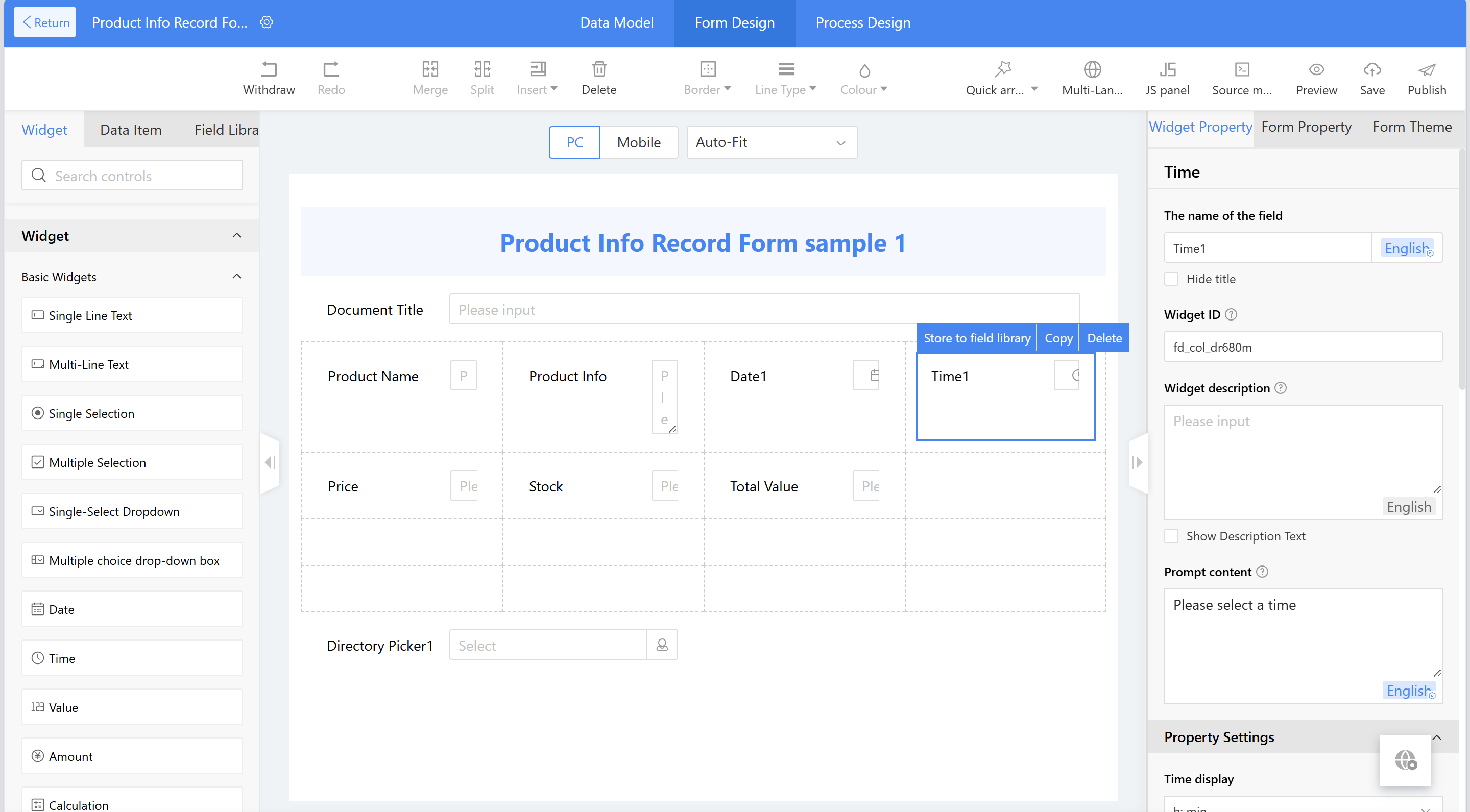
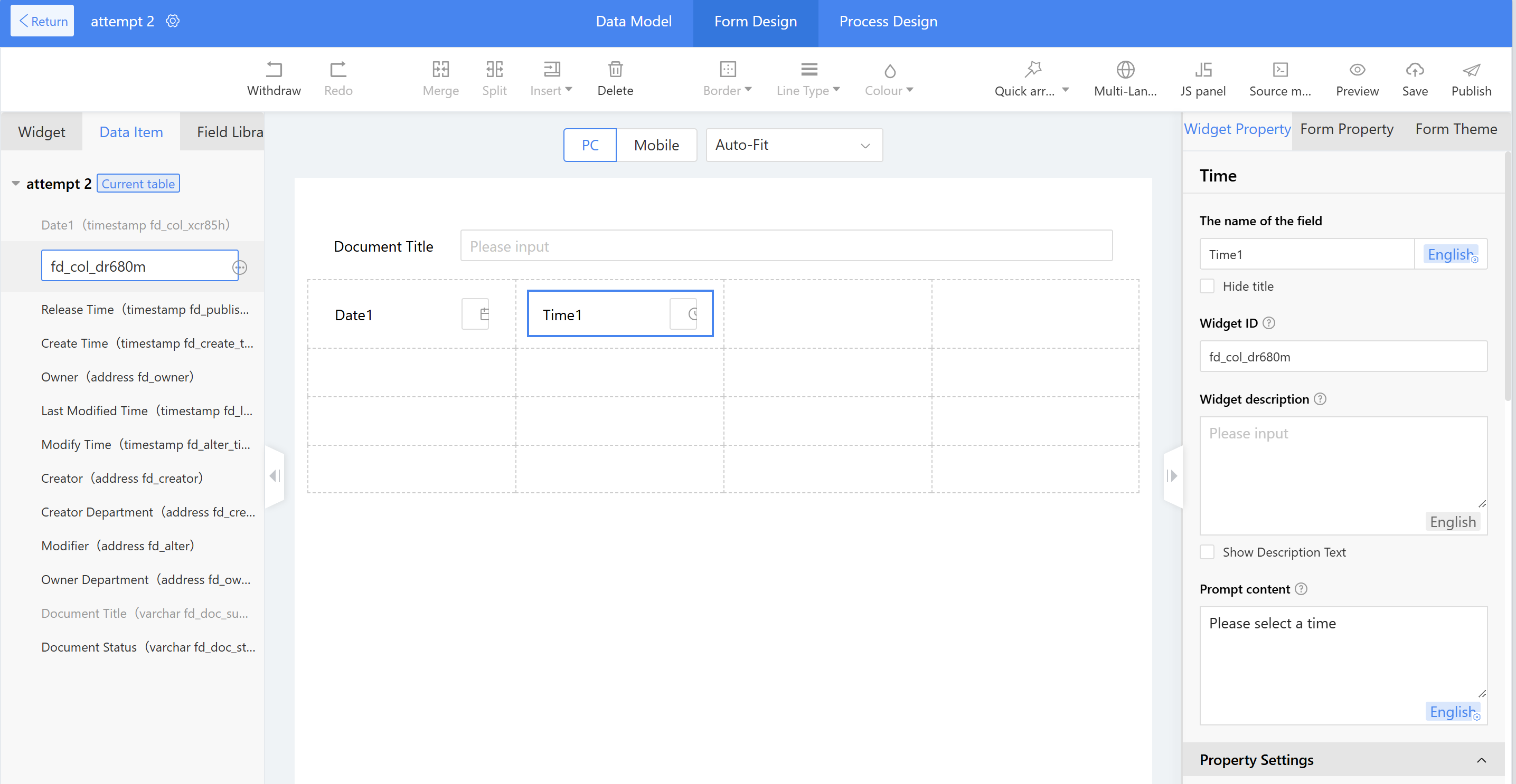
2.9.2.8.1.6 Time
Time widgets allow selection of specific times (hour, minute, second) excluding date components.
-
Settings:
a) Input format: Default hour:minute; options for hour:minute:second or whole-hour only.
b) Specified display format: Default off; if enabled, view page shows configured format overriding language default.
c) Time range: Default 00:00 to 23:59; customizable manually or via formula editor.
d) Minute interval: Default 1 minute; 6 interval options available.
e) Initial value: Default empty; options include fixed value, current time, or formula. -
Example: Meeting schedule adjustment form with start and end times editable.
-
Instructions:
- Drag time widgets into layout; set title and style.
- Choose input mode and time format.
2.9.2.8.1.7 Value (Numeric Widget)
Used to input numeric data like phone numbers, age, bank cards, or standard numeric values usable in formulas.
-
Settings:
a) Data format types:- General (no specific format)
- Decimal (set decimal places, thousand separator; default 2 decimals)
- Currency (decimal places, currency symbol ¥, $, €, HK$; includes thousand separator)
- Percentage (decimal places; default 2 decimals)
b) Limit Range: Restrict input range by fixed values or form fields; must match data format and validated on entry.
-
Example: Temperature input with initial value 30, decimal format (1 decimal place), limit range -50 to 50.
2.9.2.8.1.8 Amount (Currency Widget)
Used for monetary input such as reimbursements and budgets.
- Settings:
a) Decimal places: Customizable.
b) Currency symbol: Configurable.
c) Limit range: Restricts input range, either fixed or form field; must match amount format and validated.
2.9.2.8.1.9 Calculation
Used to calculate numeric, currency, and time values.
-
Application Scenarios:
a) Calculate total price in quotations.
b) Calculate business trip duration.
c) Compute employee self-assessment scores. -
Example 1:
Input unit price and quantity; auto-calculate total product price. -
Example 2:
Calculate trip days based on start and end dates. -
Instructions:
- Drag amount, numeric, and calculation widgets into layout; set titles and styles.
- Select calculation mode (e.g., product) and configure variables.
- Use formula editor to write formulas with date, math functions, etc.
- Test formulas with sample data; save if successful.
-
Other Settings - Data Format:
a) General: no specific format.
b) Decimal: decimal places and thousand separator (default 2 decimals).
c) Currency: decimal places, symbols (none, ¥, $), with thousand separators.
2.9.2.8.1.10 Uppercase
Converts amounts, numbers, or calculation results into uppercase text.
- Instructions:
- Drag uppercase widget into layout; set title and style.
- Associate one widget of type numeric value, amount, or calculation for uppercase conversion.
2.9.2.8.1.11 Directory Picker
Used to select organizations, departments, employees, positions, or groups.
-
Application Scenarios:
a) Obtain responsible personnel info in production management.
b) Retrieve employee personal info in event registration. -
Example: Selecting an employee auto-fills phone and email info.
-
Instructions:
- Drag directory picker widget into layout; set title and style; select "Personal" as optional type.
- Configure output parameters mapping (e.g., phone → contact info, email → email address).
-
Other Settings:
a) Optional Types: organization, department, individual, position, common group, personnel identity; multiple selections allowed; display name rules configurable (default: system settings, name, abbreviation, full path). Applies to form editing/viewing and Low-Code platform lists (not portals, reports, charts).
b) Optional former employees: Enable to include former employees in selection.
c) Initial value: submitter, fixed value, or formula editor. Submitter varies by type (e.g., individual's submitter, department's submitter's dept).
d) Multiple selection: Allow multiple selections; once published, cannot modify.
e) Output Parameter: Assign attribute values (e.g., phone, email) from selected org unit to other form fields. Allowed only if selectable type is single.
f) Selectable Range: Configure scope for selection (this organization, this department, custom via fixed or formula).- For department or position: scope can be this department or organization.
- For individual: scope can be department, organization, or custom.
- Organization and common groups do not support scope settings currently.
id: 2.9.2.8.1.12-24 title: No., URL, Attachment, Picture, Video, Slider, Text Description, Rich Text, QR Code, Hidden, Locate, Toggle, Button Widgets sidebar_position: X
2.9.2.8.1.12 No.
No. widgets auto-increment sequences for forms (e.g., purchase orders, product serials).
-
Application Scenarios:
a) Assign product numbers in product management.
b) Set employee numbers in personnel/admin management.
c) Assign order or stock numbers in inventory management. -
Numbering Elements:
- Date (supports Chinese, English US/UK formats)
- Time (supports Chinese, English US/UK formats)
- Serial Number (customize length, start number, zero-padding, looping, skipping)
- Constant (fixed text or numbers)
- Custom (using formula editor functions)
-
Real-time simulation preview of serial number format during setup.
2.9.2.8.1.13 URL
Used for users to input link content.
-
Example: Cultural exhibitions ask KOLs to provide social media URLs for promotions.
-
Instructions:
- Drag link widget into layout; set title and style.
- Configure max number of links allowed.
-
Other Settings:
- Initial value: can be preset.
- Addable Quantity: max number of links.
2.9.2.8.1.14 Attachment
Used to upload files (images, Word, PDFs, etc.).
-
Application Scenarios:
a) Upload contracts in order management.
b) Attach product files in product management.
c) Upload invoices in reimbursement. -
Example: Restrict uploads to JPG, PNG, GIF, Word, PDF; support mobile QR code upload.
-
Effect:
- Invalid formats blocked.
- Valid formats accepted.
- Mobile QR code scanning for upload.
-
Instructions:
- Drag attachment widget into layout; set title, style, and properties (file count, max size, format, QR code support).
- File format input as comma-separated list, e.g.,
.jpg,.png,.gif,.docx,.pdf. - File name format configurable; restrict by type or leave blank for no restriction.
2.9.2.8.1.15 Picture
Used for uploading images (single or multiple).
-
Application Scenarios:
a) Upload product images.
b) Collect equipment failure images.
c) Collect invoice images. -
Example: Restrict to
.jpg, .gif, .jpeg; support mobile QR code upload. -
Effect:
- Invalid formats blocked.
- Valid uploads accepted.
- Mobile QR code scanning supported.
- PC can display QR code for mobile upload sync.
-
Instructions:
- Drag image widget into layout; set title, style, properties (file count, max size, format, mobile upload options).
- Format input:
.jpg,.gif,.jpeg. - Mobile photo upload only disables PC direct upload; QR code upload on PC allowed.
2.9.2.8.1.16 Video
Used for uploading videos (single or multiple).
-
Application Scenario: Equipment repair process videos in maintenance management.
-
Example: Restrict to
.mp4, .mp3; support mobile QR code scanning. -
Effect:
- Invalid formats blocked.
- Valid uploads accepted.
- Mobile QR code upload supported.
-
Instructions:
- Drag video widget into layout; set title, style, and properties (file count, max size, format, enable mobile shooting, enable QR scanning).
- Format input example:
.mp4,.mp3.
2.9.2.8.1.17 Slider
Supports quick selection of values within a range via horizontal sliding.
-
Example: Track project phase completion progress (%).
-
Instructions:
- Drag slider widget into layout; set title and style.
- Configure properties:
- Min and max values
- Minimum movement step
- Unit (e.g., %)
- Slider color
- Column width (100%, 75%, 50%, 25%)
2.9.2.8.1.18 Text Description
Used for static text in forms (titles, prompts).
-
Example: Project phase form title.
-
Instructions:
- Drag text description widget; input content (e.g., "Project Phase").
- Set style: font size, color, boldness.
- Use layout options (e.g., center horizontally).
-
Other Settings:
- Supports up to 4000 Chinese characters.
- Can enable hyperlink with URL input.
2.9.2.8.1.19 Rich Text
Used for rich text input supporting text, images, layout.
-
Application: Company news publishing, forum posts.
-
Example: Publish intranet news with images.
-
Instructions:
- Drag rich text widget; hide unwanted widgets.
- Adjust edit and view page height settings.
-
Settings:
- Default height with scroll or auto-fit.
- View page display height preset or custom.
2.9.2.8.1.20 QR Code
Generates QR codes linking to forms or pages (scan via DingTalk, WeChat).
-
Applications:
a) Employee event registration.
b) Trainee check-in.
c) Product material download. -
Instructions:
- Drag QR code widget; set title and style.
- Configure "Page Type (After Scanning)":
- Fixed Link (input URL)
- Create Data (link to new form page)
- Link to Other Forms (dynamic data view)
- Add supplementary hint text below QR code.
2.9.2.8.1.21 Hidden Widgets
Used for hidden values passed between widgets (text, date, numeric).
-
Example: Contract payment forms filter payment info by selected contract.
-
Instructions:
- Configure hidden widgets in main and detail tables.
- Use association widgets to pass parameters linking records.
- Set filter conditions to limit displayed data.
-
Setup Notes:
- Hidden fields do not display at runtime.
- Hidden rows or columns collapse if fully hidden.
2.9.2.8.1.22 Locate
Supports map location input on PC and mobile.
-
Applications:
a) Attendance check-in.
b) Business trip location control.
c) Epidemic prevention location tracking. -
Example: Employees clock in with location validation.
-
Instructions:
- Drag location widget; set title and style.
- Configure location center and allowed radius (default 300m).
- Other options:
- Allow location adjustment within radius
- Display address components (province, city, county, detailed address)
- Show latitude/longitude
- Allow manual value modification
2.9.2.8.1.23 Toggle
Toggle switch between two states; controls show/hide or activate/deactivate.
-
Applications:
a) Collapse/expand travel expense claim in business trip forms.
b) Hide/show resume sections. -
Instructions:
- Drag toggle widget; set title and hide title.
- Configure switch default state, text size, switch size, on/off text and styles.
- Use form rules to control visibility based on toggle state.
-
Advanced: JavaScript can extend toggle actions.
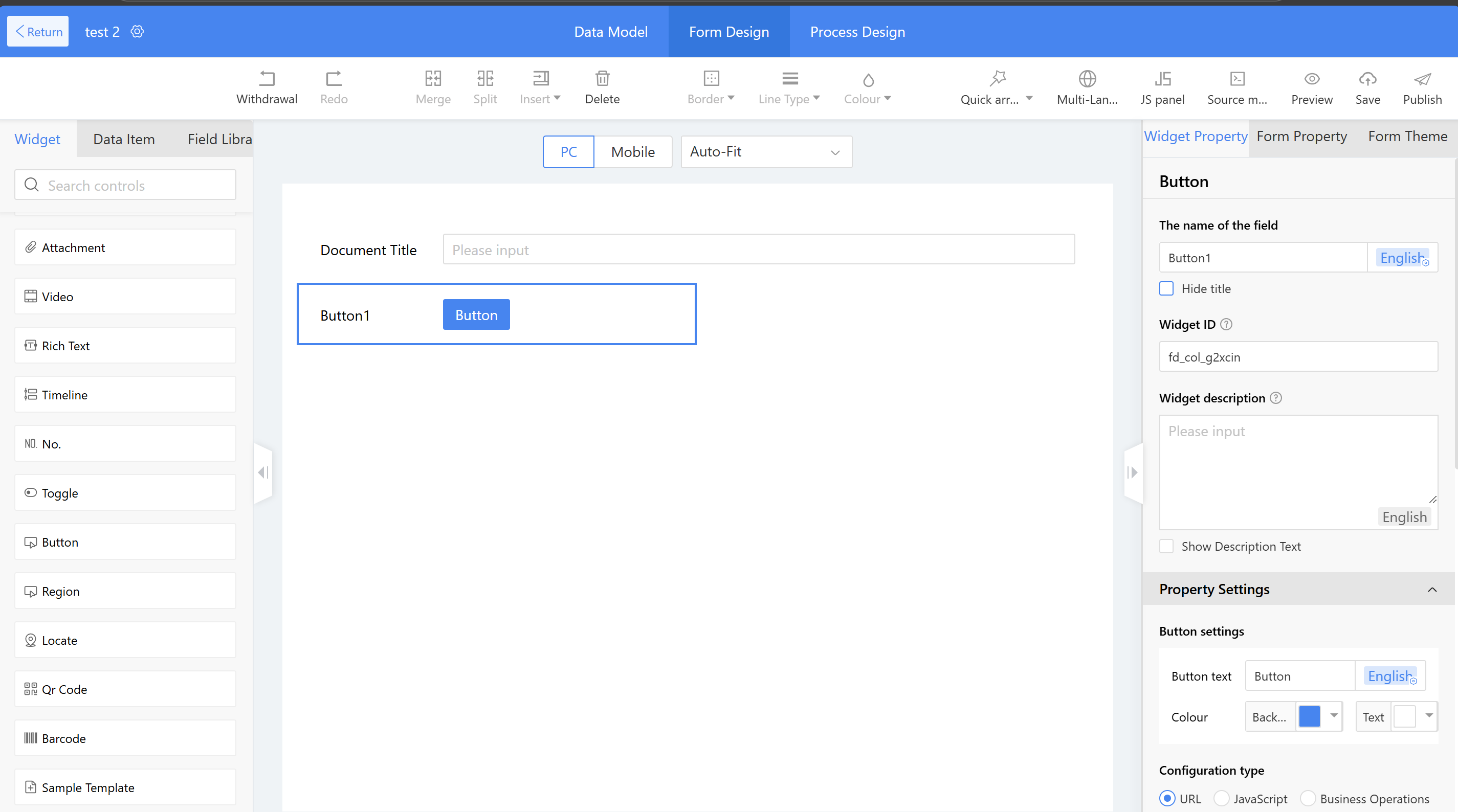
2.9.2.8.1.24 Button
Used to create clickable buttons with links or JavaScript for business logic.
-
Applications:
a) Register button on login page.
b) Rate button for customer feedback.
c) Instructor detail preview in training management. -
Example: Add "Instructor Details" button after training selection.
-
Instructions:
- Drag button widget; edit title and optionally hide it.
- Set button text and color.
- Add URL (quoted) or JavaScript code for button action.
- Configure open method: new window or current.
-
Other Settings:
a) JavaScript mode to implement custom logic.
b) Support business operation buttons that trigger action flows. -
Example Business Operation:
- Trigger action flow to add new personnel detail or update employee status to "Terminated" using script like:
MKXFORM.callFlow({
  context,
  fdProcessId: "1i5sqj78fwkew3cliw1bhp2s022hmiku2cw0",
  fdProcessCode:"template_ruyzel",
  incParams: { "docid":"" }
}, function(error, res, context) {
  console.log(res, context)
});
id: 2.9.2.8.1.6-time-value-amount-calculation-uppercase-directory-picker title: Time, Value, Amount, Calculation, Uppercase, Directory Picker sidebar_position: X
2.9.2.8.1.6 Time
Time widgets are used to select specific times, excluding year, month, and day, distinguishing them from date widgets.
-
The following settings can be set:
a) Input format: Default is hour:minute, with options for hour:minute:second or whole-hour formats;
b) Specified display format: Default is off, automatically matching the default format based on the current language; when enabled, the view page will display according to the configuration format;
c) Time range: Defines the range for time selection, defaulting from 00:00 to 23:59; users can also manually configure the time range or use the formula editor.
d) Minute interval: Default is 1 minute, with 6 intervals available for configuration;
e) Initial value: Default is empty, with options for a fixed value, current time, or formula definition. -
Example scenario: The recurring meeting schedule adjustment form in meeting management requires entering meeting-related details, including the start and end times.
-
Effect achieved: To facilitate adjusting periodic meeting times, the start and end times of the meeting can be modified.
Instructions:
Step 1: Drag the time widgets into the layout, then set the title and title style;
Step 2: Select the time widgets input mode and specify the time format.
2.9.2.8.1.7 Value
Numeric widgets are used to input numeric value information such as phone numbers, bank card numbers, age, etc., or to input standard numeric values. The entered values can be used in calculations with formula components.
-
The following settings can be set:
a) Data Format: The format of the input value, with the following four types:
• General—does not contain any specific number format;
• Decimal – sets the number of decimal places and whether to use a thousand separator. The default number of decimal places is 2;
• Currency – Set the number of decimal places and currency symbol. The default number of decimal places is 2. Currency symbols include four types (¥, $, €, HK$). The currency display automatically includes thousand separators.- Percentage – Set the number of decimal places in settings, default is 2.
b) Limit Range: Restrict the range of input values. The range can be a fixed value (unrestricted if left blank) or a form field. The number format must match the "Data Format" and can be validated upon entry.
-
Example Scenario: Configuring the numerical input for temperature, such as setting the initial value to "30"; select "Decimal" for the data format, accurate to one decimal place; setting the limit range to "-50~50".
2.9.2.8.1.8 Amount
The currency widget is used to input monetary information, such as reimbursement amounts and product budgets.
- The following settings can be set:
a) Decimal Places: The number of decimal places, which can be customized in the configuration.
b) Currency Symbol: Configure the currency symbol.
c) Limit Range: Restrict the range of input values. The range can be a fixed value (unrestricted if left blank) or a form field. The format must match the configured "Amount Format" and can be validated upon entry.
2.9.2.8.1.9 Calculation
Calculation widgets can be used to calculate numerical, monetary, and time-type widgets.
-
Application Scenario:
a) During the sales process, calculate the total price of products in a quotation.
b) In the business trip application, calculate the number of days for the trip.
c) In the employee self-evaluation system, calculate the total self-assessment score for each aspect of the employee's performance. -
Example Scenario 1: When creating a sales quotation, the total product price must be calculated after entering the unit price and quantity.
-
Effect 1: When a salesperson fills out a quotation, they only need to input the unit price and quantity, and the system automatically calculates the total product price.
Steps for Example 1:
Step 1: Drag the amount, numerical value, and calculation widget into the layout, then set the title and title style;
Step 2: Select the statistics mode—product, and configure the calculation settings—select the variables to be calculated.
- Example Scenario 2: In a business trip application, calculate the duration of the trip using the start and end dates.
- Effect 2: Calculate the number of business trip days using the start and end times through Homepage widgets.
Steps for Example 2:
Step 1: Drag the calculation widget into the layout, and set the title and title style;
Step 2: Use the formula editor to set the formula for the Homepage widget. The formula editor supports various functions, such as date functions for performing logical date calculations and mathematical functions for numerical and monetary calculations.
Step 3: Run a simulation of the formula by entering test parameters. Save if the simulation runs successfully.
- Other Settings — Data Format: The format for input values includes the following three types:
a) General—Does not include any specific number format.
b) Decimal—Sets the number of decimal places and whether to use a thousand separator. The default number of decimal places is 2.
c) Currency—Set the number of decimal places and currency symbol. The default number of decimal places is 2. Currency symbols include three options (none, ¥, $), and the display includes thousand separators.
2.9.2.8.1.10 Uppercase
Used to convert amounts, numerical values, and numbers from calculation widgets into uppercase text.
Instructions:
Step 1: Drag uppercase widgets into the layout, set the title and title style;
Step 2: Select the widget to be converted to uppercase under "Associated Widget." Here, users can choose from three types of widgets: "numeric value, amount, calculation." Only one widget can be associated.
2.9.2.8.1.11 Directory Picker
The Directory Picker is used to select organizations, departments, employees, positions, or frequently used groups.
-
Application Scenario:
a) In production management scenarios, use the address book to obtain information about the responsible personnel at each production stage.
b) In event registration scenarios, use the Directory Picker to access employees' personal information. -
Example Scenario: When employees register for company events, to enable quick submission, their phone and email information can be automatically retrieved upon selecting a person.
-
Implementation Effect: When a person is selected, the phone and email information are automatically retrieved from the system Directory Picker.
Instructions:
Step 1: Drag the directory picker widgets into the layout, set the title, select "Personal" as the optional type, and set the title style;
Step 2: Configure the outgoing parameters of the address book: phone corresponds to contact information, and email corresponds to email address.
Other Settings:
a) Optional Types: The available options include organization, department, individual, position, common group, and personnel identity. Multiple selections are allowed (the selection order can be saved).
When the optional type is an organization or department, users can modify the display name rule (with four options: default system settings, name, abbreviation, or full path). The default selection is "default system settings," but users can switch to other display methods. This rule applies to the form's edit page, view page, and various type views in the Low-Code platform list. It does not apply to other areas such as portals, reports, or charts.
When the optional type is an organization or department, the "default system settings" rule for name display is configured under Organization Management → System Configuration Management → System Parameter Settings for "Department Hierarchy Display in Directory Picker Department Information in Documents" and "Directory Picker Organization/Department Name Display Rules."
b) Optional former employees: After enabling this feature, the former employees option becomes available for selection.
c) Initial value: Three options are available—submitter, fixed value, or formula editor.
i. Submitter: Varies based on the selectable type, such as "Individual" → "Submitter," "Department" → "Submitter's Department," or "Organization" → "Submitter's Organization."
ii. Fixed value: Can specify personnel, departments, organizations, positions, etc.
iii. Formula editor: Use the formula editor to set the initial settings.
d) Multiple Selection: When "Multiple selection" is enabled, multiple options can be selected in the organizational structure. After the form is published, modifications are not supported.
e) Output Parameter: Assigns the attribute values of the organizational structure to the target widget. For example, after selecting a person, their phone number, email, etc. can be assigned to other fields in the current form. Parameter transfer is allowed when the "Selectable type" is a single type, but not allowed when there are multiple types.
f) Selectable Range: Configure the selectable range, supporting selection of this organization, this department, or custom (can be achieved by selecting fixed personnel or using the formula editor).
i. When the selectable type is "Department" or "Position," the scope can be this department or this institution;
ii. When the selectable type is "Individual," the scope can be set to this department, this organization, or custom. Custom options allow for specifying personnel or using the formula editor.
iii. "Organization" and "Common groups" currently do not support scope settings.
id: 2.9.2.8.1-widgets
title: Widget Types and Usage
sidebar_position: X
2.9.2.8.1.12 No.
No. widgets are primarily used for auto-incrementing sequences in forms, such as purchase order numbers or product serial numbers. The serial numbers are in the settings as follows.
Application Scenario:
a) In product management, product numbers are assigned to products using the serial number field.
b) In personnel and administrative management, employee numbers are set using the serial number field;
c) In inventory management, order numbers, stock numbers, etc. are set using serial numbers in the settings.
The system includes five preset numbering elements: date, time, serial number, constant, and custom, enabling customized numbering formats.
d) "Constant" supports entering fixed values, such as numbers or text;
e) "Date" supports various date formats, including Chinese, English (US), and English (UK) styles.
f) "Time" supports time formats, including Chinese, English (US), and English (UK) styles.
g) "Serial Number" supports numeric sequences, allowing customization of length, starting number, zero-padding (Adding leading zeros when digits are fewer than the maximum), looping, and number skipping, among other features.
h) "Custom" supports the configuration of custom rules for serial numbers in the formula editor's function set;
During serial number design, the simulated serial number style is displayed in real time based on settings, allowing modifications to be viewed.
2.9.2.8.1.13 URL
URL widgets are primarily used for users to input link content.
Example Scenario: Cultural and art exhibitions offer free spots to KOLs for check-in promotions, requiring the selection of suitable KOLs based on personal social media URLs provided in the registration details.
Operation Steps: Drag the link widgets into the layout, set the title, title style, and the number of links that can be added.
Other Settings:
a) Initial value: The initial value displayed on the Homepage for link widgets can be set;
b) Addable Quantity: Set the maximum number of links that can be added in settings.
2.9.2.8.1.14 Attachment
Attachment widgets are mainly used to upload attachments, such as image files, Word documents, etc.
Application Scenario:
a) In order management, contract information is uploaded through the attachment field.
b) In product management, product attachments are collected through the attachment field;
c) In the reimbursement scenario of personnel management, invoice files and other documents are collected through the attachment field.
Scenario Example: Restrict attachment upload formats to only allow the following: JPG, PNG, GIF, Word, and PDF files, with support for mobile QR code scanning to upload attachments.
Effect:
a) The format does not meet the requirements and cannot be submitted;
b) The format meets the requirements, and the upload was successful.
c) Upload attachments by scanning the QR code with your mobile phone.
Operation Steps: Drag the attachment widgets into the layout, then configure the title, title style, and property settings (Number of files, single file size, file format, PC support for QR code scanning to upload attachments). File format input method: English comma + format, separate formats with English commas, example: .jpg, .png, .gif, .docx, .pdf.
File Format - Configuration settings: The file name format for uploaded attachments can be configured.
i. Restrict types to Office, images, compressed files, etc.
ii. The format should be filled in as: English comma + format, separated by English commas, example: .jpg, .gif;
iii. Leave blank for no restrictions.
[... Continued with all remaining sections in the same detailed format ...]
2.9.2.8.1.24 Button
Button widgets can be used to configure button links or edit JavaScript code to implement business logic.
Application Scenario:
a) "Register" button for new users on the login page.
b) "Rate" button for customers to evaluate the service;
c) Button to learn more about the instructor in training management.
Example scenario: When editing a training program, users can review instructor details before making your selection.
Effect: Add an "Instructor Details" button after the training selection box for easy preview of instructor information.
Instructions:
Step 1: Drag the "Button" widget into the layout, edit the title name, and hide the title.
Step 2: Modify the button text and configure its display color according to specific scenarios.
Step 3: Use the formula editor to add a URL (Enclose with English double quotes). Users can also configure the opening method: new pop-up window or current window.
Other Settings:
a) The configuration type can be set to JavaScript to implement button operations. For specific configuration methods, refer to 2.9.2.6.3 Action Settings.
b) Button widgets support invoking “Business Operations” buttons, triggering action flows by clicking the button to execute the process.
Scenario 1: Personnel-related information - using buttons to trigger an action flow that adds new personnel details to the detail table.
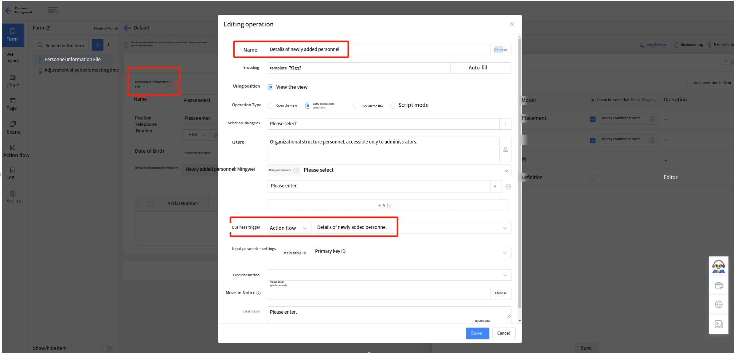
Scenario 2: Personnel-related information - using button widgets to trigger an action flow that updates employee status to "Terminated" (Business operation script mode/button widget JavaScript configuration type).
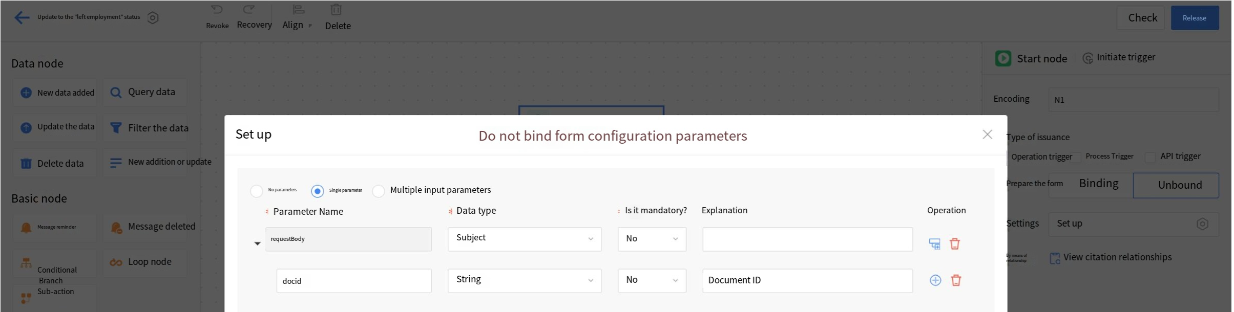
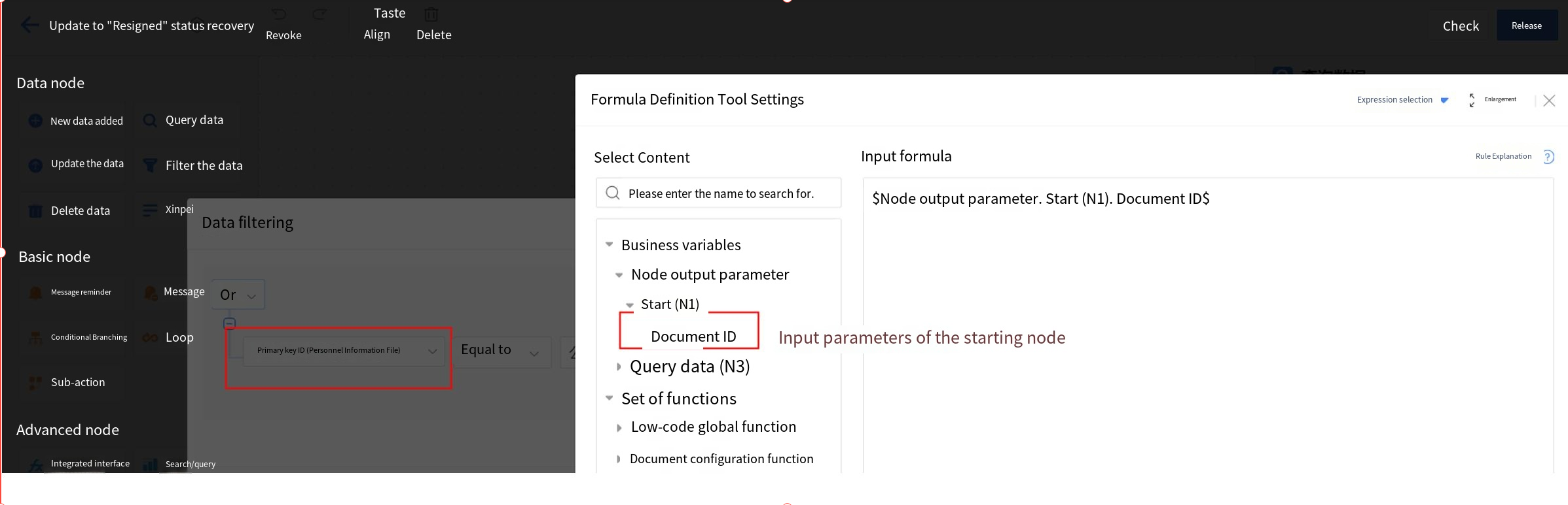
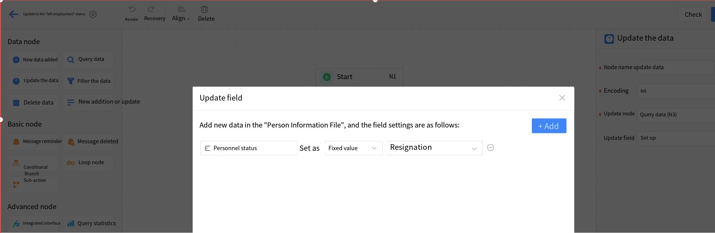
A. Action flow: Configure an actively-triggered action flow (Not bound to form updates) with the document ID as the input parameter. Query data from the node using the same filtering criteria as the start node's active trigger (Primary key ID=document ID). Update the queried data in the node with a fixed value (Status=Resignation).
2.9.2.8.1.15 Picture
Image widgets are primarily used for uploading images in forms, supporting both single and multiple images.
Application Scenario:
a) In product management, product image information is entered through the image field.
b) In equipment maintenance management, use the image field to collect details of equipment failures;
c) In reimbursement scenarios for personnel management, use the image field to collect invoice information, etc.
Example Scenario: Limit image upload formats to jpg, gif, and jpeg only, with support for uploading images via mobile QR code scanning.
Effect:
a) The format does not meet the requirements and cannot be submitted;
b) The format meets the requirements, and the upload was successful.
c) Upload images by scanning the QR code with your phone.

Steps:
- Drag the image widgets into the layout
- Set the title, title style, and property settings:
- Number of files
- Single file size
- File format
- Display configuration
- Whether to use mobile photography
- File format input method: English comma + format, separated by English commas
Example:.jpg, .gif, .jpeg
Special Modes:
- Only Supports Mobile Photo Uploads: PC cannot upload images; only mobile photo uploads are allowed
- PC QR Code Scanning: PC displays QR code for mobile scanning and upload, then syncs to PC
2.9.2.8.1.16 Video
Video widgets are mainly used to upload videos in forms, supporting both single and multiple videos.
Application Scenario:
a) In equipment maintenance management, the video field is used to collect specific details of the equipment repair process.
Example Scenario: Limit video upload formats to .mp4 and .mp3 only, with support for mobile QR code scanning to upload videos.
Effect:
a) The format does not meet the requirements and cannot be submitted;
b) The format meets the requirements, and the upload was successful.
c) Upload videos by scanning a QR code with your phone.

Steps:
- Drag the video widgets into the layout
- Set the title and title style
- Configure property settings:
- Number of files
- Single file size
- File format
- Whether to enable mobile shooting
- Whether to enable QR code scanning for mobile shooting
- File format entry method: Use an English en dash + format, separate formats with English commas
Example:.mp4, .mp3
2.9.2.8.1.17 Slider
Slider widgets primarily support users in quickly selecting specific values within a range. By sliding along a horizontal track, users can select specific values between the slider's minimum and maximum values.
Example Scenario: Project phase management requires an intuitive understanding of progress status.
Effect: Use the slider to track completion progress for easy visualization.
Instructions:
- Drag the slider widgets into the layout
- Set the title and title style in the settings
- Configure the slider property settings:
- Set the unit to "%"
Setup Instructions:
a) Minimum and maximum values: Settings the selection range of the slider
b) Minimum movement: The unit of movement per slide
c) Unit: The unit for configuration of the quantity of this slider
d) Slider Color: Settings the color display of the slider
e) Column width: The width of the slider displayed in the layout, with four options: "100%," "75%," "50%," and "25%"
2.9.2.8.1.18 Text Description
Mainly used for text descriptions within forms, such as form titles, prompts, etc.
Example Scenario: Need to configure the title of a project phase form.
Instructions:
- Drag the text description widget into the layout
- Set the content to "Project Phase"
- Set the settings style:
- Font size: 25
- Font color: green
- Bolded
- Select the layout widgets, right-click and choose "Align Center Horizontally" to center the title
Other Settings:
a) Text Content: Input the text description (supports line breaks, up to 4,000 Chinese characters)
b) Hyperlink: When enabled, shows URL input box. Clicking the text during runtime redirects to URL
2.9.2.8.1.19 Rich Text
Rich text widgets are primarily used for inputting content with rich text formatting, supporting text, image layout, and more.
Application Scenario:
a) In internal company news management, draft and publish news using rich text
b) In forum management, edit and publish posts with rich text formatting
Example Scenario: The company's administrative department needs to publish news on the corporate intranet for internal communications.
Effect: Supports publishing company news with images and text.
Instructions:
- Drag the rich text widget into the layout
- Hide the hidden widgets
- Adjust the height of:
- Edit page
- View page
Setup Instructions:
a) Default Height: Sets the text box height on edit page (scroll bars appear if content exceeds height; "Auto-fit" adjusts height automatically)
b) View Page Settings:
i. System preset – default system conditions
ii. Custom – manually set display height
2.9.2.8.1.20 QR Code
Users can quickly access forms or specified paths by scanning a QR code, typically using DingTalk or WeChat.
Application Scenario:
a) In employee activity management, employees scan a QR Code to access the registration page
b) In training management, QR codes for trainee check-in
c) On product introduction pages for client material downloads
Example Scenario: In employee activity management, employees scan a QR Code to access the registration page.
Effect: Employees can register by scanning a QR code.
Instructions:
- Drag the QR Code widget into the layout
- Set the title and title style
- Configure widget settings:
- Page type (After scanning): Fixed link
- Input registration form link
Other Settings:
a) Page Type (After Scanning):
i. Fixed Link: Manual entry of redirect link
ii. Create Data: Redirects to current form's new page
iii. Link to Other Forms: Redirects to linked form's data view page
b) Supplementary Text: Hint text below QR code
2.9.2.8.1.21 Hidden Widgets
Hidden widgets must be used in combination with widgets that support parameter passing or trigger actions. They obtain values from other widgets without displaying them on the page and support value assignment for single line text, date, and numeric widgets.
-
Example Scenario: In a contract payment form, both contract information and payment information retrieve data from the contract records, requiring a one-to-one correspondence between contract information and payment information.
-
Effect: When the contract field selects Contract A from the contract records, the payment items on the selection page will only display the payment information for Contract A.
-
Instructions:
Step 1: Perform configuration of hidden widgets in both the main form and detail table of the "Contract Receipt" form page.
Step 2: Use an association widget for the contract in the main table of "Contract Receipt," then assign the contract number from the main table of "Contract File" to the hidden widgets in the main table of "Contract Receipt" through the parameter settings of the association widget (For association widget configuration, refer to 2.9.2.8.3.1 business association).
Step 3: Use an association widget for the payment items in the "Contract Payment" detail table. Pass the contract number from the "Contract Records" receivable items to the hidden widgets in the detail table through the association widget's parameter settings.
Step 4: Set the settings data source filter condition for the payment items' association widget, where the contract number parameter for the receivable items in "Contract Records" equals the contract number in the main table. -
Setup Instructions:
a) Display Effect: Supports main tables and detail tables. When all fields in a row of the main table are hidden, the row will not be displayed at runtime. Supports detail tables where hidden fields occupy a separate column, and the column will not be displayed at runtime. If a row contains both hidden widgets and other widgets, the hidden widgets will not be displayed at runtime. If there are other widgets, they will replace the position of hidden widgets without leaving blank spaces.
2.9.2.8.1.22 Locate
Locate widgets are designed to meet business needs for map usage, supporting both PC and mobile platforms.
-
Application Scenario:
a) In attendance management scenarios, employees can complete attendance check-ins using the location field.
b) In business trip management scenarios, location fields can be used to define travel boundaries and manage employees on business trips.
c) In epidemic prevention and widget scenarios, the location field can be used to quickly collect employees' current location information. -
Example Scenario: In attendance management scenarios, employees can complete attendance check-ins using the location field.
-
Effect: Supports employee location-based clock-in. When an employee clocks in outside the designated range, the system will notify that the location is beyond the permitted area.
-
Instructions:
Step 1: Drag the location widgets into the layout and set the title and title style in the settings.
Step 2: Set the settings of the check-in location center and the radius of the allowed location range. -
Other Settings:
a) Allow Adjustment of Settings: Default is "Off." When enabled, users can reselect the location within the specified range, which will dynamically display the settings for the specific location range. The default range is "300" meters, but users can customize it. After setting the range, only locations within the specified radius (XX meters) from the selected center point can be chosen.
Set Location Center and Range: Default is "Off." When enabled, users can select a location center point from the map and set the effective range.
b) Display Content: Default selection includes province, city, county, and detailed address. Settings can be set to display province, city, county, detailed address, province and city, or province, city, and county.
i. Display Latitude and Longitude: Default is "Off." If "On" is selected, the specific latitude and longitude will be displayed in parentheses after the location name.
ii. Allow Value Modification: Default is "Off". When set to "On", users can modify the displayed location name.
2.9.2.8.1.23 Toggle
A toggle switch represents the transition between two opposing states, commonly used to indicate the activation and deactivation of functions. Additional operations may be initiated when the button is activated.
-
Application Scenario:
a) In business trip application scenarios, the travel expense application is minimized by default; users can expand it if needed.
b) When filling out information, applicants encounter numerous resume fields. They are allowed to hide certain sections based on their circumstances. -
Example Scenario: In a business trip application, the travel expense claim section is collapsed by default; users can expand it if needed.
-
Effect: The travel expense information is hidden by default when opening the business trip application page. When the toggle widgets is activated, travel expense information will be displayed.
-
Instructions:
Step 1: Drag the toggle widget into the layout, modify the title, and hide it.
Step 2: Set the switch property to the "Off" position. Adjust the text size and switch size according to your settings preferences, and configure the display text and corresponding styles for both the on and off states.
Step 3: Use form rules to set which fields to show or hide when toggling. For specific configuration methods, refer to 2.9.2.4.2.2 Display Rules. -
Instructions:
a) Action settings: Business scenarios can be extended using JavaScript code. For specific configuration methods, refer to 2.9.2.6.3 Action Settings.
2.9.2.8.1.24 Button
Button widgets can be used to configure button links or edit JavaScript code to implement business logic.
-
Application Scenario:
a) "Register" button for new users on the login page.
b) "Rate" button for customers to evaluate the service;
c) Button to learn more about the instructor in training management. -
Example scenario: When editing a training program, users can review instructor details before making your selection.
-
Effect: Add an "Instructor Details" button after the training selection box for easy preview of instructor information.
-
Instructions:
Step 1: Drag the "Button" widget into the layout, edit the title name, and hide the title.
Step 2: Modify the button text and configure its display color according to specific scenarios.
Step 3: Use the formula editor to add a URL (Enclose with English double quotes). Users can also configure the opening method: new pop-up window or current window.
- Other Settings:
a) The configuration type can be set to JavaScript to implement button operations. For specific configuration methods, refer to 2.9.2.6.3 Action Settings.
b) Button widgets support invoking “Business Operations” buttons, triggering action flows by clicking the button to execute the process.
Scenario 1: Personnel-related information - using buttons to trigger an action flow that adds new personnel details to the detail table.
Scenario 2: Personnel-related information - using button widgets to trigger an action flow that updates employee status to "Terminated" (Business operation script mode/button widget JavaScript configuration type).
A. Action flow: Configure an actively-triggered action flow (Not bound to form updates) with the document ID as the input parameter. Query data from the node using the same filtering criteria as the start node's active trigger (Primary key ID=document ID). Update the queried data in the node with a fixed value (Status=Resignation).
B. Business operation: Use the script mode of the business operation button to write the source code, directly select the action flow, and then adjust the primary key ID parameter in the script.
MKXFORM.callFlow({
  context,
  fdProcessId: "1i5sqj78fwkew3cliw1bhp2s022hmiku2cw0",
  fdProcessCode:"template_ruyzel",
//Adjust the docid parameter content MKXFORM.getFormValues()._dynamicProps.fdId to get the main document ID
  incParams: { "docid":"" }
}, function(error, res, context) {
  console.log(res, context)
})
D. Form instance data update button: Click to update data
2.9.2.8.1.25 Divider
The divider widget is mainly used to assist in form layout and style design, improving the visual effect of information classification and arrangement on the page.
Example Scenario: In personal information entry forms, the design can incorporate divider elements.
Effect: Basic information, work information, family information, etc., can be displayed separately using dividers.
Instructions:
Step 1: Drag the "Divider" widget into the layout, edit the title name, and optionally choose to hide the title.
Step 2: Set the divider settings, with four options available.
Step 3: Set the title font type, size, color, bold, italic, and underline as needed, and optionally set the divider as a directory. After completing all settings, click "Publish."
After setting the divider as a directory, clicking the divider title in the left directory on the new or view page will quickly navigate to the corresponding content
(Note: The "Advanced Properties - Set as Directory" feature is only supported on PC, not mobile).
2.9.2.8.1.26 Placeholder
Placeholder widgets are primarily used to assist in form layout and style design, enhancing the visual organization of information on the page.
Example scenario: In the scenario of product version planning and related phases, the design can incorporate placeholder widgets.
Effect: Basic information, design phase, development phase, etc., can be organized and displayed in separate modules using placeholder widgets.
Instructions:
Step 1: Drag the "Placeholder" widget into the layout and edit the field name, which will not be displayed on the Homepage.
Step 2: Set the placeholder widgets style by combining width (Widget width, following form background) and color.
2.9.2.8.1.27 Region
Region widgets are used for users to select the province, city, and county information to be filled in.
Example Scenario: When filling out a customer information form, users need to select the company's province, city, and county information.
Effect: The selection of the province, city, and county where the customer's company is located can be achieved using the region widgets feature.
Instructions:
Step 1: Drag the "Region" widget into the layout and edit the title name and style.
Step 2: Set the settings of the region widgets. The region precision defaults to province, city, and county, and the display level defaults to the full path. Different configurations can be selected based on specific needs.
Setup Instructions:
a) Initial value: Defaults to empty; can select a fixed value or use the formula editor.
b) Region precision: Defaults to province, city, and county; can be adjusted to province or province and city as needed.
c) Display level: Includes full path and last level only, defaulting to full path. The figure below shows the display effect for the last level only.
d)Color: Sets the color of the rating icons. The default is fixed, and custom icon colors are supported.
e)Rating settings: Supports clearable, half-point, and display of rating results;
f)Custom result text: When enabled, users can set custom text, typically used in conjunction with "Display results" in the settings.
2.9.2.8.1.30 Timeline
The timeline widget is primarily used to display event progress and related materials.
Example Scenario: Case log;
Effect: Display the progress milestones of related cases;
Instructions:
Step 1: Drag the "Timeline" widget into the layout and edit the title.
Step 2: Set the settings of the timeline widget, such as data source, associated data table, condition settings, etc.
Setup Instructions:
- Coordinate name: Used to assign names to fixed coordinates;
- Related data table: The source for retrieving data;
- Condition settings: Used to filter matching data.
- Content field: Used to configure the display of data content fields;
2.9.2.8.1.31 Barcode
Users can obtain asset codes through barcodes to support scanning and identifying assets.
Application Scenario:
a) In fixed asset management, employees scan the barcode on asset cards to identify assets.
Scenario Example: In fixed asset management, employees scan the barcode on asset cards to identify assets.
Effect: Employees scan the barcode on asset cards to identify assets.
Instructions:
Step 1: Drag the barcode widget into the layout and set the title and title style in the settings;
Step 2: Set the barcode content as the asset code.
Other Settings:
Barcode height: Supports configuration of the display height of the barcode, default is 40.
2.9.2.8.1.32 Sample Template
Sample templates are mainly used for uploading reference files as examples for file uploads or form filling. Currently supports Excel, Word, PDF, PPT, PPTX, ZIP, and 7z formats.
Application Scenario:
a) In patent registration management, sample templates are uploaded for authorization certificates and technical documents as references for users.
b) In meeting management, a sample template for meeting minutes is uploaded as a reference for users.
Example Scenario: In meeting management, a sample template for meeting minutes is uploaded as a reference for users.
Effect: Provides meeting minutes templates for users to reference when drafting meeting minutes.
Instructions:
Step 1: Drag the sample template widget into the layout, then edit the title and title style.
Step 2: Upload sample templates, with support for multiple uploads.
Setup Instructions:
a) Supports file uploads in Excel, Word, PDF, PPT, PPTX, ZIP, and 7Z formats.
b) Supports uploading multiple files;
c) Uploaded files can be replaced, downloaded, or deleted.
2.9.2.8.2 Enhanced Widgets
2.9.2.8.2.1 Detail Table
The detail table is primarily used for one-to-many data scenarios, managing multiple data items to clearly display each piece of data and their relationships.
Application Scenario:
a) In financial management, a reimbursement process involves multiple reimbursement items, which can be designed using a detail table for reimbursement details.
b) In inventory management scenarios, an order includes multiple products, and the order details can be designed using a detail table widget.
c) In sales quotation scenarios, a quotation requires pricing for multiple products, which can be designed using a detail table for the quotation details.
Example Scenario: When providing a sales quotation to a customer, multiple product details and subtotals for each product category must be included in the same quotation document.
Effect: Multiple product details and subtotals for each product type are calculated in the quotation statistics.
Instructions:
Step 1: Drag the detail table widget into the layout, set the title and title style;
Step 2: Drag the single line text widget into the detail table and change the title to "Product Name";
Step 3: Follow Step 2 to sequentially set the Product Code (Single line text settings), Specification/Model (Single line text settings), Unit (Single line text settings), Unit Price (Currency widgets), and Quantity (Numeric value settings);
Step 4: Drag in the calculation widget, rename it as "Subtotal"; select "Product" as the statistics mode; in calculation settings, check the data and unit price from the product information detail table. Statistical modes supported: sum, average, maximum, minimum, product, mathematical formulas, and various other calculation methods.
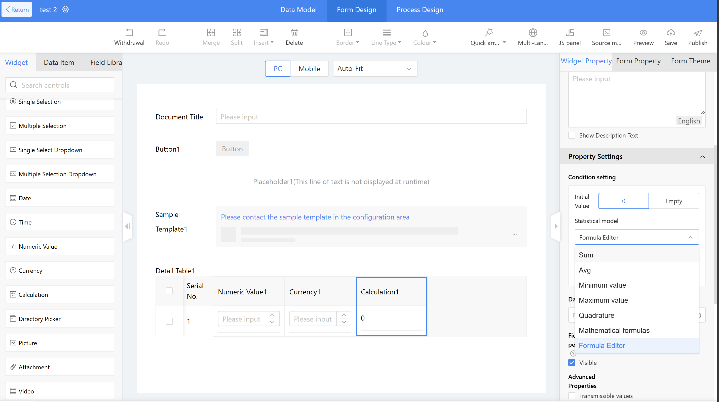
Other Settings:
a) Popup Mode: When there are many fields in the detail table, the form allows adding new pages or viewing pages during runtime without scrolling, instead using popup mode for convenient data entry or viewing details. The system defaults to table mode, but can be manually switched to popup mode as needed.
Note: When switching from table mode to popup mode, the widgets within the detail table will be properly displayed in the popup format. However, switching back from popup mode to table mode will clear all form widgets. This is a special note.
b) Nested Sub-tables: Supports embedding sub-tables within the detail table. Each row of the detail table can display sub-table information, enabling more complex business scenarios.
Application scenario: Administrative staff need to purchase new office supplies for branch offices. They submit purchase orders to request items such as electrical appliances, office supplies, and daily necessities. Each category of items is recorded in a separate sub-detail table, with all information then consolidated into a main detail table to provide a comprehensive overview of all purchased items.
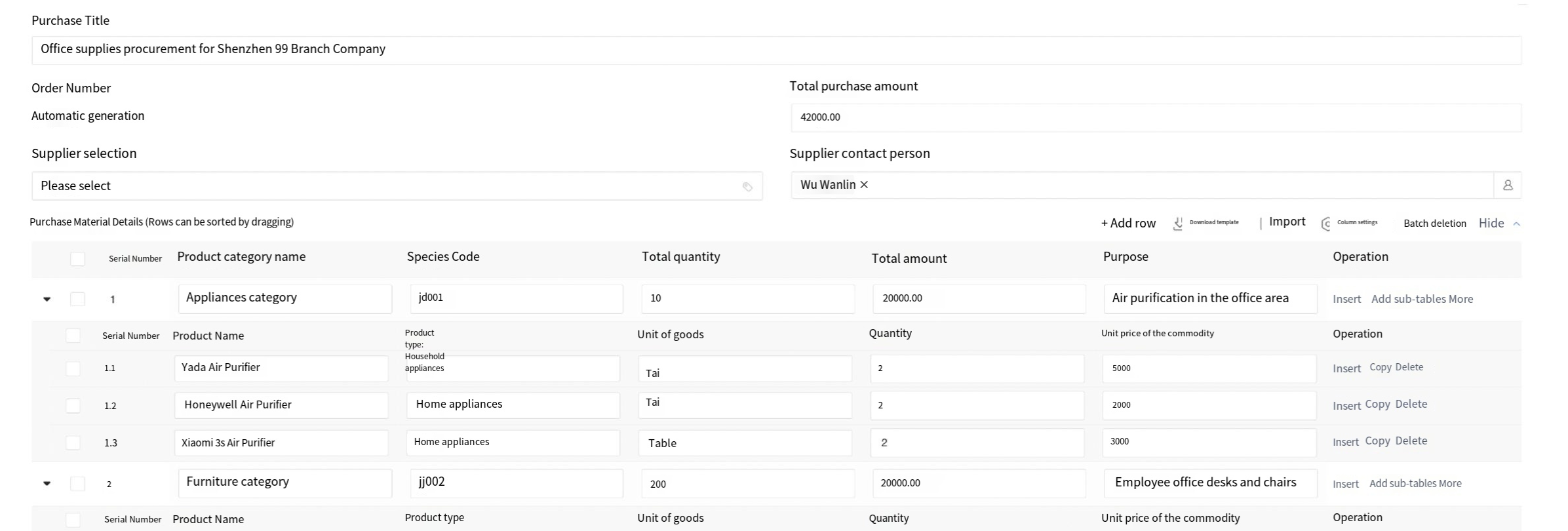
c) Default Row Count: Sets the number of empty rows displayed by default on the front-end page, with a default of 1 row.
d) One Row Required: when submitting data on the front-end page, at least one row must be filled in or retained in the detail table.
e) Display Serial Number: Whether to show the sequence number in the detail table. By default, this option is checked to display the sequence number, and the built-in sequence number will be shown in the detail table on the front-end page.
f) PC Settings
i. Table Header Freeze: when the pagination display option is unchecked for the detail table, all data will be displayed by scrolling the page. When the header freeze option is checked, the fields in the detail table header will remain displayed at the top of the data when scrolling down more than 10 items, making it easier to view the header fields.
ii. Pagination Display when Viewing: In the view or detail table, 10 entries are displayed per page by default. If there are more than 10 entries, they will be paginated. By default, the option is checked. If unchecked, all data will be displayed by scrolling the page.
iii. Collapse by Default when Viewing: Unchecked by default. When users view the detail table page, the table displays in expanded mode by default. If this configuration is checked and the form is published, the detail table will be displayed in a collapsed state when the user views the details list page. Supports configuration for both PC and mobile.
iv. Pagination for Create & Edit: By default, this option is unchecked. When creating or editing a data entry, the detail table will not be paginated. If this configuration is checked, the detail table will be paginated by default when creating or editing data. If there are more than 10 entries, they will be displayed in pages with 10 entries per page by default.
g) PC Column Settings: Configure field width in the detail table and set up filterable and sortable fields. If a field is checked, filterable and sortable icons will be displayed in the header of the detail table for users to operate. Support Manual Adjustment of Detail Table No. Width
h) Batch add: Used in conjunction with business association. When the switch is enabled, users must select the associated field: the business association field in the detail table. At runtime, users can select multiple business association pop-up box data in batch for addition, eliminating the need to select business association data row by row.
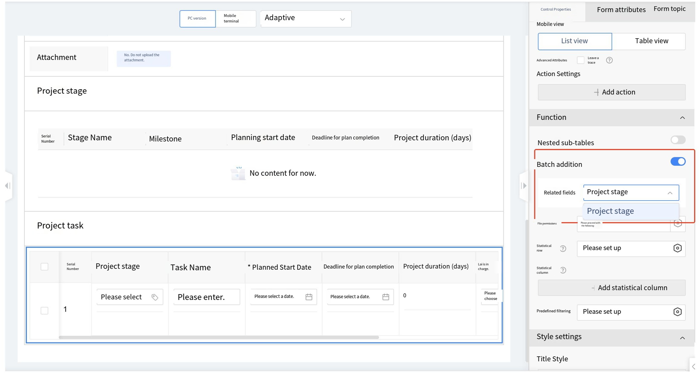
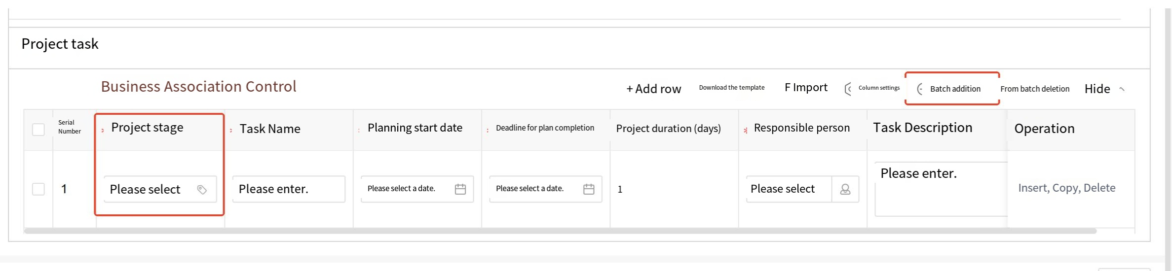
i) Row Permission: This configuration selects the directory picker widget fields in the detail table, primarily used for process approval to widget visibility of specific row data to designated approvers only. If the detail table contains directory picker widgets, and row permissions are set for that directory, and the default approver in the process design selects the directory picker widget from the detail table, then during front-end approval, only personnel listed in the corresponding row's directory can view that row's data.
j) Statistical Columns: Can calculate numerical values, amounts, and values from front-end widgets. Supported calculation modes: sum, product, average, maximum, minimum. The configuration method and results are shown in the figure below.
k) Statistical Row: Can calculate numerical values, amounts, and values from front-end widgets. Supported calculation modes: sum, product, average, maximum, minimum. The configuration method is the same as "statistics column".
l) Total: This item appears when both row and column statistics are set. Supported calculation modes: sum, average, maximum, minimum.
m) Mobile View: This configuration only takes effect on mobile devices. The default is data list view (Fields are displayed in columns from top to bottom); table view can be selected (The entire table is displayed horizontally, allowing users to swipe left and right to view form data); both views can be switched when configured.
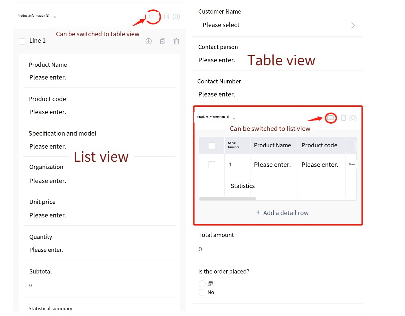
n) Trace: When advanced trace properties are enabled, adding, deleting, or modifying content in the detail table will generate trace records. Viewing permissions for trace records can be configured for departments, organizations, groups, positions, or individuals. If left unconfigured, only the creator can view them.
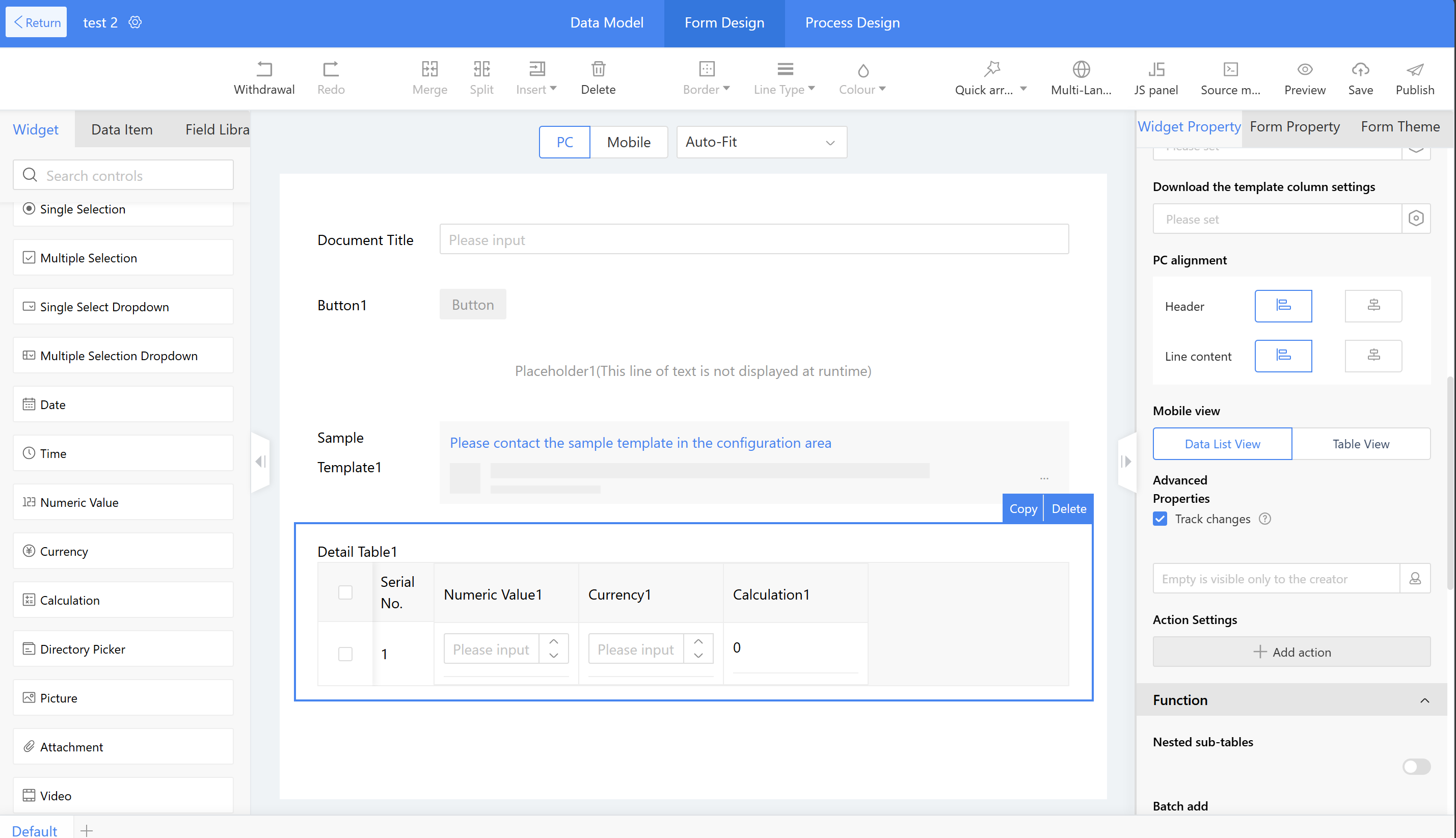
After the app runtime and creates new instance data, reopening it and clicking "Track changes" in the detail table allows users to view records of added or deleted data. Hovering over the trace icon shows modification records for the detail table data.

o) Detail Table Widgets - Grouping
When grouping is enabled, adjacent instances with identical data content will be merged into a single cell and displayed as a group; non-adjacent instances will not be merged.
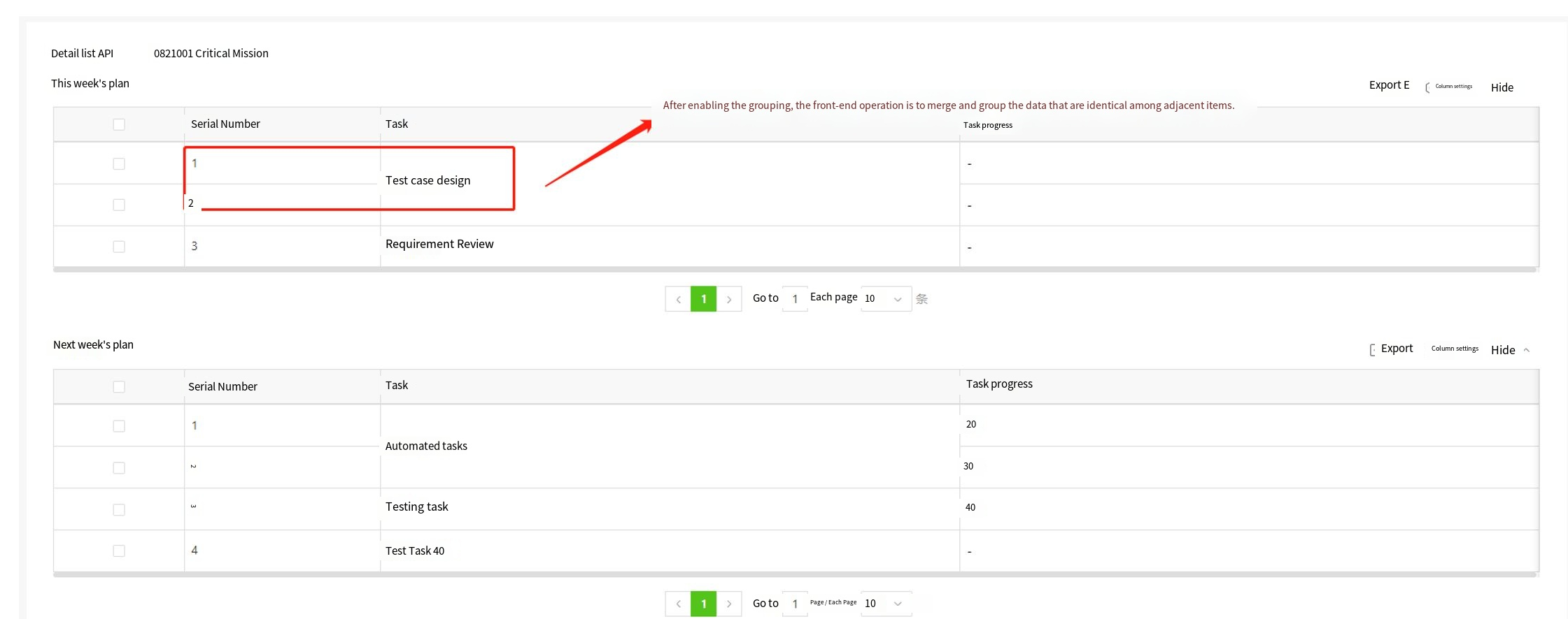
p) Detail Table Predefined Filter
Scenario: The approval process for abnormal clock-in records only needs to focus on reviewing the flagged data for approval.
Effect: During approval, approvers only see the exception data that requires attention. Once approved, all data can be viewed normally.
Configuration: The predefined filter for the detail table is configured with the node scope set to the corresponding approval node. The visibility scope is configured to show data with a status equal to the fixed value "abnormal."
2.9.2.8.2.2 Multi-header
Multi-headers are mainly used to categorize different data within a detail table.
Example Scenario: The company's HR department needs to track the statistics of new hires and departures by quarter each year.
Instructions:
Step 1: Drag the detail table widget into the layout and set the detail table title.
Step 2: Drag the multi-header widget into the detail table, set the title to "Q1," and configure the grouping quantity based on business requirements. If users input 2, each header can accommodate two widgets.
Step 3: Drag in two numeric value widgets and name them: "Number of New XXX" and "Number of YYY"
Step 4: Repeat Steps 2 and 3 to set up Q2, Q3, and Q4.
2.9.2.8.2.3 Multi-tab approval
Multi-tab approval supports grouping widgetcontent for display. Users can vote on the widget content of each tag. Only available on PC.
Example Scenario: In expert panel reviews, all project materials must be presented in separate tabs. Each expert is required to score and provide feedback on submitted items during the approval process. The review node supports the aggregation of differing opinions from multiple experts and determines the process direction based on the consolidated results.
Effect:
a) On the form filling page, applicants can switch tags to input information. After clicking "Save and Next," a checkmark will appear on the left side.
b) On the approval page, the current approver can see the Approve, Reject, Ignore, and Cancel buttons, as well as the synchronized approval status on the left.
Instructions:
Step 1: Drag the multi-tab approval widgets into the layout. On the right side, configure the tags by adding grouped tags (Which can include subtags) or standalone tags, then set the tag names and adjust their order by dragging.
Step 2: Select a tab and configure the widgets and display styles for that page.
Step 3: Configure the corresponding process on the process design page.
2.9.2.8.2.4 Steps Form
Steps forms support displaying and entering large amounts of information in stages based on business dimensions (Available on PC and mobile), reducing user input burden and improving user experience.
Application Scenario:
a) When filling out registration forms with extensive content, a steps form guides users through the process.
b) When filling out employee information forms with multiple fields, a steps form guides users through the process.
Example scenario: In a personal registration form, there are different sections requiring input, with extensive information to fill out. steps form are used to categorize the information.
Effect: A steps form guides users through the registration process, ensuring accuracy while reducing fatigue during data entry.
Instructions:
Step 1: Drag the "steps form" directly into the design area, then set the name to "XXX (User Registration)";
Step 2: In the property settings, modify the step names to "Input Account Information," "ID Information," and "Contact Information" in sequence; enable step validation, which requires completing all mandatory fields in each step before proceeding to the next step; supports modifying button names and their layout positions.
Step 3: In Step 1 "Input Account Information" of the steps form, drag in layout widgets, then configure other widgets and set their names and settings.
Step 4: Follow the steps above to configure Step 2 "Input ID Information" and Step 3 "Contact Information" of the steps form, set the theme rules, and click Publish.
2.9.2.8.2.5 Sequence
Based on business needs, users can customize the serial numbers for detail table data rows. Serial numbers are only supported in detail table configuration.
Instructions:
Step 1: Drag the sequence widget into the detail table to set the title and title style;
Step 2: Set the settings property - starting number.
2.9.2.8.2.6 Phone Number
When the current business operates internationally, phone numbers may need to display area codes. Using the phone number widget allows for selecting different country codes.
Instructions:
Step 1: International area code configuration, path "System Management > Internationalization Management > Basic Settings"
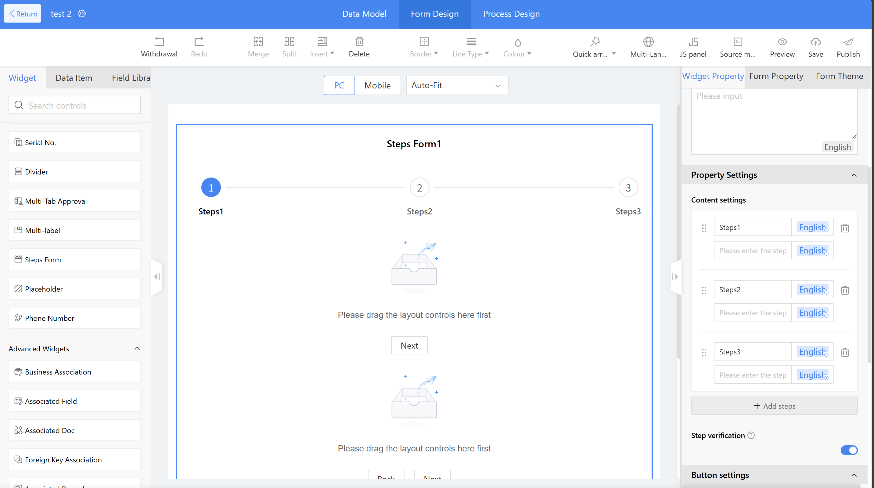
Step 2: Drag the phone widget into the form canvas area, where users can set the title and title style;
Step 3: Set the widget's settings - international area code. Turn on this switch to display the international area code, or turn it off to hide it.
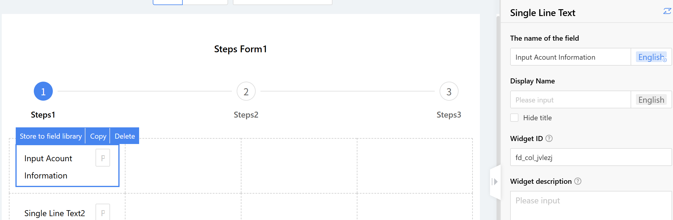
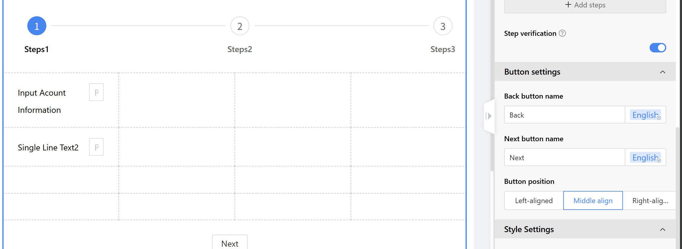
2.9.2.8.3 Advanced Widgets
2.9.2.8.3.1 Business Association
Business association is primarily used for data linkage between forms. For example, when filling out a stock-in application form, product information from the product information form can be obtained through the business association widget.
Application Scenario
a) When filling out a stock-in application form, procurement personnel can reference product information from the system, which facilitates unified product management and improves efficiency.
b) When sales personnel fill out customer follow-up records, they can reference customer information within the system, facilitating subsequent business analysis.
c) The business association classification form has added a new category navigation. The template in the category template table can be selected in the filter items of business association and can be used for category filtering (only supporting single-choice navigation list, multi-choice navigation list, single-choice navigation card, and multi-choice navigation card). Both mobile and pc terminals are supported.
Example scenario: When procurement personnel fill out a stock-in application form, product information from the system is automatically retrieved, enabling unified product management and improved efficiency.
Effect:
a) When filling out the stock-in application form, click the product name to open the product information list and select a product.
b) After selecting a product, the system automatically populates the product number and purchase unit price.
c) The business association form adds a category navigation feature. Templates in the classification template table can be selected in the business association filter options, enabling category filtering (Supporting only single-select navigation list, multi-select navigation list, single-select navigation card, and multi-select navigation card). Both mobile and PC platforms are supported.
Instructions:
Step 1: Create a form to store product information.
Step 2: Drag the business association widget into the form and set the settings name to "Product Name."
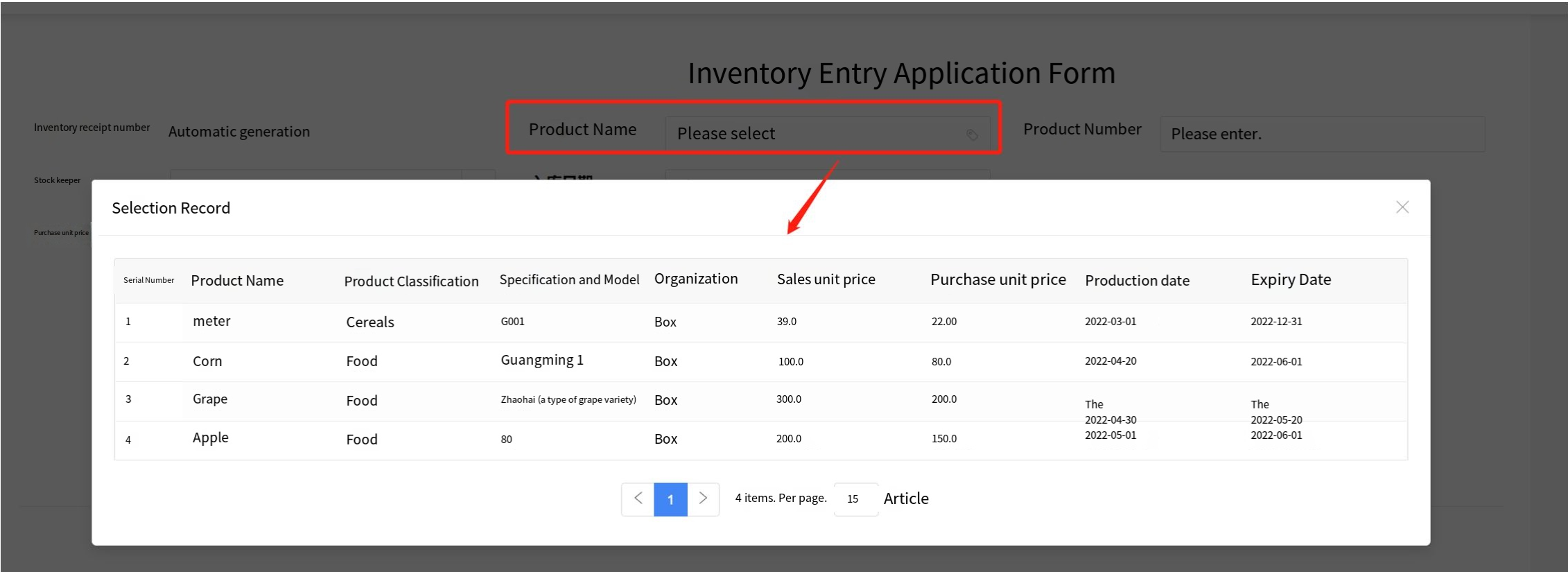
Step 3: Configure the associated form.
a) Associated form: Select the form to be associated and confirm whether the field comes from the main form or detail table of the associated form.
b) Display field: Select the content to be displayed in the front-end text box. For the product name, select the product name from the product information.
c) Display method: Specify how the option information of the associated form is displayed on the front end. The default method is a single-select list box.

d) Settings
i. Set filter options to allow filtering operations on this field in the front-end.
ii. Display items—set the display fields for the selection list. For example, products can be displayed by product name, product category, specification type, etc., as reference data for user selection.
iii. List penetration - Click the "Jump to view" action to view the corresponding product information.
e) Parameter passing settings: Fields from the product information table can be assigned to corresponding fields in the stock requisition form, such as mapping the product ID and purchase unit price from the product information table to the requisition form fields.
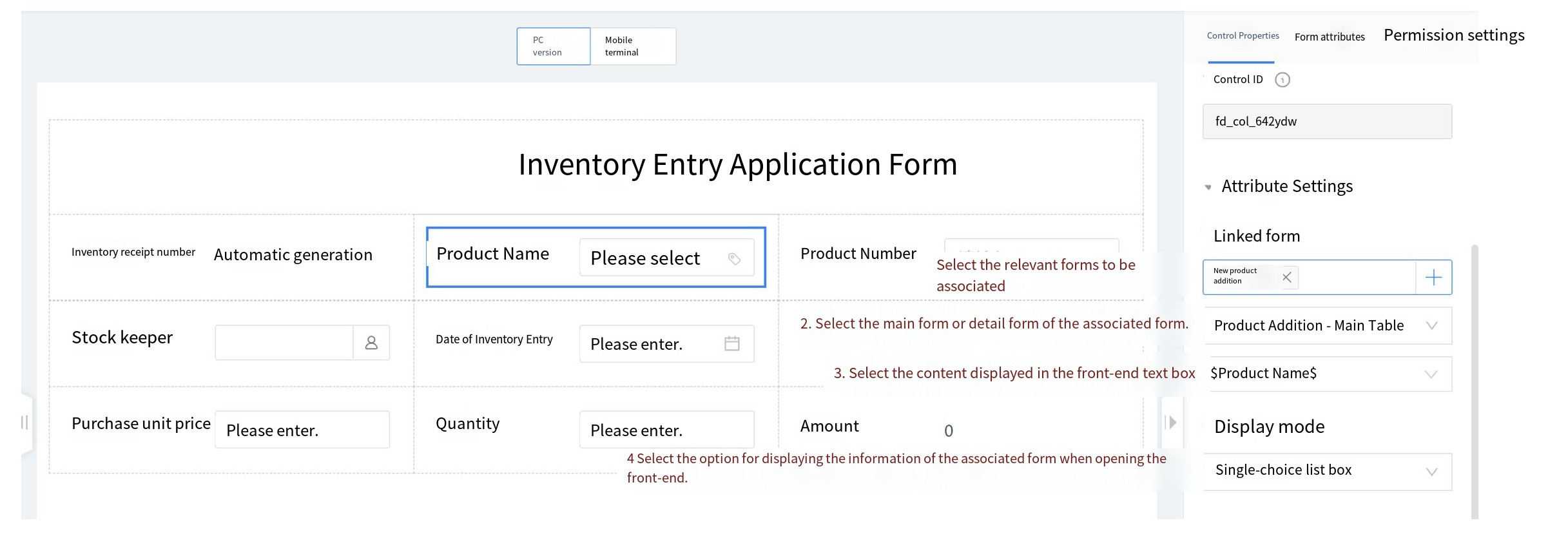
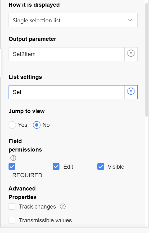
Setup Instructions:
a) Display method: The Selection Method when Associating Table Data. Supported methods: Single selection, multiple selection, radio button, checkbox, dropdown.
b) Output parameters: Mapping Relationship between the Associated Form Fields and the Current Form. After selecting data, assign the selected data values to the current form field. For example, after selecting a product, assign the product's grade, origin, etc. to the current form. Current form fields, each field can only be selected once.
i. Current form field parameter types: single line text, multi-line text, single selection, multiple selection, single-select dropdown, multi-select dropdown, date, numeric value, currency, toggle, directory picker. Supports selecting fields in both inactive and active states, with disabled fields filtered by default.
ii. Associated form field parameter types: Only active data items are supported for selection. When assigning values to fields, ensure they correspond to the types of the associated form fields. For details, please refer to the following table.
| Current Form Field | Associated Form Field |
|---|---|
| Single-line Text | Single line text, single selection, multiple selection, dropdown, multi-select dropdown, date, numeric value, amount, toggle switch |
| Multi-line Text | Single-line text, multi-line text, single selection, multiple selection, single-select dropdown, multi-select dropdown, date, numeric value, currency, toggle switch |
| Single selection | Single selection, Single dropdown |
| Multiple selection | Single selection, Multiple selection, Single dropdown, Multiple dropdown |
| Single dropdown | Single selection, Single dropdown |
| Multiple dropdown | Single selection, Multiple selection, Single dropdown, Multiple dropdown |
| Date | Date |
| Numeric Value | Numeric, Amounts |
| Currency | Numeric, Amounts |
| Directory Picker | Directory Picker |
| Toggle | Toggle |
c) Jump View: After configuring the jump view, on the front-end page, users can click the display field of the associated form to jump to and view the corresponding associated form view.
d) Data Source Settings: configure which data from the associated form can be displayed for selection. Click "Settings" to input the settings page.
i. Data filtering: Display data that meets the specified criteria. Click "Add Condition" to add multiple conditions. Select "Meet All Conditions" to connect conditions with "AND"; select "Meet any condition" to connect conditions with "OR".
ii. Data sorting: Rules for sorting data display.
iii. List settings: Set the style of the pop-up list box. Display this item when the selection mode is "Single-select list" or "Multi-select list".
- Filter options: fields in the list box, multiple selections are allowed;
- Display items: The list box shows which fields of the associated form are displayed;
- List drill-through: Clicking the list data in the list box will navigate to the view, allowing selection of a specific view from the associated form.
- Permission filtering: By default, "Readable" is selected to widget whether the column data in the list box is displayed to ordinary users.
2.9.2.8.3.2 Associated Field
The associated field is used in conjunction with business association widgets to display the associated table fields from the business context. When the content of the associated table fields in a business association changes, the related field content will also update in real-time.
During asset inventory management, the "Storage Location" field from the inventory task table needs to be displayed.
Effect: When selecting data from the inventory task in the asset inventory table (business association implementation), the "Storage Location" (associated field) is displayed on the page. When the "Storage Location" in the inventory task is modified, the asset inventory table will display the updated storage location.
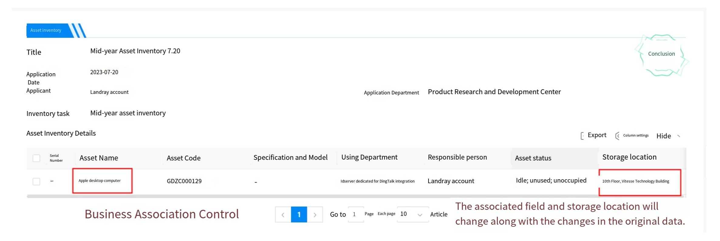
2.9.2.8.3.3 Dynamic Widgets
Dynamic widgets are primarily used to reference data from other forms or third-party datasets. First, configure the form from other applications or third-party datasets, then configure the corresponding public widgets. Dynamic widgets reference public widgets to retrieve the relevant data.
Example Scenario: When filling out contract management, sales personnel need to retrieve customer information from the customer ledger application.
Effect:
a) When clicking dynamic widgets on the homepage, a customer information list appears for user selection.
b) After selecting a customer name, the system automatically retrieves the customer status.
Process Flow:
a) Configure the dataset and associate the data;
b) Configuration public widgets and settings the data list display method.
c) Retrieve data through dynamic widgets within the form.
Instructions:
Step 1: Open the dataset creation new page by navigating through the Low-Code platform > form management > dataset management. Set the title and encoding settings, which supports auto-fill or custom input.
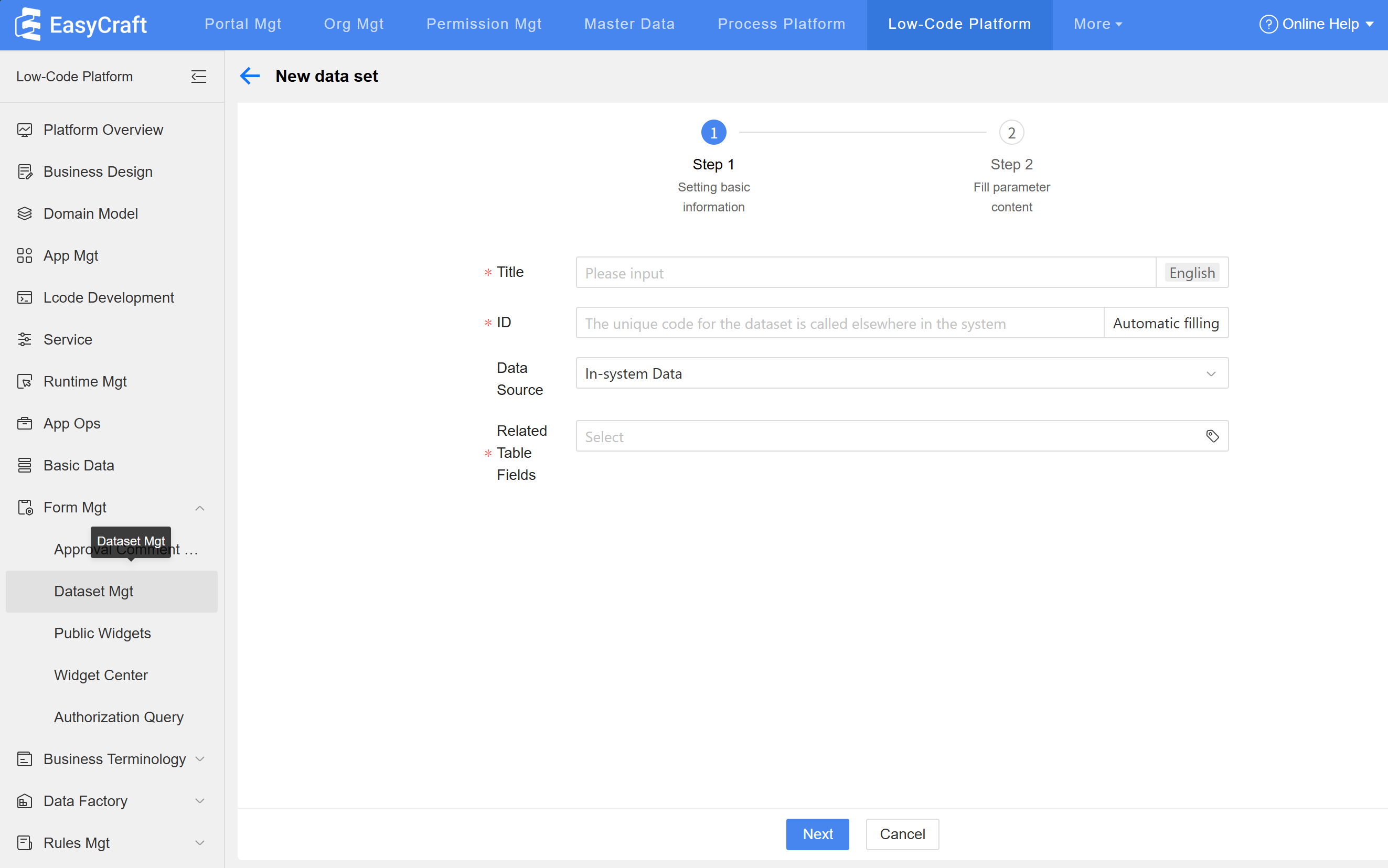
Step 2: Select "System Data" as the data source, click "Associate Form," choose the Low-Code platform, and locate the corresponding application and form.
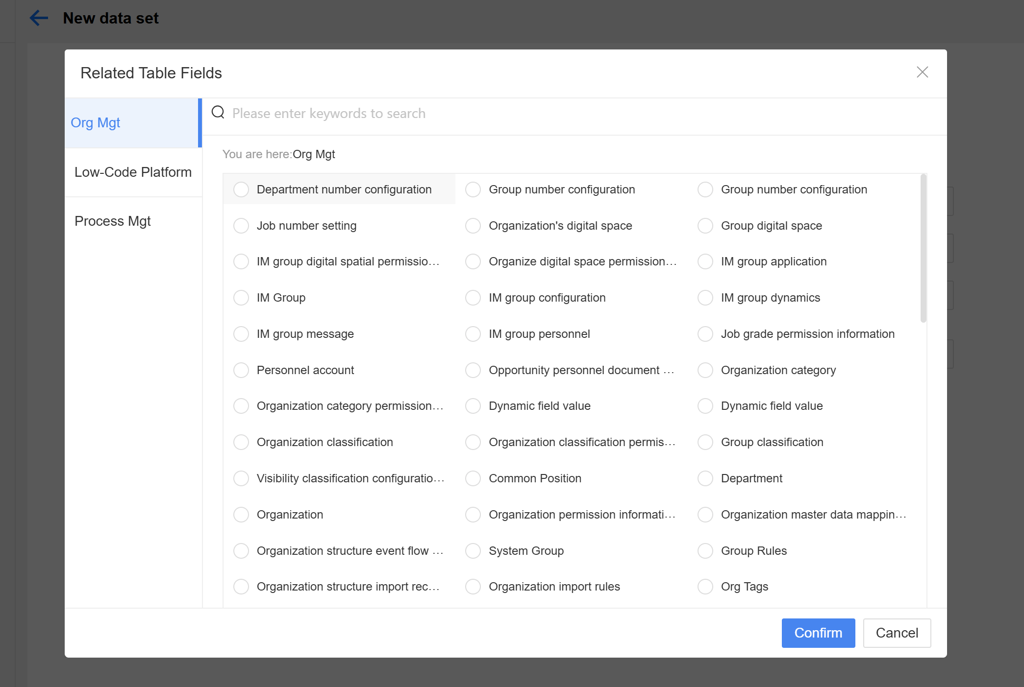
Step 3: Set the "Return Value," which determines the fields visible in the dynamic widgets list on the homepage, then click Submit to complete the dataset settings.
Step 4: Open the new public widget page via the path: Low-Code platform > Form management > Public widgets.
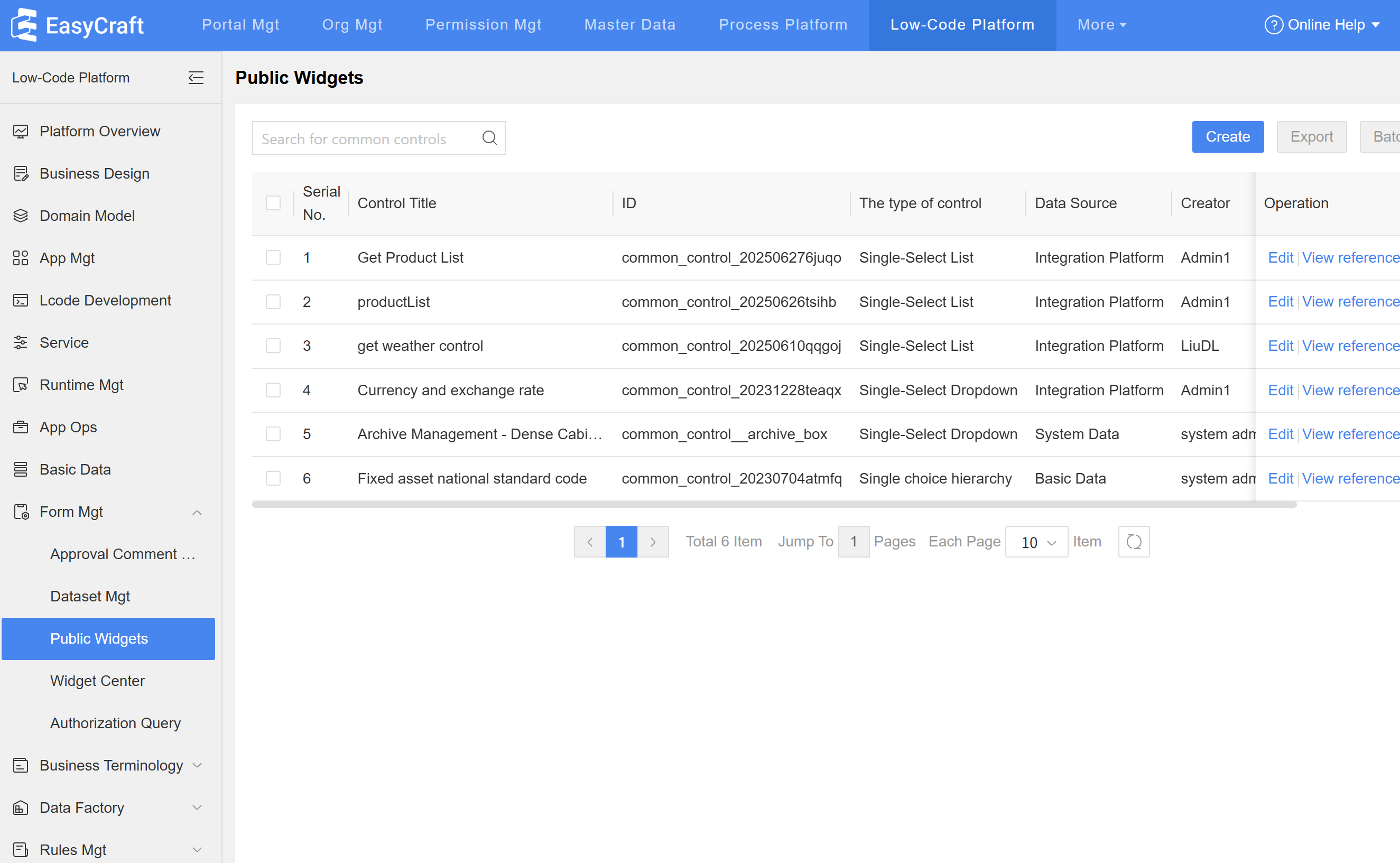
Step 5: Set the title and encoding information. The encoding supports auto-fill or customization. Select the display method for the homepage widget—single-select list.
Step 6: Select the dataset and locate the "XXX(Customer Information)" settings in Step 3 using system data.
Step 7: Fill in the parameters for public widgets:
a) Set the display field to "Customer Name," which is the content shown in the dynamic widgets text field. Also set the actual value to "Customer Name."
b) Set the settings field, which is the field shown in the Homepage list for dynamic widgets-related data. The selectable range is the return values set in the dataset.
c) Set the "search field," which is the field that can be filtered on the Homepage page. Configure the "Pagination" settings to determine whether the information is displayed via pagination on the Homepage.
Step 8: Drag dynamic widgets into the layout and set the title name in settings.
Step 9: In the public widgets settings, select the "Customer Information" widget configured in Step 7.
Step 10: Set the output parameters to assign the "Customer Status.Name" from the customer information to the "Customer Status" field in the current table. After completing the configuration, click the "Publish" button.
Other Settings: For the use of input parameters, please refer to2.12.4.1 the Application Example.
2.9.2.8.3.4 Basic Data
Basic data is primarily used for pre-configuring and sharing form fields in Low-Code applications. As part of Low-Code public data, it can be preset and called by forms across different applications as needed.
Application Scenario:
a) Employee records often require information such as "ethnicity" and "university," which can be pre-configured for use by HR systems.
b) Customer management typically requires fields such as "Customer Type," "Industry," and "Company Nature," which can be pre-configured for use by contracts and CRM systems.
Example Scenario: In an employee information record, the employee's ethnic background must be documented. To maintain data format consistency and enable future data analysis, ethnic information must be uniformly managed.
Implementation Effect: When filling in personnel information records, ethnic information can be directly queried and selected.
Instructions:
Step 1: Drag the basic data widgets into the layout, set the title and title format;
Step 2: Select the corresponding data source and display method. The display methods supported are: single selection list box, multiple selection list box, radio button, checkbox, single selection dropdown, and multiple selection dropdown. The operation is complete. (Note: For basic data configuration, please refer to2.11.3 the basic data configuration method.)
Cascading settings: When the basic data has multiple levels, users can select sub-level data through cascading configuration. If employee activities have multiple levels, only the last level needs to be displayed on the front end. The configuration method is as follows:
a) Set basic data for multi-level data items;
b) On the form page, when the display method is set to single selection dropdown or multiple selection dropdown, "Cascading" can be configured. The selectable levels (number of optional levels) and display levels (display method of levels) can be set according to business scenarios;
2.9.2.8.3.5 Main Data
Since main data serves as the enterprise's benchmark data, with a single, accurate, and authoritative data source and high business value, it is the data standard for executing business operations and decision-making analysis in enterprises.
Application Scenario:
a) The sharing of employee main data ensures the accuracy and uniqueness of employee information in various scenarios such as attendance management and payroll processing.
b) Unified main data provides a hierarchical structure for categorizing purchased materials, facilitating centralized procurement and cost savings.
c) Customer information main data provides a single source, supporting various operational and analysis applications in a unified manner.
Example Scenario: Sales personnel can retrieve customer information from main data in customer follow-up records, facilitating later operational analysis.
Effect: In the customer follow-up record table, clicking the customer name will display the customer information from the main data. Selecting the customer name will automatically populate the customer number.
Instructions:
Step 1: Drag the main data widget into the layout and modify the title name.
Step 2: Configure the display method of the front-end data source, select the main data type, and set the display value and selection page.
Step 3: Configure outgoing parameters. After selecting the customer name, the parameters are automatically returned to the form to improve data entry efficiency.
Other Settings – Filter Conditions: Set the value of the form field to be passed into the main data as a query condition to filter the corresponding main data.
2.9.2.8.3.6 Custom Page
Use code to display pages, supporting HTML, JavaScript, and CSS snippets.
Example scenario: To highlight the "Attend the meeting" option in the meeting RSVP form, use a custom page to change the option to blue.
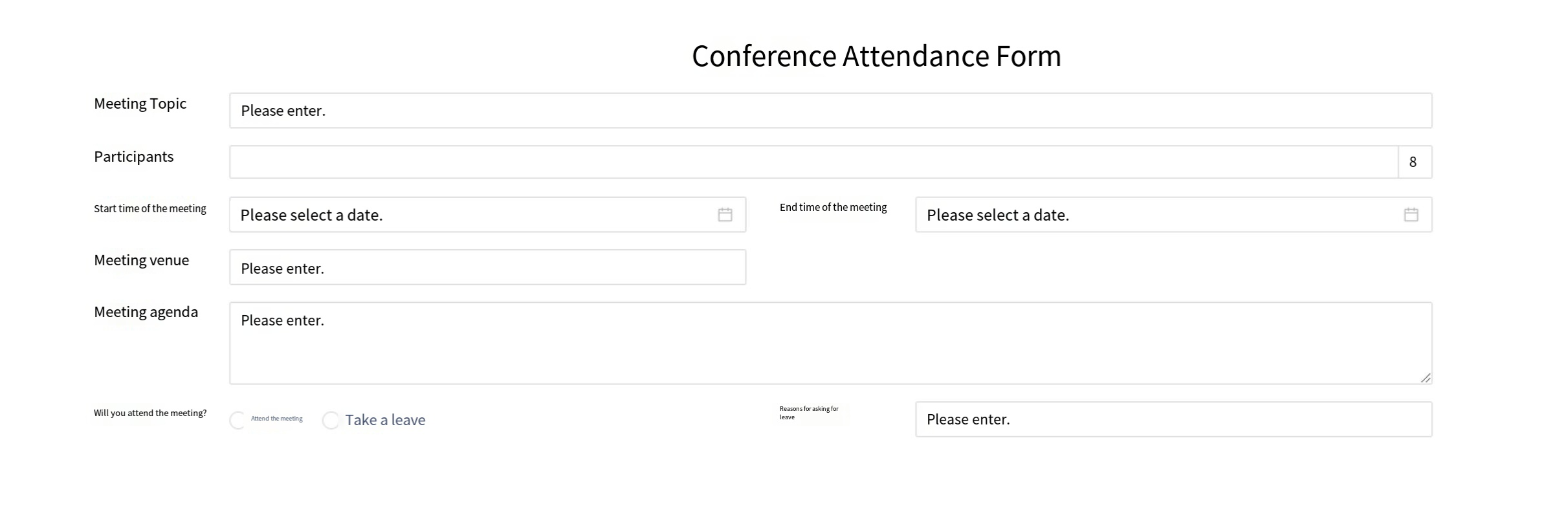
Instructions:
Step 1: Drag the "custom page" widget into the corresponding widget's layout and name it.
Step 2: Click "Settings" in the settings, and input the corresponding code on the settings page.
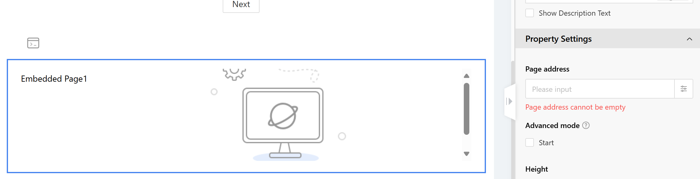
2.9.2.8.3.7 Embedded Page
Embedded pages are mainly used to embed web pages within a form and display them in the form.
Application Scenario:
a) In online stores, embedded pages provide access to ecosystem partners;
b) On the car insurance registration page, embed a partner's car insurance purchase webpage to allow individuals without car insurance to easily purchase it.
Example Scenario: On the car insurance registration page, embed a partner's car insurance purchase webpage to allow uninsured individuals to easily purchase coverage.
Effect: Embed a car insurance purchase page at the bottom of the vehicle insurance registration page.
Instructions:
Step 1: Drag the embedded page into the layout and set the title to hidden.
Step 2: Input the URL in the "Page Address" field, enclosed in English double quotation marks. Users can also configure the display height on the homepage.

2.9.2.8.3.8 Approval
Approval widgets are primarily used for configuration of approval operations or display of data related to the approval process, such as approvers, approval time, approval comment, etc.
Application Scenario:
a) In asset procurement, leaders can directly perform approval operations on the form using approval widgets. The approval widgets can also display the leader's approval comments for the asset application within the form.
b) In the cultural assistance application for labor unions, approval widgets can display the approval comments of leaders and fee administrators on the form.
In asset procurement, leaders can directly perform approval operations on the form using approval widgets. Approval widgets can also display the leader's approval comments for the asset application within the form.
Effect:
a) During the approval process, the front-end form page will display the approval actions of the current approver.
b) After the approval process is completed, the form will display the approval comments.
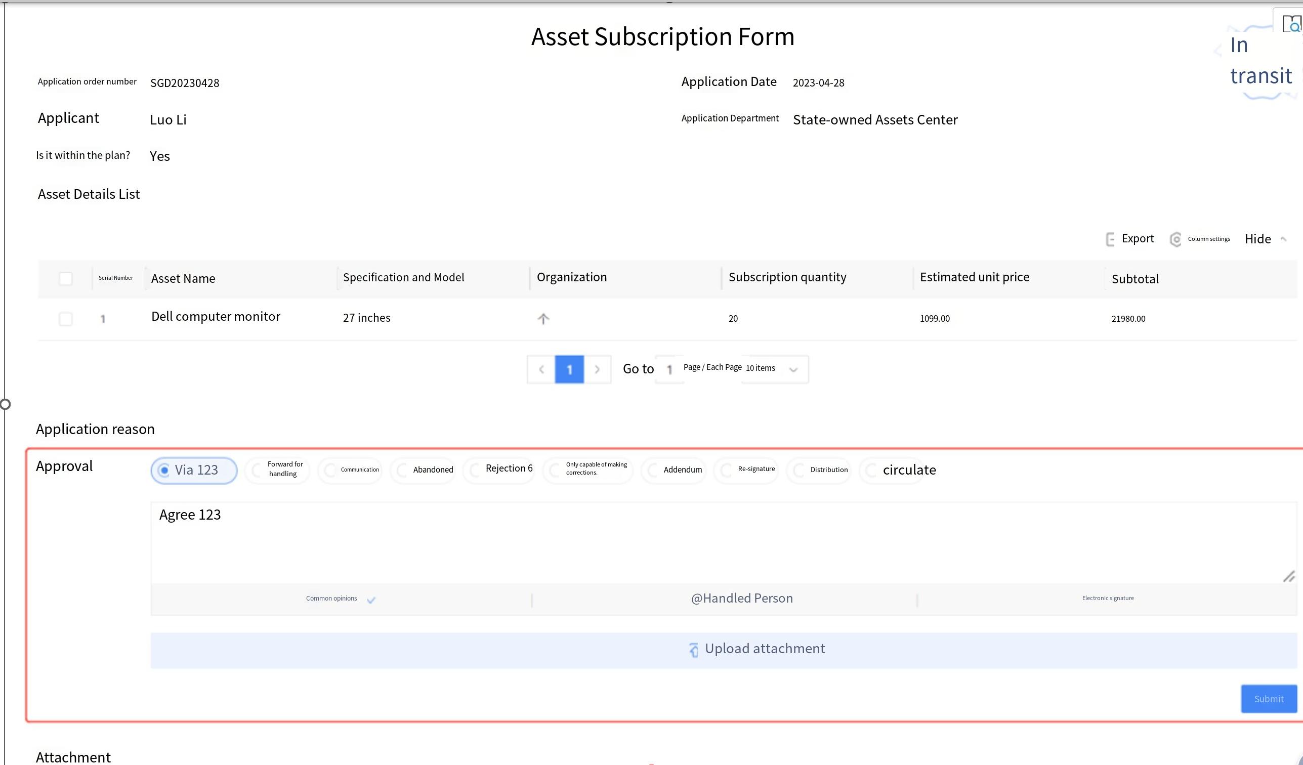
Instructions:
Step 1: First, complete the process design configuration to bind approval widgets to the approval node.
Step 2: Drag the approval widgets into the layout, set the settings, and enable advanced approval with approval comment display. The approval actions are only for the current processor. Basic approval includes only "approve" and "reject" actions, while advanced approval follows the operation template of the node in the process template.
Step 3: Configure the "Approval Comment Settings." Based on your business scenario, drag and drop the required fields into the template, and the preview will display on the right. Supports comment filtering, comment sorting settings, and drag-and-drop field layout settings.
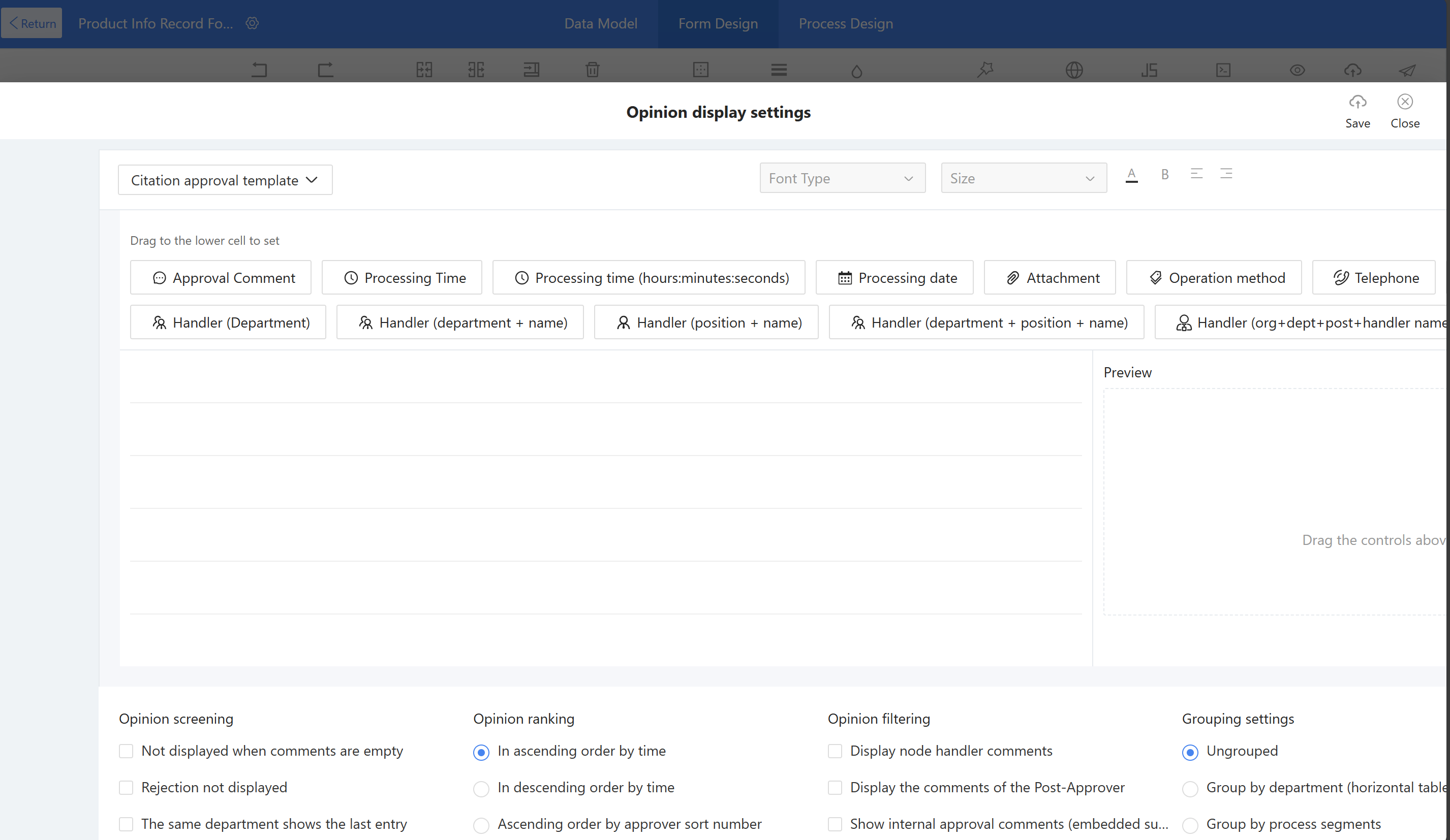
Step 4: Configure the application scope, supporting settings by process node, handler (directory picker), handler (formula definition), and node name matching. It also supports adjusting the height and width of the homepage approval widgets content display.
2.9.2.8.3.9 Associated Doc
Associated documents are primarily used to link other forms or relevant processes within a form, enabling users to conveniently track the approval progress of related processes.
Application Scenario:
a) During project phases, link the project risk approval process through associated document widgets to promptly mitigate project risks.
b) In supplier ledger management, associate the supplier onboarding process with the associated documents to promptly track the progress of supplier integration.
Example Scenario: During project phases, link the project risk approval process using the associated document widget to promptly manage and mitigate risks.
Effect: On the edit page of project phases, users can link processes to view the approval process for project risks associated with the phase.
Instructions:
Step 1: Drag the Associated doc into the layout, set the title and title format.
Step 2: Configure the "specify the scope" for related processes, specifying that only flows from the "XXX(Process Mgt)" application can be selected.
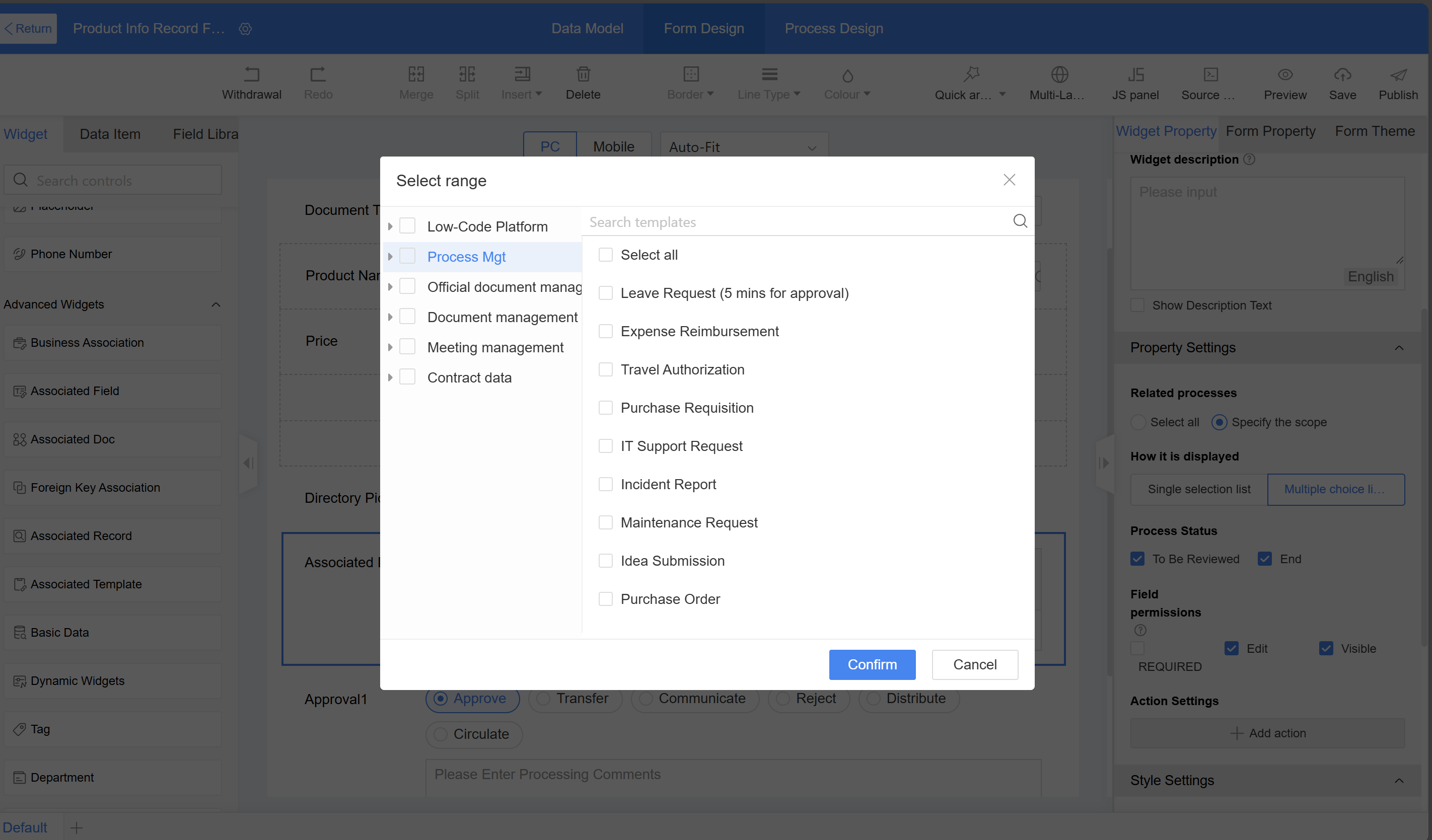
Step 3: Configuration the display mode for related processes—multi-select list box, allowing multiple selections; set the selectable process statuses.
Setup Instructions:
a) Related Process Scope: Configurable Associated Processes. For example, selecting "All" allows users to choose all processs from the Low-Code platform and flow management module; specifying a range lets users set the selection scope for the Low-Code platform (such as a particular application or form) or designate a specific category in process management.
b) Display Mode: Required; options include single-select list box and multi-select list box, defaulting to multi-select list box.
c) Process Status: Required, options include pending and completed, with multiple selections allowed.
2.9.2.8.3.10 Department
The department is used to select units or unit groups from Unit Management (located in Application Management, distinct from the organizational structure).
Application Scenario:
a) In supervision tasks, users need to select the receiving unit, where users can choose either a unit or a unit group through government departments.
b) In official government documents, it is necessary to select the receiving unit, where users can choose either an individual unit or a unit group through government departments.
Example Scenario: Configuration of the receiving unit in supervision tasks.
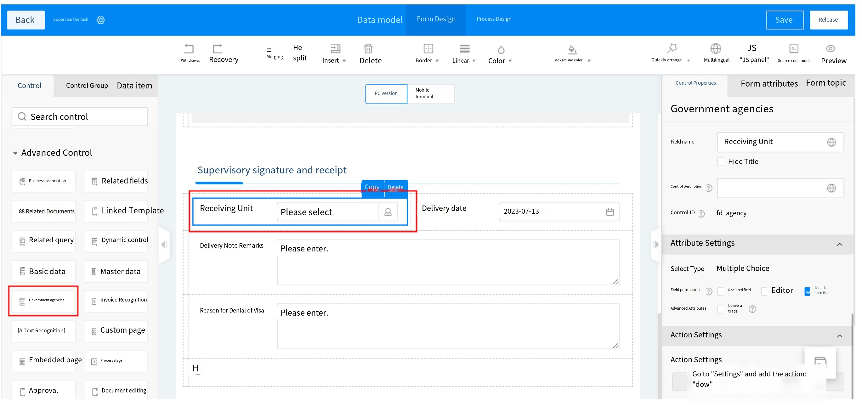
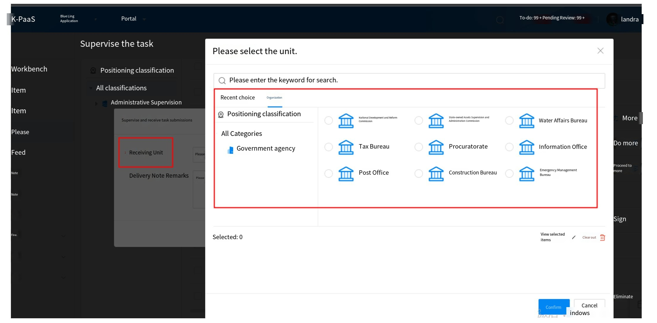
2.9.2.8.3.11 Invoice Recognition
Application Scenario: Building an invoice recognition and input module where customers need to quickly input invoice information. By leveraging the image recognition capability of the OCR service, uploading an invoice file automatically extracts the invoice information, reducing manual entry and improving efficiency.
Example Scenario: In expense reimbursement, when submitting a reimbursement form, uploading an invoice file automatically retrieves the invoice information, eliminating the need for manual entry by users.
Effect: Upload an invoice file (e.g., PDF, JPG, JPEG, or PNG), and the invoice information in the file is successfully recognized and populated into the fields. Supports recognition of multiple invoices (A single PDF file with multiple invoices).
Instructions:
Step 1: First, confirm that the Ticket Assistant integration and text recognition capability are enabled in the integration platform. Go to Integration Platform > Integration Components > OCR Service Integration and verify that the electronic invoice recognition feature in the corresponding OCR service is enabled.
Step 2: Create a form in the corresponding Low-Code application, drag the invoice recognition widget into the form, and set the invoice type.
Step 3: Click "Create New Detail Table and Bind Fields," confirm the addition of the new detail table, and input the data filling rules interface. Users can modify the widget ID, as well as customize the deletion or selection of additional fields for the current invoice type. Save and publish the form after completing the settings
Alternatively, users can add widgets (to the main table or detail table) in the form canvas area, then click "Settings" and select the table. Widgets that need to establish association rules with the invoice recognition widget must be on the same table, such as all in the main table or all in the same detail table.
Step 4: After the form is successfully published, open the application homepage to create a new instance. On the creation interface, upload an invoice file (such as PDF, JPG, JPEG, or PNG) in the invoice recognition widget. The invoice information from the file will be successfully extracted into the corresponding fields. Supports recognition of multiple invoices (A single PDF file with multiple invoices).
2.9.2.8.3.12 Text Recognition
The text recognition widget can identify content on images and automatically populate it into form fields. Currently, it supports the recognition and auto-filling of ID cards, bank cards, driver's licenses, vehicle licenses, and business licenses.
Application Scenario:
a) When onboarding new employees, their identity information must be entered into the system, which requires collecting their ID card details.
b) When onboarding new employees, it is necessary to obtain their salary card account number and bank name.
c) For vehicle management, when registering driver information, the driver's license details must be obtained.
d) For vehicle management, when registering vehicle information, the vehicle's license information must be obtained.
e) When managing suppliers, it is necessary to uniformly collect and organize the suppliers' business license information.
Instructions:
Step 1: First, confirm that the Ticket Assistant integration and text recognition capability are enabled in the integration platform. Go to Integration Platform > Integration Components > OCR Service Integration and verify that the personal ID card recognition feature in the corresponding OCR service is enabled.
Step 2: Create the corresponding form in the Low-Code application, drag the text recognition widget into the form, and select ID card as the recognition type.
Step 3: Click "Recognition Rules," check the field, add a field and assign values, then save and publish the form after completing the settings.
Step 4: After the form is successfully published, open the application homepage to initiate a new instance creation. Input the creation interface, upload an ID card image in the text recognition widget, and successfully extract the ID card information into the fields.
2.9.2.8.3.13 Associated Record
Associated records are used to view data from other forms within the current form, allowing users to centrally view multi-form data in a single form.
Application Scenario:
View information such as project plans, phases, tasks, risks, changes, and status in the project ledger table;
Widget Configuration:
a) Related Form: Link other forms (Target forms) that need to be displayed in the current form.
b) Data presentation: By default, multiple entries are displayed in a list format; single entries are displayed as flat fields, with customizable display options.
c) Display fields: Set the fields to be displayed from the related form, with options for filtering and sorting.
d) Data filtering: Use filter fields to display data associated with the current form.
2.9.2.8.3.14 Associated Template
Associated templates are primarily used to link templates between category template models and simple category models. For example, when creating classified form data in an action flow, users can specify which template to use by combining associated templates with configuration items.
Application Scenario:
a) After project approval is granted, configure the associated template in the action flow to add new project ledger template data.
2.9.2.8.3.15 Document Editor
The document editing widget primarily provides WPS attachment integration with online editing functionality, enabling users to edit document content during runtime without being limited to submitting content through uploaded attachments.
Application Scenario:
a) During project phases, when editing a project form, users can modify attachment content or replace attachments in real-time on the editing interface, or import new document information.
Instructions:
Step 1: Enable the WPS integration service in the MK system to provide document editing capabilities.
Step 2: Drag the document editing widget into the layout, set the title and supported document formats, and configure the import function and style.
2.9.2.8.3.16 Process Stage
The phase widget is used to display the different approval stages of a process. It divides the nodes in the flowchart into distinct phases, where each phase may contain one or multiple nodes. When the process reaches a specific node, its corresponding phase is highlighted, visually presenting the approval status on the form.
Application Scenario:
a) In the procurement process, phase widgets can display the approval stages within the form.
Instructions:
Step 1: First, configure the process in the process design page to bind process stage nodes through the phase widget.
Step 2: Drag the process stage widget to the canvas area, set the title, configure the process stage widget settings, select the widget category, and add stages along with their included phases. Manual addition refers to configuration of properties by manually binding nodes to phases, while automatic retrieval means obtaining data from the swimlane diagram of the flowchart in read-only mode (uneditable). Each time users switch to the form design page, the latest data is automatically retrieved from the flowchart.
2.9.2.8.3.17 Foreign Key Association
Foreign key association is primarily used for data relationships between forms. When associated data changes, the foreign key association displays the latest modified values. Example: When selecting the department for a new hire, the foreign key association widget can retrieve relevant department information.
Application Scenario
a) When entering new hire information, department details must be selected to maintain the integrity of the organizational structure.
b) When leaders check the department's personnel information, the latest staff details are displayed.
Instructions:
Step 1: Create a department table to store department information and an employee information form to store personnel details.
Step 2: In the department information form, drag in the foreign key association widget. Set the widget name to "Parent Department," associate it with the department table, and configure the relationship as many-to-one: multiple child departments belong to one parent department.
Step 3: In the employee information form, drag in the foreign key association widget. Set the widget name to "Employee's Department," associate it with the department table, and configure the relationship as many-to-one: multiple employees belong to one department.
Step 4: Configure the associated form.
-
Associated table: Select the form to be associated, and confirm whether the field comes from the main form or detail table of the associated form.
-
Associated field: If the associated table is the main table, the associated field defaults to using theme rules as the display field.
-
Display mode: Confirm the display method of the option information for opening the associated form in the Homepage. The default method is dropdown mode.
a) List Settings:
i. Display method: Default is table, with a pop-up window displayed in table format during runtime; for image display, the card option is available.
ii. Column fields: configure the fields displayed in the pop-up window during runtime.
iii. Search scope: configure the fields that support search in the pop-up window during runtime.
iv. Data sorting: configure the display order of data in the pop-up window during runtime.
v. Filter options: configure the fields for configuration in the pop-up window during runtime.
vi. Data filtering: Configure which data is displayed in the runtime pop-up window; data that does not meet the specified conditions will not be shown.
vii. View details: Disabled by default. When enabled, users can click on instance data in the pop-up window during runtime to navigate.
viii. Default sorting: If empty, it defaults to descending order by creation time. Once set, it will first sort by the first sorting item by default. If the first sorting item has the same attribute, it will then sort by the second sorting item, and so on.
b) Navigation settings: When departments have multi-level relationships, users can configure navigation settings to connect data and enable hierarchical display.
Step 5: In the department information form, drag in the foreign key association widget, set the widget name to "Department Employees," select the employee table as the associated table, and configure the association as one-to-many: one department has multiple employees (reverse relationship). For the associated field, select the foreign key association field in the employee table: the department to which the employee belongs.
The department assigned to a person in the personnel information will be adjusted based on business needs. When a person's department changes, the "Department Employees" section in the department table will display the updated employee list.
2.9.2.8.3.18 Tag
The tagging function can be used to categorize and differentiate business requirements.
Instructions:
Step 1: Configure the corresponding business tag data in the tag mechanism, path: "System Management - Tag Configuration"
Step 2: Configure the tag widgets by dragging it to the canvas area, where users can set the title and title style.
Step 3: Set the widget properties - optional types. Configure the corresponding tag categories based on business needs. After configuration, only tags from the corresponding group can be selected. This field is optional.
Settings
Create Tag: When enabled, specified front-end users are allowed to create tags.
2.9.2.8.4 Layout Widgets
2.9.2.8.4.1 Basic Layout Widget
When designing forms on the PC, users can create and style them by dragging and dropping layout elements. Layout widgets are divided into four types: one row two columns, one row three columns, one row four columns, and multi-row multi-column. Multi-row multi-column support up to 8 columns and 100 rows.
It also supports flexible layout, allowing users to design the form style directly by dragging widgets without placing them in a layout first. In the widget properties, the adjustable width can be evenly distributed across up to 4 columns.
2.9.2.8.4.2 Multi-tab Layout
The multi-tab widget is primarily used to set multiple tag layouts on the same page, enabling information to be viewed by different modules.
Application Scenario:
a) In customer ledger management, where customer information is extensive, multi-tag tabs can be used to browse customer information by page.
b) In merchant profile information management, where the amount of information is substantial, multi-tag browsing can be used to view merchant profile information by page.
Example Scenario: When there is a large amount of customer information to register, it should be viewed across separate pages organized into three modules: basic information, financial information, and contacts.
Effect: Click on different tags to view content from different modules.
Instructions: As a type of layout widgets, the layout and widgets of each tag can be customized, and tags can be switched by clicking during runtime.
Step 1: Drag multiple tags directly into the design area, then set the tag names in the property area on the right to Basic Information, Financial Information, and Contacts.
Step 2: Select the corresponding tag, then drag layout widgets or other widgets into the current tag page to design the form display content for each page.
2.9.2.8.4.3 Collapsible Group Layout Widgets
The group collapse widget is primarily used to set a collapsible and expandable layout style on the page, allowing different information to be viewed by collapsing or expanding groups.
Application Scenario:
a) In HR personnel management, HR registers and manages employee records. When different types of personnel information need to be categorized and grouped for statistics purposes, a collapsible group layout can be used for classified registration. For example, if an approval process is required and the approver does not need to review educational background, the education group can be set to collapse by default in the settings.
Example Scenario: When there is a large amount of personnel information to register, it should be categorized into basic information, personnel evaluations, and education and work experience.
Effect: Group registration based on different types of personnel information. During the approval process, the education history group is collapsed by default; clicking the group header expands or collapses the group content.
Instructions: As a type of layout widgets, the layout and widgets within each group can be customized. During runtime, the group header can be clicked to collapse or expand the section.
Step 1: Drag the group fold directly into the design area, then set the tag names in the property area to Personal Evaluation, Education Experience, and Work Experience. It can be bound to approval nodes and configured to expand or collapse by default.
Step 2: Select the corresponding group fold, then drag other widgets into the current layout page to design the form display for each page.