Chapter 8: Media Library
This chapter covers media management, tag management, uploading images, audio, video, and page components.
8.1 Media Management
Media Management only includes images, icons, audio, video, and other media uploaded by the user. These are used as sources for portal configuration, login page configuration, and content management configuration.
8.1.1 Tag Management
Users can create new tags in Tag Management to categorize media. These tags can be used when uploading media.
8.1.2 Uploading Images and Icons
Media Management: Uploading and Editing Images
-
Enter Media Management, click Upload, and select one or multiple images.
-
After selecting multiple images for upload, you can bind tags to the media.
Note: Media names and tags are important for searching and locating corresponding images.
Click Confirm and wait for the images to upload successfully. -
Edit uploaded images by cropping them to the appropriate dimensions.
Tip: The method for uploading icons is the same as uploading images.
8.1.3 Upload Audio
Audio Upload and Management
-
Go to Material Management, select Audio, and click Upload.
-
Click or drag to upload single or multiple audio files.
Supported formats:mp3,ogg,wma,flac.
Note: The maximum size for a single file is limited by the attachment size parameter in System Management > Attachment Configuration.
The number of files uploaded at once cannot exceed 5. -
Edit uploaded audio files.
-
You can edit the audio name, add keywords, and file descriptions.
Files can be searched by name or keywords.8.1.4 Upload Video
Video Upload and Management
-
Go to Material Management, select Video, and click Upload.
-
Click or drag to upload supported video formats.
Supported format:mp4.
Note: Single file size must not exceed 200MB.
The number of files uploaded at once cannot exceed 5. -
Edit uploaded video files.
-
You can edit the video name, add keywords, and file descriptions.
Files can be searched by name or keywords.8.2 Page Components
Details about page components Next Page.
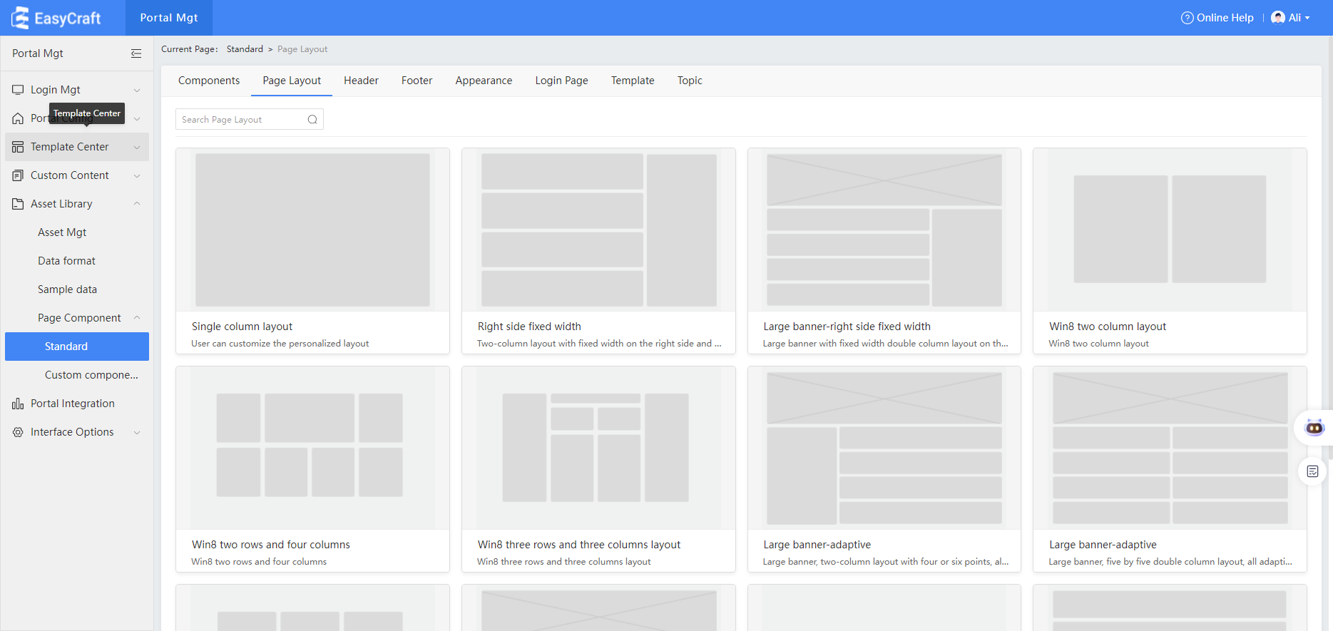
8.2.1 Standard Components
Page Components Overview
Page components include basic elements provided by the system for the portal, such as:
- Component presentation
- Appearance
- Page layout
- Header
- Footer
- Login page
- Templates
- Design and appearance
Features
- In Page Components, you can preview the appearance and presentation of these components.
- View sample data formats directly from the preview interface.
- Under the Design tab, view the system's design and appearance.
- Use the source filter to display both built-in and custom design lists.
Example
8.2.2 Custom Component Categories
Custom Components in the Material Library
1. Adding a New Category
- In the Material Library's Custom Components, click Add Category in the left category list.
- The default name for a new category is Component Library.
2. Categorizing Components
- In the component library list under different component types:
- Click the component category on the right to display all components of the current type.
- Select the associated component category.
- Choose the components to be categorized and click Confirm.
💡 Tips: Categorized components will not appear in the general component library's category list.
3. Managing Categories
-
In a created category, hover over the component card to unlink it.
- Unlinked components will return to the Component Library category.
-
Administrators can set maintenance permissions for created categories.
- Non-admin users without permissions will not see custom components in that category or in the component library.
4. Display & Version Management
- Maintainers can view the custom component display page.
- When modified custom components are re-imported into the EASYCRAFT system:
- A new version is generated.
- Administrators can select the current version for system use.