5.1 Creating a Desktop Portal
Based on the portal planning in the overall portal design structure and the following portal styles as examples, this section describes the process of creating and configuring a portal.
Example Portal Styles
- Full Screen Left Navigation
- Full Screen Left Header
- Centered Left Navigation
- Centered No Navigation
- Windows 8 Template
Steps to Create a Desktop Portal
- Plan the portal structure and determine the required pages and components.
- Choose a portal style template that fits your scenario.
- Configure the portal's basic information and properties.
- Add and configure pages, layouts, and components as needed.
- Save and publish the portal for users to access.
Tip: Once a style template is selected and the portal is created, the template cannot be changed. Plan carefully before proceeding.
1. Access the Portal Management Backend
-
Access the portal management backend either through the portal interface or by directly navigating to the backend URL:
https://<system-domain>/web/#/manage/sys-portal/manage/portal/desktopNote: Users without backend permissions won't see the entry in their personal center and will get a "no permission" warning.
-
Navigate to
Portal Management > Portal Configuration > Desktop, then click Create in the portal list.Tips:
- Style templates vary in layout (navigation, headers, footers, spacing).
- Template selection is final once created. Choose carefully.
- For mobile portals, select the Mobile tab. See [6.8.9 Mobile Portal Configuration] for more info.
Template Selection
You’ll see three methods for selecting templates:
1) Blank Template
Choose from the Blank Template or Portal Template tabs based on your design.
Tip: Left nav templates (centered/full-screen) support collapsible menus.
2) Portal Template
Use an existing portal as a base. Any created portal can be set as a content template.
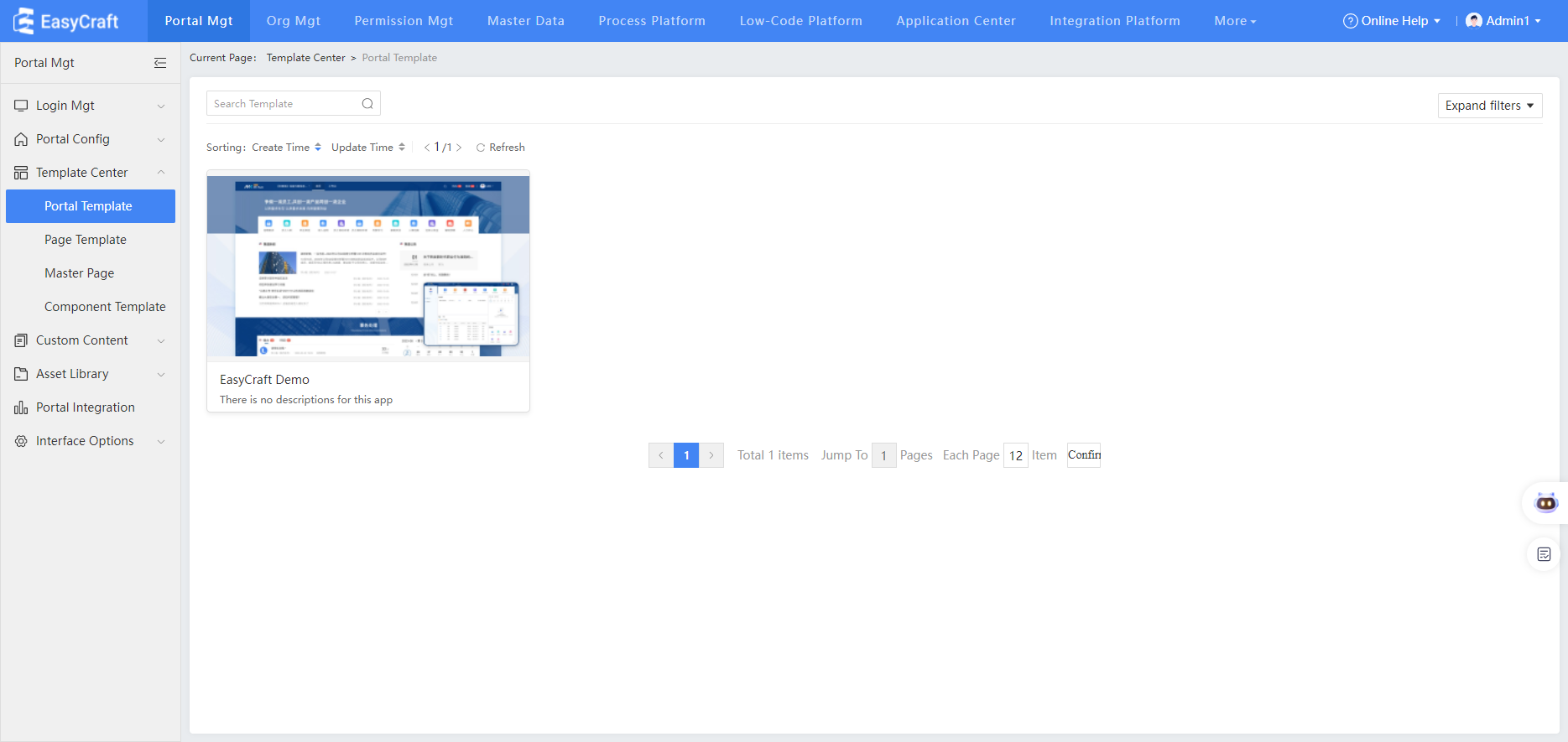
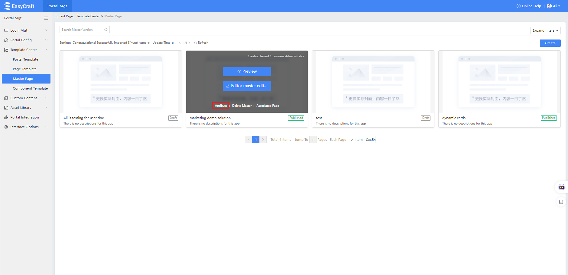
3) Template Center
Reuse templates from different projects via the Template Center. Click thumbnails to preview pages. Select Use Template to configure basic info.
Template Metadata Table
| Field | Description |
|---|---|
| Portal Solution Name | Template Center, Template Name |
| Keywords | Used for searching on the reuse platform |
| Industry | When selecting a Template Center, you can filter by industry. |
| Portal Solution Description | This field is not currently used by Template Center |
| Achievement thumbnail | When selecting a template in Template Center, you can preview it based on the thumbnail. If multiple images are uploaded, the first one will be used as the template cover. |
| Portal solution package | Compressed ZIP file of the portal |
After setup, change the portal status to Published to upload it to the Template Center.
2. Configure Portal Basic Info
In the basic info popup, choose Standard Portal and click OK to enter the editing page.
Note: Anonymous portals only allow components with public content.
Basic Info Fields
| Field | Description |
|---|---|
| Name | Displayed in the portal tab bar |
| Portal description | Description of use/content |
| Portal language | Language of the interface (Chinese or English) |
| Opening method | New tab or new browser tab |
| Type | Standard (login required) or Anonymous |
| Sorting | Order of appearance for users with multiple accessible portals |
| Cover | Thumbnail image used in the portal list |
After creating, the portal enters the editing page in draft state.
5.1.1 Page Management Configuration
1. Create a New Page
In the portal editing page:
- Hover over a page title to see operation buttons
- Click Settings beside the page name to configure basic info
Set a background image or color. Page background overrides portal background.
2. Add Pages
Click the + button to add same-level or sub-level pages.
Page Attribute Fields
| Field | Description |
|---|---|
| Name | Page title/navigation name |
| Type | Navigation group / Blank page / Link / Smart page |
| Page Navigation | Enable/disable page navigation for blank pages (when using nav-enabled templates) |
| Icon | Displayed before the page name |
| Allow page customization | Allows users to customize their experience (see [Page Customization Function Configuration]) |
| Accessible Users | Users who can view the page |
| Default Accessor | The default landing page for users |
| Maintainable Users | Users who can edit the page |
| Non-Accessible Users | Users who cannot access this page even if other permissions apply |
Tip: If a user has page-level access but not portal-level, they’ll automatically be granted portal access.
3. Portal Page Operations
Click the ... icon to:
- Set properties
- Hide the page
- Delete the page
- Set the page as a template
Page Navigation Configuration
Only applicable to templates with left navigation (full-screen/centered):
Steps
- Click ... > Property Settings for the target page.
- Enable or disable page navigation.
Note: Navigation-enabled pages can’t toggle nav settings.
- If disabling navigation:
- Option 1: Select one subpage’s content to replace the parent page content.
- Option 2: Skip and leave the homepage blank.
Important: Editing required if content is removed.
5.1.2 Flexible Layout Configuration
After dragging components into the layout, you can flexibly move their positions, add multi-tab components, and adjust the height and width by dragging the right, bottom, or bottom-right corner of the component to achieve a reasonable page layout.
Configuration Steps
-
Edit a blank page
Select "New Blank Template," and the system defaults to flexible layout. -
Drag components
Drag suites or business components from the left navigation, and adjust their height and width by dragging the right, bottom, or bottom-right corner to achieve a reasonable page layout. -
Adjust grid size
Select the root directory of the flexible layout container to switch the grid number of the page (which can be understood as the granularity of page width, with no limit on height). A higher grid number allows a larger draggable range for components. -
Set column layout
Flexible layout pages can be divided into columns, with options for two-column (left and right) or three-column layouts. Each column can be individually configured for width, grid number, row and column spacing, and can also have custom fill colors and background images. -
Use container layout
Flexible layout pages now include a container layout component, similar to fixed layout, allowing containers to be added to the content area with individually set height and width for placing components. The functionality is consistent with fixed layout. -
Use alignment guides
When adjusting the height or width of components in flexible layout, guide lines appear to assist in aligning with adjacent components, enabling users to build layouts more properly.
5.1.3 Fixed Layout Configuration
In fixed layout, you can drag in multiple container layouts, set container width, spacing, and background color, and delete nested containers. When dragging components into containers, their height and width cannot be flexibly adjusted; instead, component height must be set in the appearance settings to meet page layout requirements.
Configuration Steps
-
Switch to fixed layout
In the upper left corner of the page, switch the layout to a fixed layout, select one basic layout template, and enter the fixed layout page editing area.
Tip: If you switch layouts, components may become disorganized. Please switch carefully. -
Set container properties
Click the container to set the container width, spacing, and background color, and to delete embedded containers. -
Drag containers
Hover the mouse over the corresponding container. Based on the dotted line nesting relationship, hold the mouse to drag the container to the desired location. -
Add and configure components
Drag the left-side suite or business component into the container, then set the component layout spacing and height.
5.1.4 Using Page Templates
When creating a blank page, you can select a page template to create a page with content quickly.
Configuration Steps
Edit the blank page, select a page template, and click Preview and Use.
When creating a blank page, you can select a page template to create a page with content quickly.
Configuration Steps
Edit the blank page, select a page template, and click Preview and Use.
A suite is a collection of component styles that share a similar appearance.
Suite categories: Basic, Carousel, Navigation, List, Ranking, Charts, Statistics, DIY.
Differences between suites and business components:
-
Suites are styles and are separate from data sources. After selecting a suite style, choose to configure a system-preset data source in the corresponding format or a custom unified data source in the content area.
-
Business components are data sources. Selecting a business component determines the data source interface, and you can switch between all styles that match this data source.
The basic suite includes two types of component styles:
- Some styles do not require system data source configuration, being purely frontend displays or configurable with custom links or related trigger actions: includes basic components such as images, blank spaces, buttons, filter components, and custom links.
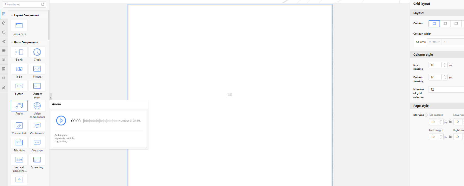
- Some styles can be configured with system-preset data sources: the portal integration system provides pre-configured data source interfaces in corresponding formats, including basic components such as personnel, calendars, meetings, messages, custom pages, audio, and video.
- When configuring data sources for styles in the basic suite, custom unified data source configuration is not supported.
- Configure the style component of the data source, using audio-visual as an example. Other configurations (personnel, calendar, meetings, messages, custom page components) are similar. Drag in the audio component, select an audio file in the content area (from the audio materials in the asset library). After configuring other styles, appearance, and permissions, preview to see the configuration effect.
- Drag in the button component, click Add Event in the configuration area, with options for click events and load completion events.
- Click event: Clicking the button triggers related actions.
- Load completion event: After the current page loads, related actions are triggered.
- After adding a click or load event, add the corresponding trigger action.
- Open page: Clicking the button opens a specific page, with configurable opening methods and link extension parameters.
- Close window: Closes the currently open window, with a configurable pop-up interface vocabulary.
- JavaScript: Custom JavaScript events.
- Confirmation dialog: Triggers a dialog pop-up, with a configurable dialog interface vocabulary.
- Connected components: Works with list components and icon components to filter out data that meets the conditions.
If the current configuration page has list components and icon components added, and a custom data source is configured, then during connection configuration, the corresponding components can be selected to define filtering conditions and filter out related data.
- After configuring one or more trigger actions, when previewing the page, clicking or completing page loading will execute the corresponding trigger actions in sequence.
5 Filter Component Configuration
- Simple filtering: Single-condition filtering or multiple conditions filtered by default using "AND" logic.
- Advanced filtering: Multiple conditions support configuring "OR" and "AND" logic for filtering.
-
From the basic suite, drag in a filter component and select simple filtering.
-
Add a filter component, with selectable components coming from charts or list groups on this page that have custom data sources configured, as shown below.
-
Set up and add filter items, with configurable option types as shown in the image.
-
For example, add an option filter item, set the option value, and name it according to actual business needs.
-
Configure the filter component to map option values one-to-one with the corresponding fields in the component form.
-
Preview to see the actual filtering component effect.
-
Toggle advanced filtering mode, which supports configuring multiple conditions with AND/OR relationships.
The carousel kit currently has 4 styles. All kit styles support selecting preset data sources or custom data sources.
- Preset data source: The portal integration system provides pre-configured data source interfaces with corresponding data formats.
- Custom unified data source: Supports selecting low-code forms, collaborative application forms, data factory forms, or integrated interfaces as data sources, followed by field mapping between display fields and data source fields.
Using Preset Data Source
- Drag in a carousel kit style, configure the component content area, and select a preset data source interface.
-
Select preset data sources from those provided by the respective system or module.
-
After selection, the corresponding data source interface content parameters will load automatically for attribute configuration.
Using Custom Unified Data Source
- Select a custom unified data source, divided into basic data fields and common property fields.
- Data source fields can be selected from low-code application forms, system application forms, data factory application forms, or integrated interfaces.
The following operations use a low-code form data source as an example. After selection, basic data fields and common property fields will load.
- Configure one-to-one mapping for basic data fields.
- Basic data: After selecting a unified data source, the component displays all fields supported by the data source interface. For different styles, some fields may be invalid. Configure display fields based on style requirements.
- Configure common property fields:
- Sorting: Supports increasing or decreasing sorting by any field in the form.
- Data filtering: Filters selected form data source data according to specified rules, effective for all styles globally.
- Icons: Some styles allow icon settings and icon redirect URLs, effective for specific styles locally.
- Additional information: Some styles include additional fields for mapping corresponding form fields, effective for specific styles locally.
- Maximum display: Sets the maximum number of documents displayed on the component, effective for all styles globally.
- Refresh time: The interval at which the component automatically refreshes its content. Leave empty for no refresh. Decimal values are configurable. Global styles apply.
- Custom button: All components support configuring custom redirect URLs and custom button names. Global styles apply.
- Content fields: Some styles support configurable display fields for content, while others have no related configurations.
- After configuration, click Preview to see the real data effect.
Shortcut
The Navigation Suite currently has 4 styles. This suite supports selecting preset data sources or custom data sources.
- Drag and drop the carousel suite style, configure the component content area, and select the preset data source interface.
-
Preset data source: The portal integration system provides pre-configured data source interfaces with corresponding data formats.
-
Custom data source: Supports user-defined link addresses.

List Suite Configuration
The List Suite currently includes 9 styles, such as plain text lists, image-text lists, and table components. This suite supports selecting preset data sources or custom data sources.
- Preset data source: The portal integration system provides pre-configured data source interfaces with corresponding data formats.
- Custom data source: Supports selecting low-code forms, collaborative application forms, data factory forms, or integrated interfaces to obtain data sources. Then, configure field mapping between display fields and data source fields.
Table Component Custom Data Source Configuration
- Drag and drop a table component and select Custom.
- Select Low-code Form in the Unified Data Source.
- Add fields to display in the table from the form.
- Configure display properties for table fields:
| Field | Field Description |
|---|---|
| Field | Select fields from the currently bound data source. |
| Column Header Text | Modify the display name of the column header. |
| Alignment | Table column data alignment selection. |
| Column width | Can be adaptive or select a fixed value (unit: px). |
| Line break method | How text is displayed when the content exceeds the column width. |
| Column header color | Choose the color of the table header. |
| Column text color | Content display color, can be set using a formula. |
| Format | Numeric type data display format. |
- Preview the table settings effect.
Ranking Suite Configuration
The Ranking Suite currently includes 4 styles. This suite style supports selecting preset data sources and custom data sources.
- Preset data source: The portal integration system provides pre-configured data source interfaces with corresponding data formats.
- Custom data source: Supports selecting low-code forms, collaborative application forms, data factory forms, or integrated interfaces to obtain data sources. Then, configure field mapping between display fields and data source fields.
Custom Data Source Configuration Steps
- Drag in the Statistical Ranking Component.
- Click the Custom button in the configuration area.
- Select the system data source (e.g., Low-code Form data).
- Configure field mappings between the ranking component's display fields and the data source fields.
- Set additional options such as:
- Sorting: Define the metric field used for ranking.
- Display Fields: Choose fields for title, subtitle, or numeric values depending on the selected style.
- Color and Style: Customize colors for ranking bars, fonts, or background as supported by the selected style.
- Preview the configured ranking component to view real data effects.
💡 Note: Some styles may support additional customizations such as icons, thresholds, or special highlight rules.
2. Configure Field Mapping Between Display Fields and Data Source Fields
After selecting the custom data source for the Ranking Suite, configure the field mappings to connect the display components with the actual data source fields.
Field Mapping Options:
-
Ranking Object
Specifies the field used to represent the ranking item, such as a document title or author name. -
Ranking Field
The statistical field that determines the ranking metric, such as the number of reads or number of documents created by an author. -
Default View
Defines the URL that users are redirected to when they click on a ranking item.- By default: Automatically uses the document URL.
- Custom: You can manually set a different link address if needed.
-
Open Method
Determines how the redirect link opens when a ranking item is clicked:- Default: Opens in a new tab.
- Optionally: Configure to open in the current page.
-
Sorting
Applies only to the ranking field (not the object). You can choose to display the results in:- Ascending order
- Descending order
-
Other Common Attributes
Include style-related configurations such as:- Display quantity
- Font settings
- Refresh interval
- Component layout
These are consistent with other suite configuration options.
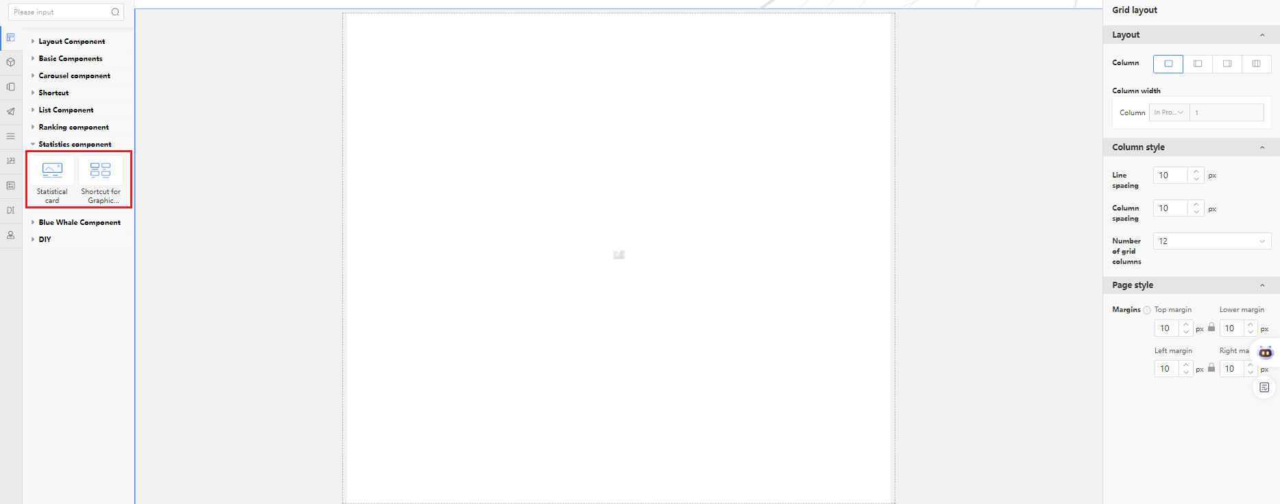
Statistics Component
Statistics Suite Configuration
The Statistics Suite currently includes 2 styles. It supports both preset data sources and custom data sources.
Data Source Types
-
Preset Data Source
The portal integration system provides pre-configured data source interfaces with predefined formats. -
Custom Data Source
You can choose from:- Low-code application forms
- Collaborative application forms
- Data factory forms
- Integrated interfaces
Once selected, configure field mappings between display fields and data source fields.
Steps to Configure the Statistics Suite:
-
Drag in the Statistics Suite component and select Custom Data Source.
-
Add Three Sets of Data Sources:
- For each, select the Low-Code Application - Leave Form as the data source.
- Set filters based on Leave Type (e.g., Sick Leave, Annual Leave).
- Perform statistics using the Document Title field.
- Configure a redirect URL for each data point to enable click-through behavior.
- Preview the configuration to check the effect.
Chart Component
Chart Suite Configuration
The Chart Suite currently includes 15 commonly used styles. It supports both preset data sources and custom unified data sources.
Data Source Types
-
Preset Data Source
These are data source interfaces with corresponding data formats integrated into the chart platform. -
Custom Data Source
You can choose from:- Low-code forms
- Collaborative application forms
- Data factory forms
- Integrated interfaces
After selection, configure the field mapping between display fields and data source fields.
Connected Component Configuration
Chart components support connected component configuration, allowing them to link with list or chart components on the same page. This enables data filtering based on interaction rules.
Example Workflow:
-
If Component A is linked to Component B, selecting an option in Component A will cause Component B to display data filtered by that selection.
-
Add a connected component:
- Only list or chart components on the current page with custom data sources configured can be selected.
-
Set filter conditions:
- Add form fields and define matching conditions using fixed values or formula-defined values.
-
Preview the configuration:
- Selecting an option in Component A filters Component B's data as per the conditions.
DIY Component
Component styles custom-developed by the custom component development platform, imported via Material Library - Page Components - Custom Components.
5.1.4.2 Business Component Configuration
Business Components
You can select standard data sources from various business modules, third-party systems, and integrated component data sources built by the integration platform.
Data Source Types
-
Business Module Data Sources
Standard data sources provided by each business module. -
Third-Party System Data Sources
Custom data sources uploaded by third-party systems. -
Integrated Component Data Sources
Configurable component data sources built through the integration platform interface.
Component Selection Method
- In the left component navigation, select the component source system.
- Filter components by system and module.
- Drag them into the corresponding container on the page.
- Or directly search for the component name and drag it into the container.
💡 Tip:
- Hover over components on the left to view style previews.
- When dragging a component directly, the default style is the first one.
Appearance Configuration
Explanation of appearance-related configuration parameters:
| Field | Description |
|---|---|
| Display | Predefined styles optimized per component. Usually no need to change. |
| Inner Spacing | Space between component and content area. Can be set individually. |
| Fill | Background color or image. Default follows the theme, or customize it. |
| Height | Default is content-adaptive, but fixed height is recommended for layout consistency. |
| Border | Show/hide border based on page style. |
| Corner Radius | Customize corner roundness uniformly or per corner. |
Content Configuration
| Field | Description |
|---|---|
| Title | Whether to display content in the title area. |
| Tab Title | Customizable component title. |
| Tab Subtitle | Subtitle in the component header. |
| Tab Icon | Icon shown before the title. |
| Content | Includes configuration for data source, number of data items, and data fields. Varies by component. |
Style Configuration
| Field | Description |
|---|---|
| Component | Presentation modes; varies by component. See all modes under Interface Components > Presentation. |
| Refresh Time | Set via encrypt.key in bootstrap config. |
| Action Button | Whether to display operational buttons. |
| Other Configs | Additional display tweaks depending on the component. Updates appear in real-time. |
Permission Configuration
| Field | Description |
|---|---|
| Custom | Enable via Page Settings > Permissions. Allows user-side customization/deletion. |
| Accessible Users | Select individuals, departments, roles, or groups. Empty = visible to everyone. |
| Non-Accessible Users | Restrict visibility by user/group. Empty = visible to everyone. |
Multi-Tab Components
When multiple components are added to a single container, it's called a multi-tab component.
- Configure content and style for each tab individually.
- Appearance settings are shared across all tabs.
- Components can be added, removed, or reconfigured at any time.
💡 Tip:
After configuring the component, click Save and Preview (top-right of the page) to see the actual effect.
- Real Data: Calls live system interface.
- Sample Data: Static demo content.
Undo Function
During page editing:
- Click the Undo button in the top-right to view a list of previous operations.
- Allows step-by-step reversal of actions.
⚠️ Important:
- After saving the page, undo history is still available.
- Once you exit and re-enter, undo history is cleared.
- Header/Footer configuration is not part of the undo history.
Final Step
- After configuring the page:
- Save it.
- Exit editing mode.
- Continue editing other pages to complete the full configuration process.
5.1.4.3 Component Templates
Component Templates
Pre-configured components can be saved as templates and directly used from the component template list.
-
Drag a single component into the container, and configure the appearance, content, and display-related parameters for the component.
-
In the component appearance settings area, save the configured component as a template.
-
During page configuration, select the Component Template tab, and drag the recently saved template component into the configuration area.
5.1.5 Portal Header and Footer Configuration
-
On the portal editing page, click the settings button next to the portal name to enable or disable the header and footer (the portal enables headers and footers by default).
-
When the header is enabled, enter the editing mode of any portal page, select the header, click settings, and configure the header content.
-
In the header settings area, switch to the Style tab to set the header style. Click the Replace button next to the header to switch between different header styles.
Tip: The header has multiple styles, and each style has different content layouts. After selecting a different header style, you can directly see the header effect in the page editing area. -
After hiding the header, you can reopen it by following the steps in step 1.
-
When the footer is enabled, enter the editing mode of any portal page, select the footer, click settings, and configure the footer content.
-
Click the Replace button next to the footer to change the footer style to a multifunctional footer.
Tip: The multifunctional footer is a footer with quick-access features. After configuring other settings, you can directly see the effect.
5.1.5.1 Header Search Configuration
-
Configure the search function in the header content area.
-
Search Scope Configuration
- In the connected EKP system, under Search Function Configuration > Default Search Module Configuration, select the business module.
- In the EasyCraft header content area, under Search Scope Configuration, select the search module.
-
After saving and publishing the portal, check the user side. The user-side header search box allows selecting the search scope, with options being the business modules selected in Demo. The default option is "All."
-
Search Address Configuration
-
System default:
When "System default" is checked, the search address in the header will be the one configured in the backend.Note: The system-configured search address is only effective when using EasyCraft full-text search. Log in to the backend as sysadmin and configure the system search address in the Backend Management Center > System Configuration. Selecting "System default" allows you to control whether the search results page opens in a new tab or within the content area.
-
Custom:
When "Custom" is checked, users can define their own search address. For example, entering"www.google.com"in the text box will redirect searches to the Baidu search engine.
-
5.1.5.2 Header Logo Address Configuration
- Configure the redirect address for the header logo in the header content area. If set to "Current homepage," clicking the logo will redirect to the current portal homepage. If set to "Custom," entering a link in the text box will redirect to that link when the logo is clicked.
5.1.5.3 Portal Dropdown List Style Configuration
- In the header style area, select a portal under "Portal Switch" to choose between a list or tiled display style for the portal dropdown.
The list style is shown as illustrated. The tiled style is shown as illustrated.
5.1.5.4 Header Portal Navigation Configuration
-
In portal configuration, create new portal categories and associate portals under Category Management.
-
Under the header style tab, switch to the second header style with portal navigation.
-
In the content area, configure the general page and portal navigation, then select and add portal categories.
-
On the user side, enter the portal header to view the portal navigation effect
5.1.6 Configure Portal Permissions
The backend allows configuration of portal access permissions, including accessible users, default users, and portal maintainers.
-
Go to the portal configuration list, locate the newly created portal, and click the [Settings] button outside the portal, as shown.
-
In the Set Portal Basic Information pop-up, select the Permissions tab.
Permission field description:
| Field | Basic parameter explanation |
|---|---|
| Accessible Users | If left empty, the portal is accessible to everyone; if not empty, only personnel listed can access the portal. |
| Non-Accessible Users | If left empty, all authorized portal users can access this page; if not empty, listed personnel cannot access the portal page. |
| Default Accessor | The page accessed by listed personnel when entering the portal is this portal. If a user is the default visitor for multiple portals, the portal sequence number determines the page they access. |
| Maintainable Users | If left empty, only relevant administrators can maintain it; if not empty, listed personnel and administrators can maintain this portal. |
5.1.7 Configure Portal Design and Appearance
The system provides multiple design styles, each with several different skin options. The backend can configure the default portal design and whether users are allowed to switch design and appearance.
- After entering the portal editing page, select the "Design and Appearance" tab to switch the default portal design and appearance.
- After checking the "Allow regular users to change designs" option, a "Design and Appearance" operation option will appear in the personal settings page for regular users after the portal is published. Regular users can flexibly switch their design styles.
5.1.8 Configure Portal Background
Portal background configuration. The default portal background follows the design, but you can also customize it with a solid color or image background.
- Enter portal editing mode, click the settings button next to the portal name, and configure the portal background.
- Customize the portal background as a solid color. The effect is as shown: the background fills the entire page area, including the header, footer, navigation, and content sections.
- Customize the portal background as an image background. The effect is as shown: the background fills the entire page area, including the header, footer, navigation, and content sections. When setting as an image, parameter descriptions: + Fit: Display original image: shows the image at its original size and clarity. Proportional stretch: if the image is smaller than the page size, it stretches proportionally (may cause distortion). + Scroll: Fixed: the background image remains stationary when scrolling the page. Follow page scrolling: The background image scrolls along with the page when sliding up and down.
5.1.9 Customizing Configuration Pages
The portal settings offer two user customization methods in custom content: simple editing and advanced editing. - In simple editing mode, users can only drag components to adjust their position, hide components, and sort or hide components under multi-tab components. - Advanced editing allows users to add components, delete components, adjust component positions, modify components, and also copy or delete custom pages. - Both simple editing and advanced editing modes support page pushing. When an administrator updates a backend page, they need to manually recommend pushing a page update reminder or forward to overwrite the user's custom page.
5.1.9.1 Simple Editing Configuration
-
Enable page customization. The portal administrator enters the portal configuration backend, switches to portal editing mode, hovers over the page title, sets page properties, and checks the "User Customization" option. In simple mode, page customization only has an enable option.
-
When regular users access this page of the portal, a "Customize" option appears in their personal settings page.
-
Click "Customize," and a pop-up displays all customizable pages under the portal.
-
Click on a page to enter custom page mode.
-
Drag components in simple custom page mode
5.1.9.2 Advanced Editing Configuration
- Set the page to allow user customization and copying. The portal administrator enters the portal configuration backend, switches to portal editing mode, hovers over the page title, sets page properties, checks the "User Customization" option, enables page copying, and clicks OK.
- Set page components to allow user customization and deletion. Hover over the page title, click the edit icon to enter the page editing screen, select the Settings > Permissions option for a component, and configure whether users can customize or delete the component on the page. Tip: Each component on the page must be individually configured to allow customization and deletion. If a component is not configured, it cannot be customized.
- Save the page, exit page editing, click the publish button on the portal to publish the portal.
- For regular users' personal settings, click Customize to enter page editing mode. Users can customize page content, such as selecting to add other components, dragging components to rearrange their positions, and configuring existing components on the page (if the component allows customization).
- After customizing the page, you can set it as the homepage, copy the page, or reset the page to restore the default page, among other operations.
- Click cancel button to return to the portal homepage, displaying the copied customized page.
- After an administrator updates the content of a page with customization enabled, they need to send a push notification to prompt all users who have customized the page, asking if they want to update with the administrator's changes.
- When users access the portal page, they receive a recommended push notification, as shown in the figure. Users can preview the page configured by the administrator and choose to ignore or update it.
- When users access the portal page, they receive a forward notification, as shown in the figure. The user's customized page content is updated to match the admin backend.
5.1.10 Configuring Portal Opening Methods
- Configure how links on the portal open for users. The portal supports opening links in the content area or in a new window.
- New Window Opening Method: Links on the portal open in a new browser window.
- Content Area Opening Method: Links on the portal open in the current page, displayed as multiple tabs.
-
Go to the portal configuration list, find the newly created portal, click the [Settings] button outside the portal, and enter the basic portal configuration pop-up window.
-
After setting the opening method, click Confirm, then click Update and Publish.
-
The display effect when configured to open in the content area.
-
The display effect when configured to open in a new window.
5.1.11 Configuring the Floating Window Feature
The floating window feature is a client-side function. After enabling it in the personal center, all links on portal components will open in a floating window when accessed by the user.
-
Users enter the portal, select Personal Center > Personal Settings > Portal Settings in the header, and enable the floating window feature.
-
After enabling the floating window feature, a floating window icon appears in the lower-right corner of the portal page.
-
When users open a new link from the portal, it will be displayed in a floating window style, as shown in the figure.
- In the upper-right corner of the floating window, click the minimize button to collapse the link into the floating window icon.
- In the upper-right corner of the floating window, click the maximize button to display the floating window in full screen.
- In the upper-right corner of the floating window, click the close button to close the floating window.
- In the upper-right corner of the floating window, click the "..." button to enable batch operations, allowing all opened links in the floating window icon to be processed in bulk.
- In the upper-right corner of the floating window, click the "..." button to disable the floating window feature. Portal links will then open according to the portal's configured method. The floating window feature can be re-enabled in Personal Center.
- Hold the mouse button on the floating window title to drag it up or down. Place the mouse on the borders of the floating window to resize it.
5.1.12.1 Portal Export
-
Single Portal Export
- Go to the portal management backend, select the portal in the portal configuration list, and click [Export].
Tip: If the network is unstable and the exported portal contains large files such as audio or video, clicking export may take a few minutes to package before the file download pop-up appears.
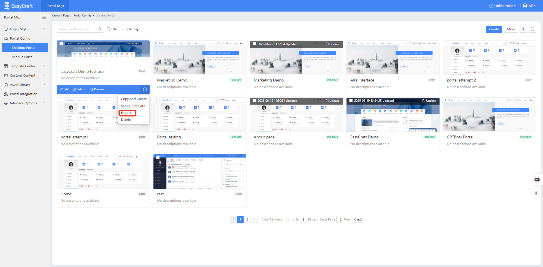
- Select the storage path for the exported portal.
Tips: Portal export packages portal information and configurations, page templates, data sources including custom content, sample data from the asset library, custom components, custom headers, custom footers, and custom design packs.
- Go to the portal management backend, select the portal in the portal configuration list, and click [Export].
-
Batch Portal Export
Go to the portal management backend, select multiple portals in the portal configuration list, and click [Batch Export].
5.1.12.2 Portal Import
- Go to the portal management backend, click [Import] in the portal configuration list.
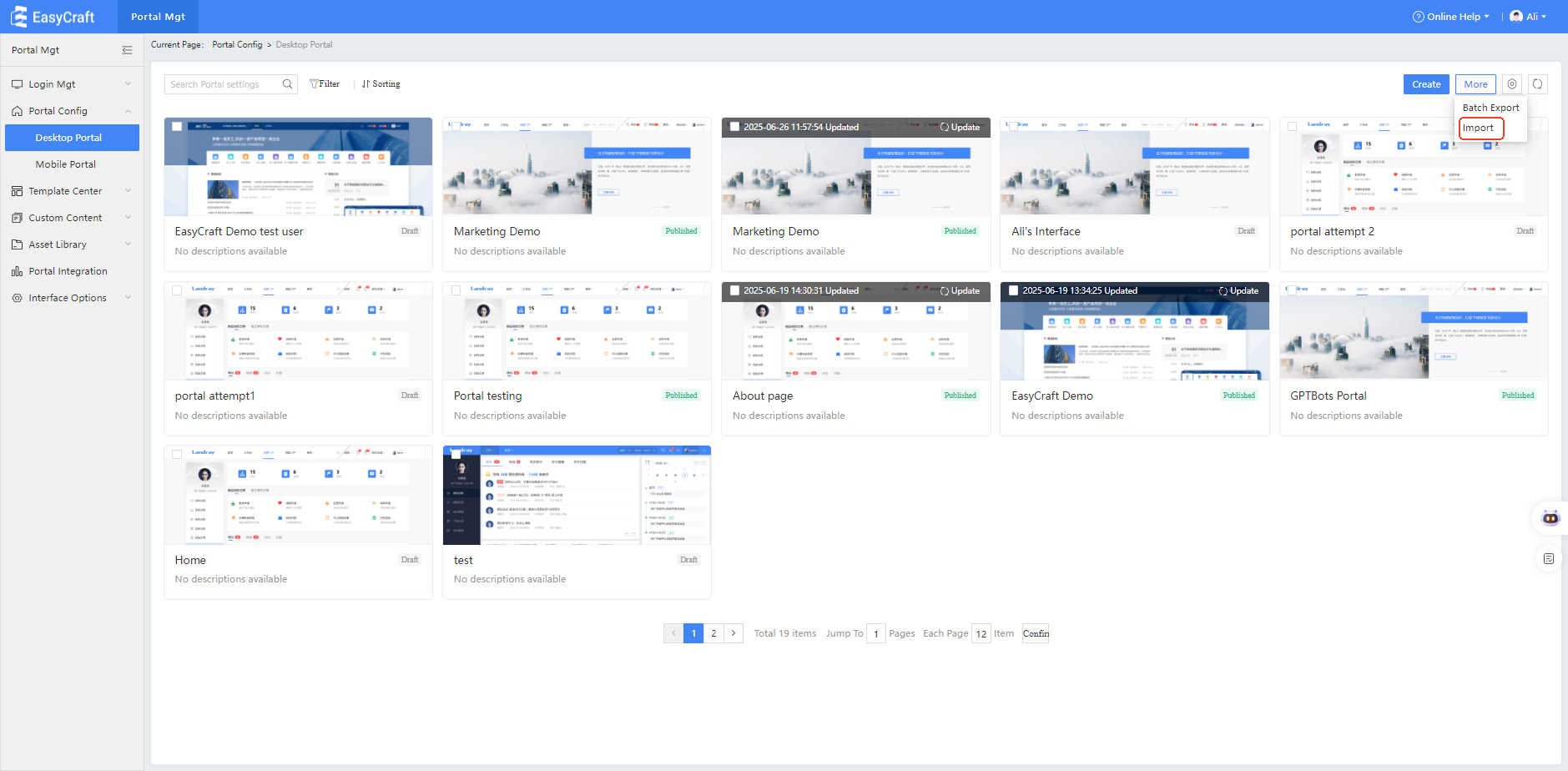
-
Upload the exported portal zip file from the previous step.
-
During the upload process, you can cancel and re-upload the file.
-
After successful upload, a prompt will indicate the portal upload was successful.
-
Click 'Return' to enter the portal management list, where you can see the recently uploaded portal.
Tip: When importing a new portal, its status is set to draft. When updating an imported portal, the status remains unchanged.
5.1.13 Configure Custom Shortcuts
-
If a portal is configured with a custom shortcuts component, this component allows users to customize the display, hide, and sorting of shortcuts within the component. It also supports administrators locking certain shortcuts, preventing users from customizing them.
In portal configuration, add the Custom Shortcuts component.
Tip: On the portal editing page, in the left component selection area, you can search for "Custom Shortcuts" and select to add the custom shortcuts component. -
Click the Settings of the component to configure and select the data source for custom shortcuts.
The data source comes from graphic-text shortcuts in custom content management.Tip 1: Explanation of the three configuration areas:
- Locked Area: Shortcuts added to this area cannot be sorted or hidden by users.
- Display Area: Shortcuts in this area are visible to users by default and can be sorted or hidden as desired.
- Hidden Area: Shortcuts in this area are not visible to users by default, but users can choose to add them to the display area.
Tip 2: Once a user has customized the shortcuts, any changes made by the administrator to the default display and hide settings will not affect the user's customizations.
-
When users access the portal, they can customize the shortcuts.
Tips: Users can set shortcuts to show or hide and can sort the displayed shortcuts.5.1.14 Configure Smart Pages
Configuration Overview
Primarily provided by AIP, smart recommendation components and smart tags are integrated with portal configuration to assemble smart pages.
-
Smart Recommendation Components:
Through AIP services, smart recommendation components are provided. These components use common recommendation strategies to suggest relevant content to users.Smart components include:
Headline recommendations, internal knowledge/industry knowledge/knowledge repository recommendations, today's work recommendations, related work recommendations, scenario recommendations, and application recommendations.Common recommendation strategies:
- Popularity-based recommendation: Recommend content based on the most clicked or searched items in the last 7 days or 1 month.
- Suggestions among users with the same identity: Recommend content preferred by users with the same identity tags.
- Cross-recommendation based on similar behaviors: Recommend other content viewed by users who also viewed this item.
- User profile-based recommendation: Recommend content personalized according to user tags.
-
Smart Pages:
The portal management provides smart pages with intelligent tags. The AIP service matches smart pages with user tags to display the most relevant content.